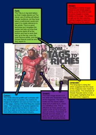
1. Colour:
The multi-coloured graffiti wall contrasts with
the artists bright red jacket, this makes the
image a lot brighter and pop out from the rest
of the page, making it the first thing the reader
sees. The boldness of his jacket against the
wall could signify that he likes to stand out,
and he is seen as someone who stands out
from other artists in the music industry.
Images:
The main image shown is of
the artist who dominates most
of the magazine. The beer
bottle and the stereo reflect
what sort of artist he is, which
is a rebellious one. This is
effective as many people can
relate to him as he is trying to
give an ordinary impression of
himself and has clearly not
gone for a glamorous type of
photo shoot, showing money
doesn’t make success.
Language:
The language is slang like
which suggests that this issue
of the magazine was made for
young adults. The emphasis of
Dizzee Rascals name in bold
once again highlights that he is
the star of the magazine.
Design:
The article is mainly imaged
based as one whole page is
taking up by the artist as well
as some images of empty
bottles of the page. The writing
is split up into four columns
making it easier to read and
filling out a bit of the space.
Font:
The Title is in big bold letters
so that it really stands out The
clever use of writing will attract
a wider audience, as they have
taken a well-known quote and
used it to create relevance to
the article. This is a good
technique as it engages the
reader and lets us know that
everyone starts off at the
bottom and has to work their
way up to the top, even the
most famous artists, and that
Dizzee Rascal could be who
they aspire to.