
Recommended
More Related Content
What's hot
What's hot (20)
Similar to Dizzee Rascal Double Page Spread
Similar to Dizzee Rascal Double Page Spread (20)
More from reyganrudgley
Recently uploaded
Recently uploaded (20)
Dizzee Rascal Double Page Spread
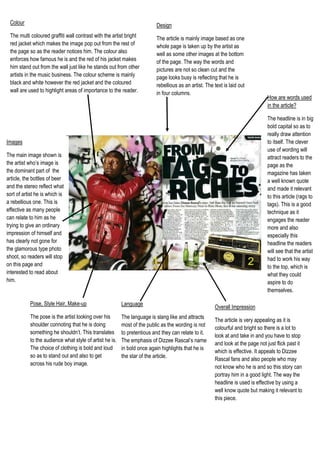
- 1. Overall ImpressionThe article is very appealing as it is colourful and bright so there is a lot to look at and take in and you have to stop and look at the page not just flick past it which is effective. It appeals to Dizzee Rascal fans and also people who may not know who he is and so this story can portray him in a good light. The way the headline is used is effective by using a well know quote but making it relevant to this piece.How are words used in the article?The headline is in big bold capital so as to really draw attention to itself. The clever use of wording will attract readers to the page as the magazine has taken a well known quote and made it relevant to this article (rags to tags). This is a good technique as it engages the reader more and also especially this headline the readers will see that the artist had to work his way to the top, which is what they could aspire to do themselves. LanguageThe language is slang like and attracts most of the public as the wording is not to pretentious and they can relate to it. The emphasis of Dizzee Rascal’s name in bold once again highlights that he is the star of the article.Pose, Style Hair, Make-up The pose is the artist looking over his shoulder connoting that he is doing something he shouldn’t. This translates to the audience what style of artist he is. The choice of clothing is bold and loud so as to stand out and also to get across his rude boy image. 6477002266950ImagesThe main image shown is the artist who’s image is the dominant part of the article, the bottles of beer and the stereo reflect what sort of artist he is which is a rebellious one. This is effective as many people can relate to him as he trying to give an ordinary impression of himself and has clearly not gone for the glamorous type photo shoot, so readers will stop on this page and interested to read about him. DesignThe article is mainly image based as one whole page is taken up by the artist as well as some other images at the bottom of the page. The way the words and pictures are not so clean cut and the page looks busy is reflecting that he is rebellious as an artist. The text is laid out in four columns. ColourThe multi coloured graffiti wall contrast with the artist bright red jacket which makes the image pop out from the rest of the page so as the reader notices him. The colour also enforces how famous he is and the red of his jacket makes him stand out from the wall just like he stands out from other artists in the music business. The colour scheme is mainly black and white however the red jacket and the coloured wall are used to highlight areas of importance to the reader.