
Recommended
More Related Content
What's hot
What's hot (20)
Similar to Black background album advert design
Similar to Black background album advert design (20)
More from JessieGee14
More from JessieGee14 (20)
Recently uploaded
Recently uploaded (20)
Black background album advert design
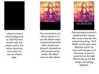
- 1. I chose to have a black background as I feel that this would make the photo used in the advert stand out more than if it was on a blank page. The conventions of a album advert is to use the album cover. I experimented with other photos but research showed me that people would prefer the album cover on the advert. From personal research I preferred the release date to be show like this instead of writing, “OUT NOW” as this was more effective and fit sin more with the genre of the music. It used to same font as the SUB FOCUS title to link the image and writing together.
- 2. I have decided to put stars in that rated the album as this is what you usually see on an album advert. I was originally only going to use one but I thought using two others would fill out the page more and make it more eye catching as there are more reviews. I also felt if I only used one star rating that the text in the advert would be very centre focused, which isn't what I want as there are three girls in the band, therefore, there is no centre focus. The photo already focuses a bit too much than I would like on the brunette girl in the middle.
- 3. I have put quotations below the star ratings to make them look more professional. Obviously the quotes are not actually from the magazines. But these are newspapers/magazines that would usually review an album and have their opinions quoted on the advert. I have begun to add images of social networking sights on the advert. This shows that you Sub Focus are online and they can go and find out more information of these social networking sites.
- 4. I added available on iTunes as this is usually on a album advert and mainly where people go to get their music as the majority of people have smart phones now so there is easy access to buying music. I also added a fake website to the bottom of the page as this is a convention of an album advert. This makes the advert look more professional looking.
- 5. I edited this one to make the bottom burgundy and the writing cream as I felt that this helped the poster flow more, merging the text with the image. However, I don’t think this looks very professional and looks a bit tacky. I liked this poster, however, I felt as if the image was too cut off from the area of text below. This stopped the advert from flowing. I felt as if there was something missing. This is my favourite poster as I fell that it is different and would stand out in the magazine catching the readers eye. The fact the some of the image is black and white helps it flow with the text area below. The column of colour gives the audience an preview of what the CD cover looks like. It can be seen to connote that the album has more to show and that is why you need to listen to it. So far the advert