1. The headingof the article followsthe
same style of how the textis presented.
The textis clearbut placedondifferent
anglestoseemmore modernand
appeal toa more rock oriented
audience.The fontfollowsthe same
denotationsof the magazine,asitis
boldand angled.
The article useslanguage thatisclear
and understandabletoamore formal
audience.The drop-capistodraw the
attentiontothe article and they want
the firstparagraph to standout and
grab the audience’sattentioninorderto
getthemto keepreading.The textis
much smallerthaneverythingelse,
therefore itmustuse language tokeep
the audience concentratedonthe
article.
The By-line isusedtotell the readerwhohastakenthe
picture,whenthe picture wastakenandwhy. The by-
line isusedmainlytogive relevance tothe picture and
to simultaneouslyadvertise the photographer. The by-
line ismuchlargerthan the rest of the article which
has beenadenotationof all magazines.The by-line is
the way of grabbingattentiontothe firstparagraph
whilststill presentingapotentiallyattractive wayof
drawinginattentionsuchas byhavinga patternon the
letter.
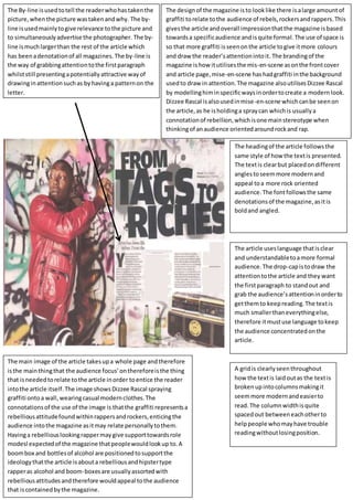
The main image of the article takesupa whole page andtherefore
isthe mainthingthat the audience focus’onthereforeisthe thing
that isneededtorelate tothe article inorder toentice the reader
intothe article itself.The image showsDizzee Rascal spraying
graffiti ontoa wall,wearingcasual modernclothes.The
connotationsof the use of the image is thatthe graffiti representsa
rebelliousattitudefoundwithinrappersandrockers,enticingthe
audience intothe magazine asitmay relate personallytothem.
Havinga rebelliouslookingrappermaygive supporttowardsrole
modesl expectedof the magazine thatpeoplewouldlookup to.A
boombox and bottlesof alcohol are positionedtosupportthe
ideologythatthe article isabouta rebelliousandhipstertype
rapperas alcohol and boom-boxesare usuallyassortedwith
rebelliousattitudesandtherefore wouldappeal tothe audience
that iscontainedbythe magazine.
The designof the magazine isto looklike there isalarge amountof
graffiti torelate tothe audience of rebels,rockersandrappers.This
givesthe article andoverall impressionthatthe magazine isbased
towardsa specificaudience andisquite formal.The use of space is
so that more graffiti isseenonthe article togive itmore colours
and draw the reader’sattentionintoit. The brandingof the
magazine ishow itutilisesthe mis-en-scene asonthe frontcover
and article page,mise-en-scene has hadgraffiti inthe background
usedto draw in attention.The magazine alsoutilisesDizzee Rascal
by modellinghiminspecificwaysinordertocreate a modernlook.
Dizzee Rascal isalsousedinmise-en-scene whichcanbe seenon
the article,as he isholdinga spraycan whichis usuallya
connotationof rebellion,whichisone mainstereotype when
thinkingof anaudience orientedaroundrockand rap.
A gridis clearlyseenthroughout
how the textis laidoutas the textis
brokenupintocolumnsmakingit
seemmore modernandeasierto
read.The columnwidthisquite
spacedout betweeneachotherto
helppeople whomayhave trouble
readingwithoutlosingposition.