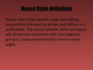
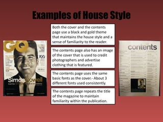
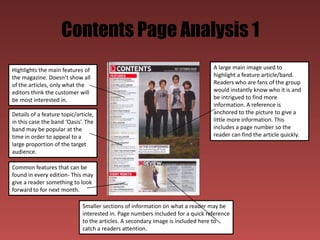
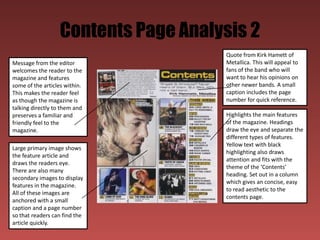
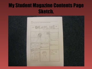
Contents Page Research
      Callum Lamb
What is the purpose of a contents
                page?
The purpose of a contents page is to inform the
reader about many of the articles and features
within the magazine and the pages on which
you can find them. Some of these articles will be
anchored to an image to show the reader what
they are featuring. Often, a contents page will
include a message from the editor, welcoming
readers to the magazine and glancing over a
topic that the reader may find interesting.
Typical Conventions of a contents
                page
Contents pages usually follow a house design and are
easy to read. They use colours that are relevant to the
magazine and are usually the same or similar to the cover
page. They are normally one to two pages long and are
set out in columns, normally 3-4 to make them easier to
read. They also have a large image of a feature article and
a few secondary images relating to other articles. These
images are usually anchored with a number to show
which story it relates to. The is also sometimes a letter
from the editor, welcoming the ready to the magazine
and what they can expect from this edition.
House Style definition
House style is the specific usage and editing
conventions followed by writers and editors in a
publication. The colour scheme, fonts and layout
will all become consistent with the magazine
giving it a personal and familiar feel on most
pages.
Examples of House Style
    Both the cover and the contents
    page use a black and gold theme
    that maintains the house style and a
    sense of familiarity to the reader.

    The contents page also has an image
    of the cover that is used to credit
    photographers and advertise
    clothing that is featured.

    The contents page uses the same
    basic fonts as the cover.- About 3
    different fonts used consistently.
    The contents page repeats the title
    of the magazine to maintain
    familiarity within the publication.
Contents Page Analysis 1
Highlights the main features of                                                  A large main image used to
the magazine. Doesn’t show all                                                   highlight a feature article/band.
of the articles, only what the                                                   Readers who are fans of the group
editors think the customer will                                                  would instantly know who it is and
be most interested in.                                                           be intrigued to find more
                                                                                 information. A reference is
Details of a feature topic/article,                                              anchored to the picture to give a
in this case the band ‘Oasis’. The                                               little more information. This
band may be popular at the                                                       includes a page number so the
time in order to appeal to a                                                     reader can find the article quickly.
large proportion of the target
audience.

Common features that can be
found in every edition- This may
give a reader something to look
forward to for next month.

                              Smaller sections of information on what a reader may be
                              interested in. Page numbers included for a quick reference
                              to the articles. A secondary image is included here to
                              catch a readers attention.
Contents Page Analysis 2
                                      Quote from Kirk Hamett of
Message from the editor               Metallica. This will appeal to
welcomes the reader to the            fans of the band who will
magazine and features                 want to hear his opinions on
some of the articles within.          other newer bands. A small
This makes the reader feel            caption includes the page
as though the magazine is             number for quick reference.
talking directly to them and
preserves a familiar and              Highlights the main features
friendly feel to the                  of the magazine. Headings
magazine.                             draw the eye and separate the
                                      different types of features.
                                      Yellow text with black
Large primary image shows
                                      highlighting also draws
the feature article and
                                      attention and fits with the
draws the readers eye.
                                      theme of the ‘Contents’
There are also many
                                      heading. Set out in a column
secondary images to display
                                      which gives an concise, easy
features in the magazine.
                                      to read aesthetic to the
All of these images are
                                      contents page.
anchored with a small
caption and a page number
so that readers can find the
article quickly.
My Student Magazine Contents Page
             Sketch.
Creating a House Style for my Student
             Magazine.
My contents page will be similar to my front
cover in many ways in order to create a
definitive house style.
I will use the same two font choices (Impact and
Century Gothic) and colour scheme (Red, black
and white) that I used on my front cover. This
will create a familiar feel that persists
throughout the magazine.

Contents page research

  • 1.
  • 2.
    What is thepurpose of a contents page? The purpose of a contents page is to inform the reader about many of the articles and features within the magazine and the pages on which you can find them. Some of these articles will be anchored to an image to show the reader what they are featuring. Often, a contents page will include a message from the editor, welcoming readers to the magazine and glancing over a topic that the reader may find interesting.
  • 3.
    Typical Conventions ofa contents page Contents pages usually follow a house design and are easy to read. They use colours that are relevant to the magazine and are usually the same or similar to the cover page. They are normally one to two pages long and are set out in columns, normally 3-4 to make them easier to read. They also have a large image of a feature article and a few secondary images relating to other articles. These images are usually anchored with a number to show which story it relates to. The is also sometimes a letter from the editor, welcoming the ready to the magazine and what they can expect from this edition.
  • 4.
    House Style definition Housestyle is the specific usage and editing conventions followed by writers and editors in a publication. The colour scheme, fonts and layout will all become consistent with the magazine giving it a personal and familiar feel on most pages.
  • 5.
    Examples of HouseStyle Both the cover and the contents page use a black and gold theme that maintains the house style and a sense of familiarity to the reader. The contents page also has an image of the cover that is used to credit photographers and advertise clothing that is featured. The contents page uses the same basic fonts as the cover.- About 3 different fonts used consistently. The contents page repeats the title of the magazine to maintain familiarity within the publication.
  • 6.
    Contents Page Analysis1 Highlights the main features of A large main image used to the magazine. Doesn’t show all highlight a feature article/band. of the articles, only what the Readers who are fans of the group editors think the customer will would instantly know who it is and be most interested in. be intrigued to find more information. A reference is Details of a feature topic/article, anchored to the picture to give a in this case the band ‘Oasis’. The little more information. This band may be popular at the includes a page number so the time in order to appeal to a reader can find the article quickly. large proportion of the target audience. Common features that can be found in every edition- This may give a reader something to look forward to for next month. Smaller sections of information on what a reader may be interested in. Page numbers included for a quick reference to the articles. A secondary image is included here to catch a readers attention.
  • 7.
    Contents Page Analysis2 Quote from Kirk Hamett of Message from the editor Metallica. This will appeal to welcomes the reader to the fans of the band who will magazine and features want to hear his opinions on some of the articles within. other newer bands. A small This makes the reader feel caption includes the page as though the magazine is number for quick reference. talking directly to them and preserves a familiar and Highlights the main features friendly feel to the of the magazine. Headings magazine. draw the eye and separate the different types of features. Yellow text with black Large primary image shows highlighting also draws the feature article and attention and fits with the draws the readers eye. theme of the ‘Contents’ There are also many heading. Set out in a column secondary images to display which gives an concise, easy features in the magazine. to read aesthetic to the All of these images are contents page. anchored with a small caption and a page number so that readers can find the article quickly.
  • 8.
    My Student MagazineContents Page Sketch.
  • 9.
    Creating a HouseStyle for my Student Magazine. My contents page will be similar to my front cover in many ways in order to create a definitive house style. I will use the same two font choices (Impact and Century Gothic) and colour scheme (Red, black and white) that I used on my front cover. This will create a familiar feel that persists throughout the magazine.