
Recommended
More Related Content
What's hot
What's hot (17)
Viewers also liked
Viewers also liked (19)
Similar to College Magazine Front Cover & Contents Page
Similar to College Magazine Front Cover & Contents Page (20)
More from asmediae12
More from asmediae12 (20)
College Magazine Front Cover & Contents Page
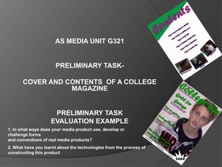
- 1. AS MEDIA UNIT G321 PRELIMINARY TASK- COVER AND CONTENTS OF A COLLEGE MAGAZINE PRELIMINARY TASK EVALUATION EXAMPLE 1. In what ways does your media product use, develop or challenge forms and conventions of real media products? 2. What have you learnt about the technologies from the process of constructing this product
- 2. In what ways does your media product use, develop or challenge forms and conventions of real media products? The front cover similarities: The use of strap My Front Cover lines and a date. Men’s Health Front Cover The use of a Masthead to let the reader know what the magazine is called The use of Cover Lines to explain what is in the magazine Plain Background Dominant Image (Rule Of Thirds) Use of puffs and pugs to attract readers
- 3. Differences between my front cover and ‘Men’s Health’: ‘Men’s Health has a barcode whereas mine Men’s Health Front Cover My Front Cover hasn’t The use of different sell and cover lines as well as the magazine name and strap line. The use of a different main image. Mine is a student whereas ‘Men’s Health’ is a famous actor. The use of different colours and fonts.
- 4. In what ways does your media product use, develop or challenge forms and conventions of real media products? Similarities between my Contents Page and a well known magazine Contents Page My Contents Page ‘Q’s’ Contents Page The date Contents Page title Page numbers along with a title of that specific page Smaller images along the bottom of the page
- 5. Differences with Contents Page The use of Sub-headings My Contents Page ‘Q’s’ Contents Page A main contents page image More information explaining what information is in each page A different colour style is used. Mine being purple and green and there contents page colour scheme being black and white
- 6. What have you learnt about the technologies from the process of constructing this product The preliminary task has shown me how to use a range of resources including: Adobe Photoshop, Adobe In Design and digital cameras when taking photos for my front cover and contents page. Adobe Photoshop was used to create my front cover as it can be used to edit and manipulate photos quicker and easier than InDesign A digital camera was used to take my main front cover photo along with smaller photos for my Adobe InDesign was used to contents page. create my contents page as it can be used to manipulate boxes better than Photoshop
- 7. Using the digital camera, I could ensure that My image was an MCU which dominated the frame. I observed the rule of thirds when using the photo, I made certain that the cover lines were using the rule of thirds. I should have moved the image down and to the right more so that the left third had more space for cover lines and so that the masthead did not cover the models forehead. I should have also made the model smile because in this photo he looks quite depressed. I Adding the stroke effect to the text. I used Adobe Photoshop to design my front cover as it useful program Fixing the problem to manipulate photos. Photoshop helps with editing of the main image with red eye. and the editing of the text. I added a stroke effect to the text to make it more eye catching and so it stands out a lot more that in would have if I did not use the stroke effect. I also changed the levels of the colours, to add more emphasis on the student. Originally the model had red eye which I corrected with the red eye tool. I made sure everything looked correct with the main image before I carried on with inserting my cover lines and sell lines.
- 8. I added a stroke Using In-design For my Contents page effect to the text to make it stand out more. I had the main text box at the top and made sure I used the same colours as the front cover, them being green and purple. I used a rectangle box and manipulated it which took a Manipulating the long time to make the rectangle behind the diagonal effect behind the title of the contents text. page. I used one single textbox to write all of my contents in which I admit was a mistake, I should have used a separate textbox for each different page/pages which would have given me more freedom to move the text I imported images that I took with the digital wherever I wanted camera and resized them to make them all fit along the bottom of the page Using Adobe InDesign to design my contents page was very beneficial as InDesign is mainly used to manipulate boxes and for what I wanted to do, It was a great tool. The box that I manipulated with InDesign is the diagonal box behind the Contents Page Title. Without InDesign this would have been very difficult but InDesign made it a lot easier.