1. In what ways does your media product use,
develop or challenge forms and conventions
of real media products?
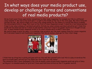
On my front cover I have used similar conventions to other music magazines for example my title is a different
colour scheme to the rest of my work and it is right in the middle at the top of the cover page. My title is bold and
catches the eye . My central image is of a boy in my college posing for the camera in a quirky way which is usually
the stereotypical kind of image that is put on the front of music magazines except it would be a real famous person.
I kept to my colour scheme of red black and white. Initially my colour scheme was black and white but I think this
would look too bland and dull so I chose to add another colour but it had to be gender neutral so I thought I’d use
red. A usual standard music magazine sticks to its colour scheme which is what I have done.
My central image is quite far away, it is a medium close up which isn’t the most common thing for a music magazine
but I did some research and found some magazines that did do medium close ups for their cover image
I think that my strap line is catchy and goes with my title well ‘Get yourself note-iced’ this is a play on words as the
word is actually spelt ‘noticed’ but I’ve added the ‘note’ from the title ‘noted’ .
The convention that I have challenged is the title as usually a main stream music magazine would use girly or fancy
writing as it is intended usually for girls but I have used bold block letters so that it is gender neutral.
2. I used similar conventions of the layout of music magazines contents pages except I used a column full of pictures and
two columns full of text and page names and numbers.
I think this looks good because the pages are more important that the images anyway. I have put the images as the
images of the readers for the magazine so that it looks like more of a community magazine, not just for ‘beautiful
people’ but for average every day people who are interested in music.
I have decided to challenge the convention on my contents page, I have added an editors letter. I researched music
magazines and I noticed that most of them did not include an editors letter so I thought I’d put my own uniqueness into
my magazine and add my own. It is common for fashion magazines to use an editors letter but for music magazines this
is very rare. I think mine looks more effective and makes my magazine different.
The image is clear and
looks professional
I used a ‘signature’ to make
it look more official
3. My final front cover
I made my headlines
catchy and all in the I used a catchy
same font to make it slogan to go with my
look like the everyday title to make it
usual music magazine. memberable and it
had to link to my
I used a neutral background title.
to make it not specific to a
specific gender Barcode was
included as every
I added the price quite magazine has
big in the corner this.
I kept to the
colour scheme by
By using a headline ranging the
that will catch the headlines in colour
chosen audiences’ eye but only
. I carried out alternating
questionnaires to find between red and
out this black
I included images to
give the reader a
taster of what is This text identifies
inside for the audience
who is the person in
the picture
4. My final contents page
I didn’t stick to the
I illustrated some of the
colour scheme with the
pages with images to give
title for the contents
the reader an idea of what
page as I wanted it to
they will be reading about
be different and to
on the particular page
stand out.
I decided to put
the page numbers
in red and the
page titles in
black so that it is
easy to distinguish I used images
between the page from articles in
number and what’s my magazine so
on the page that readers can
get a sneak
preview of what
they're going to
read
5. My final feature page I put the title of
the review in
bold, big writing
as this attracts
people to read
I used a genuine the review and
quote from a looks really
tweet wrote on effective.
twitter as
twitter is popular
at the moment
and would
interest my
younger readers.
I used a
picture that
I took myself
at the
concert. I
used a
picture
where the
fans are also
included to
show how
much fun
everyone was
This is another image that I took from having aswell
the concert of the main singer. I think By using quotes from real people I have made the as showing
this is a good photo so I decided to review more personal and makes the fact that the the band
include it in the review. concert was a good one more believable as the playing.
reader can see the evidence
6. How does your media product represent
particular social groups?
My media product represents the mainstream social group as it is
not intended for any particular genre of music. My music
magazine appeals to both genders, all ages and all musical
interests. I have included news and lyrics from the songs that
are currently in the UK top 40.
On my front cover I have included an image of an average
looking boy under the age of 18 although he seems to
have a ‘quirky’ look and that he is confident. I intended to
do this because I wanted to use someone who my
intended audience could relate to.
As the picture of Kaleb is the biggest attraction of cover page I
think this helps to draw my audience in as they may be able to
connect to him through all the aspects in which he represents. I
think they will assume straight away that he is a
stereotypical, young boy searching for fame and wanting to get
‘noticed’. I really think Kaleb could be a potential role model for my
target audience because he shows that anyone can make it if they
have real talent and he also teaches people to see that fame and
everything that comes with it is his career and not his life.
7. What kind of media institution might
distribute your media product and
why?
The three media institutions I looked into were Q, Bauer Media and Kerrang and I think
that all of these institutions would distribute my product as they all distribute good music
magazines that are popular which I personally think my magazine would be.
I think my magazine would be different and would appeal to everyone which these
institutions could gain from as they’d be getting more money with my magazine.
I think the layout of my magazine is similar to the
front covers of the magazines that Kerrang
distribute and I think that Kerrang would be the
most suitable institution for my magazine.
8. Who would be the audience for
your media product?
The audience for my media product would be young people under the age of 21 who are interested in music and getting into
the music industry without having a preference to any particular genre. I think my magazine appeals to this audience
because it is not gender specific or age specific and the music it talks about appeals to everyone as it is mainstream.
I chose this audience because I think that everything included in my magazine appeals to everyone. I think my
magazine would also appeal to all races because there is not just one music genre involved. By having my cover
model fit in with the age range it really helps the reader to connect with him more because it is easier to
relate to someone when you’re a teenager or around the same age as you.
I have included an article written by Kaleb himself which is his chance to tell the readers how he got into the
music industry and included tips on how the readers can get into the industry too.
9. I researched other
As my chosen audience was all
monthly music magazines
ages, all music interests and all
and I noticed that their
genders I used a stereotypical
On my contents prices were much higher so
boy under the age of 18.
page I addressed I decided to lower the
my audience price of my magazine.
personally
I made my magazine
different hoping that
this would attract my
audience. I made it
about the reader and How did you
attract your
more personal to them
audience?
I used gender neutral
colours such as red so
as not to appeal to any
I included the price on the certain gender in
front as it is a cheap price to particular
say I decided this would
attract my audience even
more.
10. Audience feedback
“ ‘Noted’ is a
“Your cover
really good title
photo looks
for a music
really good, I
magazine, it
like how you’ve
would definitely
used someone
intrigue me to
that young
read it and find
people can
out what its all
relate to”
about.”
“ The headlines “I like the colour
you’ve used are scheme that you’ve
really eye used for your
catching, they magazine, it’s
definitely make gender neutral and
me want to would appeal to
read all about both girls and boys.
them” I think this is the
kind of magazine
that I'd buy”
11. Photography and using Photoshop
The images I used in my music magazine were all edited through Photoshop. I used
Photoshop as I think this is the best editing programme to use when it comes to projects
such as this one. With Photoshop I was able to adjust the brightness of my cover image and
increase the contrast to make the image bolder and clearer.
When taking the photo of my cover star I asked him to stand against a blank wall so it would
be easier to make sure that all the attention would be on the person involved on the front
cover and that there was no distractions going on behind him.
I took a lot of my images at a concert. I took some of the band playing but also I took a lot of
the crowd and of people genuinely enjoying themselves to illustrate the good review of the
concert.
12. Looking back on your preliminary task, what do you feel you
have learnt in the progression from it to the full product?
I have learnt that a music magazine has to appeal to a certain audience and that it is hard
to create it so that it appeals to every gender, race etc.
It is important to take in the feedback earned from doing questionnaires as this gives you
an insight into what people want and will help your magazine grow in popularity
therefore selling more copies.
I have learnt that the front cover image needs to be of high definition and of good quality.
The image I used in my preliminary task was quite bad quality although at the time I
thought it looked really effective. I can see now from comparing the two that the first
image was no where near as effective.