
Recommended
More Related Content
What's hot
What's hot (17)
Viewers also liked
Similar to Evaluation powerpoint]
Similar to Evaluation powerpoint] (20)
More from asmediaf12
More from asmediaf12 (20)
Evaluation powerpoint]
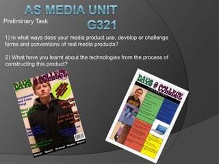
- 1. Preliminary Task 1) In what ways does your media product use, develop or challenge forms and conventions of real media products? 2) What have you learnt about the technologies from the process of constructing this product?
- 2. In what ways does your media product use, develop or challenge forms and conventions of real media products? Similarities of Front Covers Masthead Main Image (Rule of Thirds) Main Cover Line Cover Lines Barcode
- 3. Differences between front covers My magazine is specifically aimed at students who attend college where as the target audience of ‘VIBE’ would be aimed more towards males between the ages of 14-18. Has cover lines and an image that appeal to students. I have used a medium close up of a student as my main image so that straight away the magazine appeals to my target audience.
- 4. In what ways does your media product use, develop or challenge forms and conventions of real media products? Contents Page. Masthead (Initial) Highlights front cover features Text layout of contents Uses sub headings to help reader Layout out of columns for features within the magazine and categorised
- 5. What have you learnt about the technologies from the process of constructing this product? Throughout the production of constructing my magazine the 3 new pieces of technology I used were; Blogger, Photoshop cs6 and Adobe InDesign. Using these 3 industry standard programmes meant that I could create a realistic magazine cover and contents page
- 6. Using a digital camera meant that I could capture the perfect image I needed and ensured that my image was an MCU which covers the majority of the page. I left enough room for my masthead, cover lines and I made sure I kept to the rule of thirds. Using Photoshop meant I could arrange the model to where I wanted him and could place the cover lines, puff and barcode around him. On each bit of text I used a drop shadow and other effects to make it stand out more to students. Using different colours meant my cover had plenty of variety and was appealing to my target audience.
- 7. Keeping to a template of other contents pages I was able to ensure I had a realistic contents page, keeping to the 3 column guide line meant everything was organised and looked professional. To create my contents page I looked at several others to make sure I was getting the right idea for my layout. As well as on the cover page I made sure I kept to the rule of thirds. I do think that my contents page could be improved as it looks a little too plain. I could have improved it by adding effects to the text and adding more adventurous images.