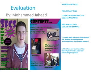
1. AS MEDIA UNIT G321
Evaluation PRELIMINARY TASK-
By: Mohammed Jaheed COVER AND CONTENTS OF A
COLLEGE MAGAZINE
PRELIMINARY TASK
EVALUATION EXAMPLE
1. In what ways does your media product
use, develop or challenge forms
and conventions of real media products?
2. What have you learnt about the
technologies from the process of
constructing this product
2. In what ways does your media product use, develop or challenge forms and conventions of
real media products?
THE FRONT COVER-SIMILARITIES
Masthead
Cover Lines
Informal and
direct
Puff is to
attract
readers to
look at
something
specific.
Main image
3. Differences with front cover
The main difference between the two
magazines is that they both have
different purposes to attract a
specific audience. Mines is a college
magazine whereas Mens’Health is
mainly for Men. With the men’s
health magazine there is more
writing and the picture is a lot smaller
compared to mines. The use of colour
is also different as mines contains
certain colours and there is a
background.
4. In what ways does your media product use, develop or
challenge forms and conventions of real media products?
Contents
Positioning of the
The picture heading…
layout…
Layout of columns
and features
Refers back to the making the
front cover magazine more
features... categorised ...
Captions of
pictures to help
readers
understand a bit
more …
5. DIFFERENCES WITH CONTENTS PAGE
The differences between the
contents pages are that the men’s
health magazine consists of more
detailed information and a lot
more pictures are used this is to
make the readers life a lot easier.
My contents page seems more
colourful and there is a lot of
space still left to be used.
However with the Men’s health
contents they complete the page
with a lot of writing and images.
The use of images they’ve put on
makes the magazine seem more
professional and sophisticated
whereas mines seems more
random.
6. What have you learnt about the technologies from the process of constructing this
product?
Digital camera use: Moodle was
angle, shot , type of useful for
shot. (MCU, CU, getting certain
MSL) etc resources.
Using in design for Manipulating
layout and effects for images adding
my contents page. certain effects for
my front cover.
7. Using the digital camera , I could have a
certain shot type that would be beneficial
to me in this case the MCU was most
appropriate and it is for most front covers
of magazines . This type of shot is mostly
dominant in the front cover as it follows
the rule of thirds, which I carefully
thought about and left enough space for
my cover lines on the left hand side. Also
taking into account the model I used and
where his eyes are placed. Initially in the
top third of the magazine.
Using adobe photo shop was very useful as it helped me to make
my front cover very colourful , I manipulated the image by adding
more brightness to it and the writing around the image is also due
to photo shop. Using photo shop I added certain shapes to attract
the readers attention such as the puff and the ‘star shaped puff’.
Which looks very attractive also the black ‘fx’ used around the
writing makes the magazine seem more legible.
8. Using In-design For my Contents page
Using in design was very beneficial to me as it helped me to
experiment with my contents page. Firstly I had to think about the
colours I was going to use, they had to be similar to my front cover. I
also manipulated shapes so it could make my page look better. Also
with the writing effect I used was similar to my front cover. I used
the ‘fx’ tool which gives an outline to the writing. I ensured that it
was a subtle look. I did think about the layout of my contents page
as I had drafted it similarly. For the pictures I could of changed the
shape of them and make them look more interesting. But instead I
left a picture box and just added the picture, which makes the
pictures seem standard. I also added a background colour which
completes my contents page, it also adds a more ‘teen’ look to the
page. I could however have improved this page by adding much
more detail to the page and make it seem more informative. I also
could have changed or rotated my images and give it a better look.
Using in design was very difficult but because I had thought about
my contents page and the layout it made it seem a bit easier. I have
learnt how important technology is in making magazines.
Using the stroke
effect to add to the
text.