SlideShare a Scribd company logo
1 of 4
I chose to use a simple, bold font for my title as it resembles the
 The price of my
                                        ‘NME’ title, I used this magazine as my inspiration.
 magazine is £2.30.                                                                                            Showing reliability of magazine,
 This is a low and
 affordable price, I
 chose to price my
 magazine at this after
 receiving the results                                                                                                    Competition prize
 from my survey.                                                                                                          displayed in a ‘sticker’
        I have presented                                                                                                  format. This will draw
        my magazines                                                                                                      in the attention of my
        name ‘Music News                                                                                                  target audience
        Updates’                                                                                                          especially with the
        underneath my                                                                                                     large text indicating
        title so new                                                                                                      the page the
        readers are aware                                                                                                 competition is located.
        of what ‘MNU
        ‘stands for.


My model directly
addresses the audience
with her piercing eyes,
this acts as a
persuasive feature, a     By                                                                                      I styled my model especially to
my audience will feel     including                                                                               ensure she portrayed a
obliged to purchase the   this my                                                                                 ‘rebellious’ attitude. I teamed
magazine.                 audience                                                                                her deep red lipstick with the
                          is aware of                                                                             colour of the main headlines
                          what my                                                                                 to attract my audience.
                          double
  I chose to include      page
  images of the band I    spread is
  am featuring in my      featuring.
  double page spread on                                                                                           The use of a shadow
  my front cover as it                                                                                            behind my main text
  highlighted certain                                                                                             draws attention to the
  things my audience                                                                                              information and makes
  would relate with                                                                                               the overall view of the
  music. For example,                                                                                             page seem more
  the live image of the                                                                                           professional.
  band member singing
  into a microphone.                                                                                          The use of the ‘+’ sign instead of
                                                                                                              the standard English spelling of
                                                                                                              ‘plus’ is modern and hip, this will
                                                                                                              allow a relationship to form
                                                                                                              between my front cover and my
                                                                                                              target audience.
I presented the date of the                                                                                       I chose to present the title
magazine issue large                                                                                              using this font downloaded
underneath the main heading,                                                                                      from ‘www.dafont.com’ as it is
this will ensure that readers                                                                                     similar to the font used by
are aware which issue it is                                                                                       NME magazine. The choice of
and whether they have already                                                                                     title ‘inside this week’ is
purchased it.                                                                                                     relevant to that particular
                                                                                                                  issue.

                                                                                                                        The use of the
                                                                                                                        artist quote
                                                                                                                        presented in a
                                                                                                                        larger bold font
                                                                                                                        than the other
            I edited my main story in                                                                                   writing is used to
            black and white as well as                                                                                  grab the audiences
            making it larger. As I wanted                                                                               attention, making
            it to stand out from the rest of                                                                            them want to read
            the images shown around the                                                                                 the story.
            page.

                                                                                                                      I chose to present the name of
                                                                                                                      the artist underneath the
                                                                                                                      quote smaller as I didn't want
                                                                                                                      it to distract from the main
                                                                                                                      quote.

                                                                                                                     I used plan black lines of a
   I chose to use a different font
                                                                                                                     small diameter as a way of
   for the quote of my main story
                                                                                                                     breaking up the page. It added
   as I felt it would draw
                                                                                                                     to the layout and overall
   attention to the text. This is a
                                                                                                                     appearance to the contents
   feature shown in NME
                                                                                                                     page.
   magazine.
                                                                                                                               The deep red colour of the
                                                                                                                               advertisement box links in
                                                                                                                               with the reds used on my front
                                                                                                                               cover. As well as a link with
                                                                                                                               fonts such as ‘Ariel’ I also
                                                                                                                               wanted to link the colour
                                                                                                                               through from my front page to
                                                                                                                               my contents. As I felt it gave
                                                                                                                               my magazine a professional
                                                                                                                               feel.

      I included the listing of page numbers on my contents     I presented this story central     I also did the same thing with the story
      page as I felt it showed readers what was being offered   and just below the main story      advertised, it links in with the sticker on
      throughout the magazine. Rather than just the key         to represent its importance as     the front cover advertising free tickets to
      stories.                                                  I featured it on my front cover.   the festival.
I chose to do an introductory page to my
                                                                      double page spread as I felt I had so much
                                                                      to write on my double page that I wouldn’t
                                                                      have enough space to properly introduce
                                                                      the band.


                                                                                                                                I feel by
                                                                                                                                including
                                                                                                                                the guitar
                                                                                                                                in the
                                                                                                                                image, the
                                                                                                                                band is
                                                                                                                                represented
                                                                                                                                through
                                                                                                                                their genre
                                                                                                                                of music.


This quote is explaining the                                                                          The small paragraph of text
image presented, I added           I presented the main heading                                       displayed is an introduction to
humour to the quote as I felt it   large and in bold to draw in                                       the extra double page spread.
linked in tot he light             the readers attention. I feel                                      It gives the reader a small
heartedness of the image and       the colour white was a good                                        insight into the feature,
gave an insight into what was      choice as it is very catching in                                   making them want to read on.
to come in the following           contrast with the dark colours
double page spread.                within the background image.
I used a montage of                  I used the ‘Bold’ tool and
                                                                          photographs as my main                                                I added the
                                                                                                               ‘Caps Lock’ when writing the
                          I also put a shadow on the images as a way of   visual aid to the double page                                         dashed lines
                                                                                                               questions for my interview. By
                          making them stand out on the page, I felt       as I felt it was a subtle way to                                      down the side of
                                                                                                               doing this I made the
                          this would make the feature more affective      include a large variety of                                            my page to
                                                                                                               questions easy to read.
                          and would appeal to the readers eye.            images without overcrowding                                           enhance the
                                                                          the page.                                                             visual aspect. I
                                                                                                                                                didn’t want the
  I chose to                                                                                                                                    large amount of
  include ’48                                                                                                                                   writing to
  hours on the                                                                                                                                  overpower the
  road’ as my                                                                                                                                   visuals.
  main title to
  link in with my
  introductory
  double page
  spread. It also
  gives the                                                                                                                                        I presented the
  audience a clue                                                                                                                                  dates of that
  into what the                                                                                                                                    individual city
  article is about.                                                                                                                                date in a different
                                                                                                                                                   colour as I
                                                                                                                                                   wanted it to
                                                                                                                                                   stand out from
                                                                                                                                                   the grey
                                                                                                                                                   background.
                                                                                                                                                      The arrow
                                                                                                                                                      replicated a
                                                                                                                                                      ‘time line’. I
The use of the                                                                                                                                        wanted it to
drop-cap                                                                                                                                              be clear that
acted as a                                                                                                                                            the tour
hook for my                                                                                                                                           lasted a year
audience. The                                                                                                                                         from January
larger letter                                                                                                                                         to December.
also broke up
the large
paragraphs of
text that
made up the
opening of
my double
page spread.                                                                    I presented this quote large and in                      I also put a shadow on this
                      ‘Photography by Becky Murphy’ is a
                      professional layout idea that I chose to                  the middle of my text as not only a                      feature and on the
                      include as not only does it declare who                   way of braking up the large over-                        information displayed inside
                      was the main photographer but also                        powering text boxes but also to                          to ensure the reader can read
                      breaks up the text.                                       draw in the reader. As the quote is                      the text clearly and are also
                                                                                quite interesting they may feel                          drawn to the feature, as it is
                                                                                inclined to read on.                                     key to the story.

More Related Content

What's hot

Part 1 questions 1,2,3,4
Part 1 questions 1,2,3,4Part 1 questions 1,2,3,4
Part 1 questions 1,2,3,4rohayshayley
 
Planning ancillaries
Planning ancillariesPlanning ancillaries
Planning ancillariesDanny Norton
 
Analysing conMusic magazine contents page analysis tents pages prep for blog...
Analysing  conMusic magazine contents page analysis tents pages prep for blog...Analysing  conMusic magazine contents page analysis tents pages prep for blog...
Analysing conMusic magazine contents page analysis tents pages prep for blog...asmediae12
 
Analysis of double page spread articles for television
Analysis of double page spread articles for televisionAnalysis of double page spread articles for television
Analysis of double page spread articles for televisiona2columne12
 
Analysing contents pages
Analysing  contents pages Analysing  contents pages
Analysing contents pages asmediae12
 
Case study music_magazine
Case study music_magazineCase study music_magazine
Case study music_magazineniamhlees
 
Nme contents page analysis
Nme contents page analysisNme contents page analysis
Nme contents page analysiscat663
 
Main magazine research covers
Main magazine research coversMain magazine research covers
Main magazine research covers957820
 
Magazine advert
Magazine advertMagazine advert
Magazine adverthobleycar
 
Magazine cover analysis
Magazine cover analysis Magazine cover analysis
Magazine cover analysis emilylivesey
 
Conventions of a music magazine
Conventions of a music magazineConventions of a music magazine
Conventions of a music magazinephillipsrebecca
 
As media coursework evaluation
As media coursework evaluationAs media coursework evaluation
As media coursework evaluation06esmith
 

What's hot (20)

BRNC Evaluation
BRNC EvaluationBRNC Evaluation
BRNC Evaluation
 
Part 1 questions 1,2,3,4
Part 1 questions 1,2,3,4Part 1 questions 1,2,3,4
Part 1 questions 1,2,3,4
 
Presentation2h
Presentation2hPresentation2h
Presentation2h
 
Planning ancillaries
Planning ancillariesPlanning ancillaries
Planning ancillaries
 
Media product
Media productMedia product
Media product
 
Media product
Media productMedia product
Media product
 
Media product
Media productMedia product
Media product
 
Analysing conMusic magazine contents page analysis tents pages prep for blog...
Analysing  conMusic magazine contents page analysis tents pages prep for blog...Analysing  conMusic magazine contents page analysis tents pages prep for blog...
Analysing conMusic magazine contents page analysis tents pages prep for blog...
 
Analysis of double page spread articles for television
Analysis of double page spread articles for televisionAnalysis of double page spread articles for television
Analysis of double page spread articles for television
 
Magazine analysis
Magazine analysisMagazine analysis
Magazine analysis
 
Analysing contents pages
Analysing  contents pages Analysing  contents pages
Analysing contents pages
 
Case study music_magazine
Case study music_magazineCase study music_magazine
Case study music_magazine
 
Nme contents page analysis
Nme contents page analysisNme contents page analysis
Nme contents page analysis
 
Main magazine research covers
Main magazine research coversMain magazine research covers
Main magazine research covers
 
2012 eval
2012 eval2012 eval
2012 eval
 
Magazine advert
Magazine advertMagazine advert
Magazine advert
 
Magazine cover analysis
Magazine cover analysis Magazine cover analysis
Magazine cover analysis
 
Q1 evaulation
Q1   evaulationQ1   evaulation
Q1 evaulation
 
Conventions of a music magazine
Conventions of a music magazineConventions of a music magazine
Conventions of a music magazine
 
As media coursework evaluation
As media coursework evaluationAs media coursework evaluation
As media coursework evaluation
 

Viewers also liked

ประกาศผลการคัดเลือกบุคคลเพื่อบรรจุและแต่งตั้งเข้ารับข้าราชการฯ ตำแหน่งครูผู้ช...
ประกาศผลการคัดเลือกบุคคลเพื่อบรรจุและแต่งตั้งเข้ารับข้าราชการฯ ตำแหน่งครูผู้ช...ประกาศผลการคัดเลือกบุคคลเพื่อบรรจุและแต่งตั้งเข้ารับข้าราชการฯ ตำแหน่งครูผู้ช...
ประกาศผลการคัดเลือกบุคคลเพื่อบรรจุและแต่งตั้งเข้ารับข้าราชการฯ ตำแหน่งครูผู้ช...Totsaporn Inthanin
 
คู่มือการเขียนรายงาน การอ้างอิง การประกวดโครงงานวิทยาศาสตร์ สมาคมวิทยาศาสตร์ ...
คู่มือการเขียนรายงาน การอ้างอิง การประกวดโครงงานวิทยาศาสตร์ สมาคมวิทยาศาสตร์ ...คู่มือการเขียนรายงาน การอ้างอิง การประกวดโครงงานวิทยาศาสตร์ สมาคมวิทยาศาสตร์ ...
คู่มือการเขียนรายงาน การอ้างอิง การประกวดโครงงานวิทยาศาสตร์ สมาคมวิทยาศาสตร์ ...Totsaporn Inthanin
 
คอศ.1 ประกาศกระทรวงศึกษาธิการ เรื่อง กรอบคุณวุฒิการศึกษาวิชาชีพปริญญาตรีสาย...
คอศ.1   ประกาศกระทรวงศึกษาธิการ เรื่อง กรอบคุณวุฒิการศึกษาวิชาชีพปริญญาตรีสาย...คอศ.1   ประกาศกระทรวงศึกษาธิการ เรื่อง กรอบคุณวุฒิการศึกษาวิชาชีพปริญญาตรีสาย...
คอศ.1 ประกาศกระทรวงศึกษาธิการ เรื่อง กรอบคุณวุฒิการศึกษาวิชาชีพปริญญาตรีสาย...Totsaporn Inthanin
 
Manuel mustafa arte frutal
Manuel mustafa  arte frutalManuel mustafa  arte frutal
Manuel mustafa arte frutalManuel Mustafa
 
พฤติกรรมสัตว์
พฤติกรรมสัตว์พฤติกรรมสัตว์
พฤติกรรมสัตว์pronpron
 
ประกาศรายชื่อผู้ผ่านการคัดเลือก ตำแหน่งผู้อำนวยการสถานศึกษา สอศ. 2559
ประกาศรายชื่อผู้ผ่านการคัดเลือก ตำแหน่งผู้อำนวยการสถานศึกษา สอศ. 2559ประกาศรายชื่อผู้ผ่านการคัดเลือก ตำแหน่งผู้อำนวยการสถานศึกษา สอศ. 2559
ประกาศรายชื่อผู้ผ่านการคัดเลือก ตำแหน่งผู้อำนวยการสถานศึกษา สอศ. 2559Totsaporn Inthanin
 
คู่มือ Canon 550 D ภาษาไทย
คู่มือ Canon 550 D ภาษาไทยคู่มือ Canon 550 D ภาษาไทย
คู่มือ Canon 550 D ภาษาไทยTotsaporn Inthanin
 
ผู้มีสิทธิ์ สอบ ภาค ค. ครูผู้ช่วย สอศ.
ผู้มีสิทธิ์ สอบ ภาค ค. ครูผู้ช่วย สอศ.ผู้มีสิทธิ์ สอบ ภาค ค. ครูผู้ช่วย สอศ.
ผู้มีสิทธิ์ สอบ ภาค ค. ครูผู้ช่วย สอศ.Totsaporn Inthanin
 
พฤติกรรมสัตว์
พฤติกรรมสัตว์พฤติกรรมสัตว์
พฤติกรรมสัตว์pronpron
 
แนวโน้มและโอกาสของสาขาแม่พิมพ์ ทิศทางการขับเคลื่อน โดย อ.กรอ.อศ กลุ่มอาชีพแม่...
แนวโน้มและโอกาสของสาขาแม่พิมพ์ ทิศทางการขับเคลื่อน โดย อ.กรอ.อศ กลุ่มอาชีพแม่...แนวโน้มและโอกาสของสาขาแม่พิมพ์ ทิศทางการขับเคลื่อน โดย อ.กรอ.อศ กลุ่มอาชีพแม่...
แนวโน้มและโอกาสของสาขาแม่พิมพ์ ทิศทางการขับเคลื่อน โดย อ.กรอ.อศ กลุ่มอาชีพแม่...Totsaporn Inthanin
 
Italy economy research
Italy economy researchItaly economy research
Italy economy researchmrjacksonheard
 
Ilusiones Ópticas, Manuel Mustafa
Ilusiones Ópticas, Manuel MustafaIlusiones Ópticas, Manuel Mustafa
Ilusiones Ópticas, Manuel MustafaManuel Mustafa
 

Viewers also liked (17)

ประกาศผลการคัดเลือกบุคคลเพื่อบรรจุและแต่งตั้งเข้ารับข้าราชการฯ ตำแหน่งครูผู้ช...
ประกาศผลการคัดเลือกบุคคลเพื่อบรรจุและแต่งตั้งเข้ารับข้าราชการฯ ตำแหน่งครูผู้ช...ประกาศผลการคัดเลือกบุคคลเพื่อบรรจุและแต่งตั้งเข้ารับข้าราชการฯ ตำแหน่งครูผู้ช...
ประกาศผลการคัดเลือกบุคคลเพื่อบรรจุและแต่งตั้งเข้ารับข้าราชการฯ ตำแหน่งครูผู้ช...
 
คู่มือการเขียนรายงาน การอ้างอิง การประกวดโครงงานวิทยาศาสตร์ สมาคมวิทยาศาสตร์ ...
คู่มือการเขียนรายงาน การอ้างอิง การประกวดโครงงานวิทยาศาสตร์ สมาคมวิทยาศาสตร์ ...คู่มือการเขียนรายงาน การอ้างอิง การประกวดโครงงานวิทยาศาสตร์ สมาคมวิทยาศาสตร์ ...
คู่มือการเขียนรายงาน การอ้างอิง การประกวดโครงงานวิทยาศาสตร์ สมาคมวิทยาศาสตร์ ...
 
คอศ.1 ประกาศกระทรวงศึกษาธิการ เรื่อง กรอบคุณวุฒิการศึกษาวิชาชีพปริญญาตรีสาย...
คอศ.1   ประกาศกระทรวงศึกษาธิการ เรื่อง กรอบคุณวุฒิการศึกษาวิชาชีพปริญญาตรีสาย...คอศ.1   ประกาศกระทรวงศึกษาธิการ เรื่อง กรอบคุณวุฒิการศึกษาวิชาชีพปริญญาตรีสาย...
คอศ.1 ประกาศกระทรวงศึกษาธิการ เรื่อง กรอบคุณวุฒิการศึกษาวิชาชีพปริญญาตรีสาย...
 
Test1
Test1Test1
Test1
 
Manuel mustafa arte frutal
Manuel mustafa  arte frutalManuel mustafa  arte frutal
Manuel mustafa arte frutal
 
พฤติกรรมสัตว์
พฤติกรรมสัตว์พฤติกรรมสัตว์
พฤติกรรมสัตว์
 
Demi
DemiDemi
Demi
 
Demi
DemiDemi
Demi
 
ประกาศรายชื่อผู้ผ่านการคัดเลือก ตำแหน่งผู้อำนวยการสถานศึกษา สอศ. 2559
ประกาศรายชื่อผู้ผ่านการคัดเลือก ตำแหน่งผู้อำนวยการสถานศึกษา สอศ. 2559ประกาศรายชื่อผู้ผ่านการคัดเลือก ตำแหน่งผู้อำนวยการสถานศึกษา สอศ. 2559
ประกาศรายชื่อผู้ผ่านการคัดเลือก ตำแหน่งผู้อำนวยการสถานศึกษา สอศ. 2559
 
คู่มือ Canon 550 D ภาษาไทย
คู่มือ Canon 550 D ภาษาไทยคู่มือ Canon 550 D ภาษาไทย
คู่มือ Canon 550 D ภาษาไทย
 
ผู้มีสิทธิ์ สอบ ภาค ค. ครูผู้ช่วย สอศ.
ผู้มีสิทธิ์ สอบ ภาค ค. ครูผู้ช่วย สอศ.ผู้มีสิทธิ์ สอบ ภาค ค. ครูผู้ช่วย สอศ.
ผู้มีสิทธิ์ สอบ ภาค ค. ครูผู้ช่วย สอศ.
 
수정1
수정1수정1
수정1
 
1234
12341234
1234
 
พฤติกรรมสัตว์
พฤติกรรมสัตว์พฤติกรรมสัตว์
พฤติกรรมสัตว์
 
แนวโน้มและโอกาสของสาขาแม่พิมพ์ ทิศทางการขับเคลื่อน โดย อ.กรอ.อศ กลุ่มอาชีพแม่...
แนวโน้มและโอกาสของสาขาแม่พิมพ์ ทิศทางการขับเคลื่อน โดย อ.กรอ.อศ กลุ่มอาชีพแม่...แนวโน้มและโอกาสของสาขาแม่พิมพ์ ทิศทางการขับเคลื่อน โดย อ.กรอ.อศ กลุ่มอาชีพแม่...
แนวโน้มและโอกาสของสาขาแม่พิมพ์ ทิศทางการขับเคลื่อน โดย อ.กรอ.อศ กลุ่มอาชีพแม่...
 
Italy economy research
Italy economy researchItaly economy research
Italy economy research
 
Ilusiones Ópticas, Manuel Mustafa
Ilusiones Ópticas, Manuel MustafaIlusiones Ópticas, Manuel Mustafa
Ilusiones Ópticas, Manuel Mustafa
 

Similar to The price of music news updates

Magazine Analysis Front Covers
Magazine Analysis Front CoversMagazine Analysis Front Covers
Magazine Analysis Front CoversCallumCarmichael
 
Evaluation of My Music Magazine
Evaluation of My Music MagazineEvaluation of My Music Magazine
Evaluation of My Music Magazineozgealtinok
 
Evaluation of My Music Magazine
Evaluation of My Music MagazineEvaluation of My Music Magazine
Evaluation of My Music Magazineozgealtinok
 
As media coursework evaluation
As media coursework evaluationAs media coursework evaluation
As media coursework evaluation06esmith
 
Conventions of a Children’s Magazine
Conventions of a Children’s MagazineConventions of a Children’s Magazine
Conventions of a Children’s MagazineRobyn Prattis
 
Music magazine evaluation 1
Music magazine evaluation 1Music magazine evaluation 1
Music magazine evaluation 1mjellis
 
Analysis of my Final Products
Analysis of my Final ProductsAnalysis of my Final Products
Analysis of my Final Productskpnpensby
 
Media evaluation question 1
Media evaluation question 1Media evaluation question 1
Media evaluation question 1bethsquires
 
Question one
Question oneQuestion one
Question oneIsobelll
 
Music magazine cover and contents analysis
Music magazine cover and contents analysisMusic magazine cover and contents analysis
Music magazine cover and contents analysiskimberleysarahsmart
 
How did you attract
How did you attractHow did you attract
How did you attractedgeyy
 
Question 1)
Question 1)Question 1)
Question 1)12L1491
 
Media evaluation. Blue Parker
Media evaluation. Blue ParkerMedia evaluation. Blue Parker
Media evaluation. Blue Parkerblueparker
 
Media studies evaluation
Media studies evaluationMedia studies evaluation
Media studies evaluationpoppydodgsonx
 

Similar to The price of music news updates (20)

Q5
Q5Q5
Q5
 
Magazine Analysis Front Covers
Magazine Analysis Front CoversMagazine Analysis Front Covers
Magazine Analysis Front Covers
 
Evaluation of My Music Magazine
Evaluation of My Music MagazineEvaluation of My Music Magazine
Evaluation of My Music Magazine
 
Evaluation of My Music Magazine
Evaluation of My Music MagazineEvaluation of My Music Magazine
Evaluation of My Music Magazine
 
As media coursework evaluation
As media coursework evaluationAs media coursework evaluation
As media coursework evaluation
 
Conventions of a Children’s Magazine
Conventions of a Children’s MagazineConventions of a Children’s Magazine
Conventions of a Children’s Magazine
 
Music magazine evaluation 1
Music magazine evaluation 1Music magazine evaluation 1
Music magazine evaluation 1
 
Analysis of my Final Products
Analysis of my Final ProductsAnalysis of my Final Products
Analysis of my Final Products
 
Evaluation q1.
Evaluation q1.Evaluation q1.
Evaluation q1.
 
Evaluation
EvaluationEvaluation
Evaluation
 
Evaluation
EvaluationEvaluation
Evaluation
 
Media evaluation question 1
Media evaluation question 1Media evaluation question 1
Media evaluation question 1
 
Task 1
Task 1Task 1
Task 1
 
Question one
Question oneQuestion one
Question one
 
Music magazine cover and contents analysis
Music magazine cover and contents analysisMusic magazine cover and contents analysis
Music magazine cover and contents analysis
 
How did you attract
How did you attractHow did you attract
How did you attract
 
Question 1)
Question 1)Question 1)
Question 1)
 
Mock up
Mock upMock up
Mock up
 
Media evaluation. Blue Parker
Media evaluation. Blue ParkerMedia evaluation. Blue Parker
Media evaluation. Blue Parker
 
Media studies evaluation
Media studies evaluationMedia studies evaluation
Media studies evaluation
 

The price of music news updates

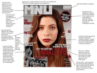
  • 1. I chose to use a simple, bold font for my title as it resembles the The price of my ‘NME’ title, I used this magazine as my inspiration. magazine is £2.30. Showing reliability of magazine, This is a low and affordable price, I chose to price my magazine at this after receiving the results Competition prize from my survey. displayed in a ‘sticker’ I have presented format. This will draw my magazines in the attention of my name ‘Music News target audience Updates’ especially with the underneath my large text indicating title so new the page the readers are aware competition is located. of what ‘MNU ‘stands for. My model directly addresses the audience with her piercing eyes, this acts as a persuasive feature, a By I styled my model especially to my audience will feel including ensure she portrayed a obliged to purchase the this my ‘rebellious’ attitude. I teamed magazine. audience her deep red lipstick with the is aware of colour of the main headlines what my to attract my audience. double I chose to include page images of the band I spread is am featuring in my featuring. double page spread on The use of a shadow my front cover as it behind my main text highlighted certain draws attention to the things my audience information and makes would relate with the overall view of the music. For example, page seem more the live image of the professional. band member singing into a microphone. The use of the ‘+’ sign instead of the standard English spelling of ‘plus’ is modern and hip, this will allow a relationship to form between my front cover and my target audience.
  • 2. I presented the date of the I chose to present the title magazine issue large using this font downloaded underneath the main heading, from ‘www.dafont.com’ as it is this will ensure that readers similar to the font used by are aware which issue it is NME magazine. The choice of and whether they have already title ‘inside this week’ is purchased it. relevant to that particular issue. The use of the artist quote presented in a larger bold font than the other I edited my main story in writing is used to black and white as well as grab the audiences making it larger. As I wanted attention, making it to stand out from the rest of them want to read the images shown around the the story. page. I chose to present the name of the artist underneath the quote smaller as I didn't want it to distract from the main quote. I used plan black lines of a I chose to use a different font small diameter as a way of for the quote of my main story breaking up the page. It added as I felt it would draw to the layout and overall attention to the text. This is a appearance to the contents feature shown in NME page. magazine. The deep red colour of the advertisement box links in with the reds used on my front cover. As well as a link with fonts such as ‘Ariel’ I also wanted to link the colour through from my front page to my contents. As I felt it gave my magazine a professional feel. I included the listing of page numbers on my contents I presented this story central I also did the same thing with the story page as I felt it showed readers what was being offered and just below the main story advertised, it links in with the sticker on throughout the magazine. Rather than just the key to represent its importance as the front cover advertising free tickets to stories. I featured it on my front cover. the festival.
  • 3. I chose to do an introductory page to my double page spread as I felt I had so much to write on my double page that I wouldn’t have enough space to properly introduce the band. I feel by including the guitar in the image, the band is represented through their genre of music. This quote is explaining the The small paragraph of text image presented, I added I presented the main heading displayed is an introduction to humour to the quote as I felt it large and in bold to draw in the extra double page spread. linked in tot he light the readers attention. I feel It gives the reader a small heartedness of the image and the colour white was a good insight into the feature, gave an insight into what was choice as it is very catching in making them want to read on. to come in the following contrast with the dark colours double page spread. within the background image.
  • 4. I used a montage of I used the ‘Bold’ tool and photographs as my main I added the ‘Caps Lock’ when writing the I also put a shadow on the images as a way of visual aid to the double page dashed lines questions for my interview. By making them stand out on the page, I felt as I felt it was a subtle way to down the side of doing this I made the this would make the feature more affective include a large variety of my page to questions easy to read. and would appeal to the readers eye. images without overcrowding enhance the the page. visual aspect. I didn’t want the I chose to large amount of include ’48 writing to hours on the overpower the road’ as my visuals. main title to link in with my introductory double page spread. It also gives the I presented the audience a clue dates of that into what the individual city article is about. date in a different colour as I wanted it to stand out from the grey background. The arrow replicated a ‘time line’. I The use of the wanted it to drop-cap be clear that acted as a the tour hook for my lasted a year audience. The from January larger letter to December. also broke up the large paragraphs of text that made up the opening of my double page spread. I presented this quote large and in I also put a shadow on this ‘Photography by Becky Murphy’ is a professional layout idea that I chose to the middle of my text as not only a feature and on the include as not only does it declare who way of braking up the large over- information displayed inside was the main photographer but also powering text boxes but also to to ensure the reader can read breaks up the text. draw in the reader. As the quote is the text clearly and are also quite interesting they may feel drawn to the feature, as it is inclined to read on. key to the story.