1. AS Media Unit G321
Preliminary Task
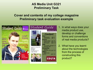
Cover and contents of my college magazine
Preliminary task evaluation example
1. In what ways does your
media product use,
develop or challenge
forms and conventions
of real media products?
2. What have you learnt
about the technologies
from the process of
constructing this
product?
2. • In what ways does your media product use, develop or
challenge forms and conventions of real media products?
Similarities of Covers
The masthead is made as
the page header and has
the largest text type and
fills most of the pages
width so it is the first thing
notice when viewing
The main images use the
rule of thirds where the
image can be cut into 9
equal sections and the
main part of the image,
usually the fact it shown
it the centre and either
middle or top box.
The use of shapes to
highlight pieces of text
and make them stand out
to hold more interesting
They both use cover lines Plain coloured background
and relative information
to advertise and some which helps to make the
to the reader.
support the magazines main image and sell lines
content. stand out against it
3. • In what ways does your media product use, develop or
challenge forms and conventions of real media products?
Differences of Covers
The colours used for my
Student Guide must
attract both males and
females so must use
neutral colours, but also I
thought it would be best to
include purple as that is
the main colour used in
the college theme.
The amount of sell and
cover lines used on the
cover page is less for my
magazine obviously
because it is small but I
thought it would be more
effective to be kept simple
with just a few main points
relating to all viewers.
The image shot is different as
the one used on my magazine
is a mid-shot as it only shows
from the chest upwards. The
Company magazine’s main
image uses a full length shot .
4. • In what ways does your media product use, develop or
challenge forms and conventions of real media products?
Similarities of Content Pages
Gives the same type of
information, it gives
examples and a quick
view of what is shown on
each page if you are
looking for a certain thing
or just for the best
articles to view.
The use of shapes to
create the columned box
to give its own section
about that certain part of
information which is
separate to the pictures.
They have a mostly clear
background and have at
least 1 or more images
showing the people who
the magazine is about,
which can often be related
to the typical reader too.
5. • In what ways does your media product use, develop or
challenge forms and conventions of real media products?
Differences of Content Pages
The colours used for my
magazine must attract
both sexes so must use
neutral colours, however
Company magazine uses
a range of colours which
are more likely to relate
only to women as they are
mostly light, summery and
feminine.
On my student Guide I
have used more than one
image to break up the page
whereas Company
magazines content page is
made up of just one picture
which covers the whole
background too.
I have used images of one
female and two males, showing
the Student Guide relates to
both genders equally and can
be read by any person who
attends the college.
6. • What have you learnt about the technologies from the
process of constructing this product?
1. I have used Moodle to get
resources and to look at
examples of work.
2. I used a digital camera to take
images, this meant I had to think
about angles and background
spade, rule of thirds and shot
types when taking each shot.
3. I had to learn the different
features of Adobe In Design to
create the whole of my contents
and then a double page spread.
4. I also learnt how to use
Photoshop to manipulate and edit
images. This included changing
the colour, cropping and adding
text or shapes.
7. • What have you learnt about the technologies from the
process of constructing this product?
I had to use a digital camera to take
photo, when using this I had to think
about the angles at which I was taking
the picture and the amount of
background space. Also if it used the
rule of thirds and the different shot
types when taking each one. On this
I used this college website when I picture, which is one I used on my
needed to know what had to be contents page, the 9 boxes help to
done next in the project be and to show how the
fine out any other information centre 3 show the
which may be useful when creating main body and the
my magazine to make it of the top right is where
highest standards. I was able to the main focus is.
look at example of things if I did not
understand the process or details
of things that were important.
8. • What have you learnt about the technologies from the
process of constructing this product?
I used Adobe, In Design, to create all of my contents page and also a double
page spread. Whilst using this program I had to learn about the different
features it had and then put them into use on my magazine.
I had to make the boxes behind the text using the shape tool, also then I had
to add text on top of them and then change the colours and font to fit in with
the theme of my college guide and be effective on my target audience, which
is anyone who attends Solihull 6th Form College. Next I had to add pictures
which I then cropped and edited so they were of the right size and did not
have too much background. For both the masthead
and the images of student I have given them a drop
shadow effect which instantly changed them from
being just a simple box picture to
being more interesting and attractive.
9. • What have you learnt about the technologies from the
process of constructing this product?
I also learnt how to use Photoshop to manipulate and edit images.
This included changing the colour to lighter or darker, and getting
rid of any sections of the picture which were not of use.
First I edited the effects on the picture so the tones were darker and lighter
in certain places. I added a masthead using a colour and font which I found
was appropriate to the target audience. Then created a college logo using
box shape and text, I also did the same at the bottom to advertise and offer
using a star shape which showed the information in a more attractive way.
Finally I added separate text clips to the page, I placed them down the sides
of the background of the photo where it is mostly clear space.