
Recommended
More Related Content
What's hot
What's hot (19)
Viewers also liked
Viewers also liked (18)
Similar to Analysis of NME Magazine Cover Design and Target Audience
Similar to Analysis of NME Magazine Cover Design and Target Audience (20)
More from asmediac14
More from asmediac14 (20)
Analysis of NME Magazine Cover Design and Target Audience
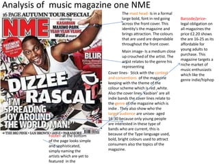
- 1. Analysis of music magazine one NME The mast head- Is in a formal large bold, font in red going across the front cover. This identity's the magazine and brings attraction. The colours that are used are dependable throughout the front cover. Main image- Is a medium close up crouched of the artist. The artist relates to the genre his representing Cover lines- Stick with the context and conventions of the magazine keeping with the theme of the colour scheme which is red ,white. Also the cover lines ‘kasbian’ are all indie bands the cover lines relate to the genre of the magazine which is indie . They also show who the target audience are unisex- aged 16-30 because only young people are interested in these type of bands who are current, this is because of the Type language used, bold, bright colours used to attract consumers also the topics of the magazine. Footer- at the bottom of the page looks simple and sophisticated, simply naming the artists which are yet to featured in the Barcode/price-legal obligation on all magazines the price £2.20 shows the are 16-25 as its affordable for young adults to purchase. This magazine targets a niche market of music enthusiasts which like the genre indie/hiphop
- 2. Mise-en scene is created from the background the artist is seen writing on the graffiti wall which connotation to the genre of hip-hop as hip-hop is often associated with graffiti Main image- is of the artist which relates to the theme of the front cover the facial expression his showing is up to mischief as his turning back this relates to his music Main Headline sticks to the theme of the magazine using the same colour scheme. Relates to what is happening in the image the writing is also slanted which denotes the streets and rapping style. Layout-is the same type of graffiti on the cover in the corner of the magazine is the page number, date, title this is to remind the reader where they are in the magazine and mast head in a smaller font this is branding. The target audience of this magazine is 16-30 years old aimed at any gender and ethnicity and would be popular among working class. This is reflective as the price is £2.95, It’s not too expensive for working class. It’s aimed at those who are interested in the genre of indie music they also have images are reflective of the sub genre the article would fit into. Branding of nme uses the sans serif font which is rounded, curved it’s easier to read. When the target audience see this font they automatically think Nme. They also stick with the same colour font throughout all magazines which is white,red,black this is also branding , As it’s recognisable with Nme every time. USP- Is the artist which is dizzee rascal , who is famous, best know for his song bonkers meaning when fans see this magazine they are persuaded to buy it. The target audience for this magazine seems to be a niche market the target age is for 16-30 year olds using new and old bands in the magazine and also they have a online magazine for convenience which is a niche.