VIP Call Girls In Goa 7028418221 Call Girls In Baga Beach Escorts Service
Conventions of music mags
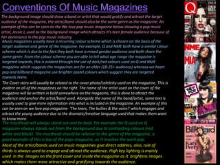
1. Conventions Of Music Magazines
The background image should show a band or artist that would gratify and attract the target
audience of the magazine, the artist/band should also be the same genre as the magazine. An
example of this can be seen on the We love pop music magazine below showing a pop music
artist, Jessie J, used as the background image which attracts it's teen female audience because of
her dominance in the pop music industry.
Music magazines usually have a recurring colour scheme which is chosen on the basis of the
target audience and genre of the magazine. For example, Q and NME both have a similar colour
scheme which is due to the fact they both have a mixed gender audience and both share the
same genre. From the colour scheme you are able to tell what age range the magazine is
targeted towards, this is evident through the use of dark/red colours used on Q and NME
magazine which suggests the magazines are for an older (18-25+ audience) whereas we heart
pop and billboard magazine use brighter pastel colours which suggest they are targeted
towards teens.
The Cover story will usually be related to the cover photo/celebrity used on the magazine. This is
evident on all of the magazines on the right. The name of the artist used on the cover of the
magazine will be written in bold somewhere on the magazine, this is done to attract the
audience and anchor the artist/band used. Alongside the name of the band/artist, some text is
usually used to give more information into what is included in the magazine. An example of this
can be seen on we love pop magazine- 'The tears, The bullies & the voice!' which engages and
attract the young audience due to the dramatic/emotive language used that makes them want
to know more.
The masthead will always stand out and be bold. For example the Q used on Q
magazine always stands out from the background due to contrasting colours (red,
white and black). The masthead should be relative to the genre of the magazine, a
good example of this is top of the pops magazine, as it involves the work pop.
Most of the artist/bands used on music magazines give direct address, also, rule of
thirds is always used to engage and attract the audience. High key lighting is mainly
used in the images on the front cover and inside the magazine as it brightens images
which makes them more attractive and gratifying towards the audience.