Call Us ✡️97111⇛47426⇛Call In girls Vasant Vihar༒(Delhi)
Digipack
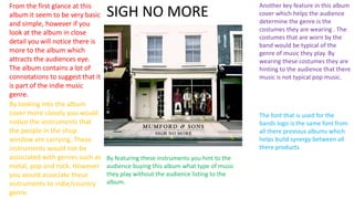
1. From the first glance at this
album it seem to be very basic
and simple, however if you
look at the album in close
detail you will notice there is
more to the album which
attracts the audiences eye.
The album contains a lot of
connotations to suggest that it
is part of the indie music
genre.
By looking into the album
cover more closely you would
notice the instruments that
the people in the shop
window are carrying. These
instruments would not be
associated with genres such as
metal, pop and rock. However
you would associate these
instruments to indie/country
genre.
By featuring these instruments you hint to the
audience buying this album what type of music
they play without the audience listing to the
album.
Another key feature in this album
cover which helps the audience
determine the genre is the
costumes they are wearing . The
costumes that are worn by the
band would be typical of the
genre of music they play. By
wearing these costumes they are
hinting to the audience that there
music is not typical pop music.
The font that is used for the
bands logo is the same font from
all there previous albums which
helps build synergy between all
there products.
SIGH NO MORE
2. The text that are used on the
back of this album is the same
font that is used on the front
cover which helps back the back
of the album and the front of the
album a package.
The image of the window keep up
the idea of the conventions of an
indie album that was made
apparent on the album cover. The
image of the window wouldn’t be
featured on may other artist
album. The image of the window
matches with the front cover and
it makes the album seem like one
product.
The logos of all the different distribution
company's and all the production company's
involved with the album are also shown. They used
a similar style to the album to put them in so that
they fit in with the album and do not stick out and
All the tracks that are featured in
the album are set out in a way
that you would not see in any
pop, rock, metal albums are set
out on the back of the album. The
track names are positioned one
after the other with no number
next to them which keeps the
style of the back cover clean and
follows the whole theme of the
album.
All the copyright and barcode
details for the album are
positioned at the bottom of the
album as they are key. The text of
all the copy right information
follow they theme of the album
which looks clean.