
Recommended
More Related Content
What's hot
What's hot (20)
Viewers also liked
Viewers also liked (10)
Similar to Conventions of indie digipaks and ideas for my own
Similar to Conventions of indie digipaks and ideas for my own (20)
More from amyflint5477
More from amyflint5477 (20)
Recently uploaded
Recently uploaded (20)
Conventions of indie digipaks and ideas for my own
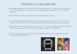
- 1. Indie bands album covers often reflect the music on the album. If the music is more alternative so will the album cover, if the music has a laid back sound the album cover will produce the same feel. They tend not to feature the band and instead have wording or images. If the digipak does show the band in any way the images will be alternative or black white for example blur shows the band in a cartoon manner and The 1975 show the band in black and white. Some albums only feature the band’s name and not the title of the album, sometimes the albums name can be seen somewhere else within the digipak for example Arctic Monkeys. Text on the album covers can either be very simple and plain, very alternative or reflect a logo associated with the band.
- 2. Ideas for my own Digipak From my research I have found, front covers of Indie digipaks tend not to be of the band as they care more about their music than selling themselves. If a band does feature on the front it will be in a quirky way. Picture that represent something or show a theme are usually used. I will use a picture of something besides the band of my front cover. Digipaks usually have more than 3 sleeves – if the band is shown it will be on the inside of the digipak in a poster like manner. I will create between 4 and 6 sleeves for my band, I do want to include a picture of the band somewhere in my Digipak. Colouring – is black and white or of a dull colour. I have not yet decided if my front cover will be black and white but it will however be symbolic. Font – font tends to be simple in black or white, many bands use block capitals to make their wording stand out. If a band have a certain font/logo they will use it so their audiences can recognise them. My font will be simple and probably white, I may create a logo for my band that continues throughout the digipak.