1. FRONT COVER MUSIC MAGAZINE ANALYSIS
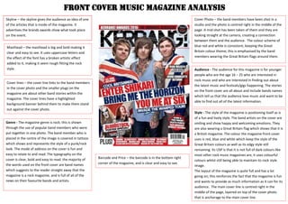
Skyline – the skyline gives the audience an idea of one
of the articles that is inside of the magazine. It
advertises the brands awards show what took place
on the event.
Masthead – the masthead is big and bold making it
clear and easy to see. It uses uppercase letters and
the effect of the font has a broken artistic effect
added to it, making it seem rough fitting the rock
style.
Cover lines – the cover line links to the band members
in the cover photo and the smaller plugs on the
magazine are about other band stories within the
magazine. The cover lines have a highlighted
background banner behind them to make them stand
out against the cover photo.
Cover Photo – the band members have been shot in a
studio and the photo is centred right in the middle of the
page. A mid-shot has been taken of them and they are
looking straight at the camera, creating a connection
between them and the audience. The colour scheme of
blue red and white is consistent, keeping the Great
Britain colour theme; this is emphasised by the band
members wearing the Great Britain flags around them.
Barcode and Price – the barcode is in the bottom right
corner of the magazine, and is clear and easy to see.
Audience - The audience for this magazine is for younger
people who are the age 16 – 25 who are interested in
rock music and who are interested in finding out about
the latest music and festivals/gigs happening. The stories
on the front cover are all about and include bands names
which tell us that the audience love music and want to be
able to find out all of the latest information.
Genre - The magazine genre is rock; this is shown
through the use of popular band members who were
put together in one photo. The band member who is
placed in the centre of the image is covered in tattoos
which shows and represents the style of a punk/rock
look. The mode of address on the cover is fun and
easy to relate to and read. The typography on the
cover is clear, bold and easy to read. the majority of
the words used on the front cover are band names
which suggests to the reader straight away that the
magazine is a rock magazine, and is full of all of the
news on their favourite bands and artists.
Style - The style of the magazine is positioning itself as is
of a fun and lively style. The band artists on the cover are
smiling and show happy and welcoming emotions. They
are also wearing a Great Britain flag which shows that it is
a British magazine. The colour the magazine front cover
uses is red, blue and white which keep the style of the
Great Britain colours as well as its edgy style still
remaining. Its USP is that it is not full of dark colours like
most other rock music magazines are, it uses colourful
colours whilst still being able to maintain its rock style
image.
The layout of the magazine is quite full and has a lot
going on; this reinforces the fact that the magazine is fun
and wants to provide as much information as it can for its
audience. The main cover line is centred right in the
middle of the page, layered on top of the cover photo
that is anchorage to the main cover line.
2. Skyline – the skylinegives the audience a clear view of the
bands and artists inside the magazine, which can help
persuade them to buy the magazine if they see a band that
they are interested in.
Masthead– the masthead is big and bold making it clear and
easy to see. It uses uppercase letters and sharp lines and edges
which represents and reflects upon the hard and heavy rock
music genre style. The colour of the masthead is all black with a
white outline which contrasts with the black making it even
bolder.
Cover lines – the cover lines all uses heavy, bold and more
violent words which link with the cover photo and house
style of the magazine.
Barcode and Price - the barcode has its own space in the
left corner of the magazine making it clear and
recognisable.
Flash – the flash at the top right corner helps to draw the
audience into buying the magazine for people who are
interested in the band on the poster in the magazine.
Cover Photo - this shot of the band member has been shot
in a studio, as the background is white making the
musician the main focus. The shot is a full body shot so
that all of her body is visible; her body language reinforces
the heavy rock style. Mise en scene of her clothing and the
prop she is holding of a gun gives a masculine and violent
feel, but the little clothing that she is wearing changes this
making her also feminine at the same time. The lighting of
the photo is made so that all of her body is lighted well
and so that the contrast between her pale skin tone and
the dark clothing she is wearing is defined. She is also
looking straight into the camera which gives more of a
connection between her and the audience. The musician
from the band is being represented in a feminine way,
wearing exposing clothes that shows a lot of her skin off;
this links to the cover line found on the left side ‘the
hottest chicks in hard rock’ as she is made to look
attractive as the photo is anchorage to the cover line. You
can easily see that she is being represented as a hard rock
musician as she is wearing all black with heavy black
makeup. She is also holding a gun as prop, which
reinforces the more ‘hard’ rock style.
Audience - The audience for this magazine is for older people of
the ages 18-30. It is targeted for both genders, but more
towards male because of the regular use of women on the front
cover. It is for people who are interested in heavy rock music.
The magazine itself is being represented as a hard rock
magazine targeted for mainly men, as the main image and cover
line are the dominant focus and the band member is wearing
little clothes and is exposing herself quite a lot.
Genre - The magazine is for heavy rock genre of
music. This is shown through the use of the
bands/band member in the photo; they are
dressed in black and wearing dark make up which
fits the stereotypical look of a punk/rock style.
The mode of address also represents the genre of
themagazine, through words like ‘hard rock’ and
‘destruction’ which give the audience a sense of a
more heavy and ‘rock-star’ style. The font is bold
and sharp which represents the rock music style.
Style -The style of the front cover is stylish and has a dark and
heavy rock personality. This is reflected through the use of dark
colours used; the hints of red on the cover design make the
features bold and stand out more as they are the only coloured
areas which contrast against the rest of the black and white
colours. The purple used also gives the magazine a hint of more
colour, but so that it still remains with a dark style and feel to it.
The magazines USP is the fact that it looks glamorous for a rock
music genre magazine and that it is focused on the women of
rock. It focuses more on the look and image of rock stars rather
than the music they make.The layout of the magazine is simple,
making it easy to read. The cover photo has space to be seen
clearly and is not covered or being layered by the cover lines
surrounding it. The cover image is layered so that it is in front of
all of the text.
3. Skyline – the skyline gives the
audience an idea of one of the
articles that is inside of the magazine.
It tells them some of the names of
the bands that will be featured inside
of the magazine.
Masthead – the masthead is big and bold; I
like how it is white and stands out against the
black background. The font style is interesting
and looks as if it is shattered; this reflects the
genre of the magazine and the carefree of the
rock star life and the edginess of it.
Cover lines – the main cover line is about the
band in the photo. It is clear and easy to see,
with the band’s name in capitals and in the
colour white so that it contrasts with the
black clothing that they’re wearing. Plugs are
found at the left hand side of the cover,
telling the audience about the posters that
can be found inside of the magazine, which
may help encourage them to buy it if they are
interested in the bands on the posters.
Cover Photo – the band members have been
shot in a studio and the cover photo is a mid-
shot. They are looking directly into the
camera which creates a connection between
them and the audience. The image has been
given a textured effect to fit the punk style of
their genre of music. The band is being
represented as quite moody through their
facial expressions. They are wearing all black
and leather which represents their rock/punk
fashion and style.
Barcode and Price – the barcode is in
the bottom right corner of the
magazine, and is clear and easy to
see.
Audience - The audience for this
magazine is for younger people who
are the age 16 – 25 who are
interested in rock music and who are
interested in finding out about the
latest music. It is for people who are
interested in the most popular bands
in rock.
Genre
The magazine genre is rock and this
can be seen clearly, as Green Day,
the band in the cover photo, are a
popular and well know rock band.
The words used on the cover also
show the genre clearly, like through
the words ‘punk’ and the display of
all of the different band names on
the cover.
4. Skyline – the skyline gives the audience an idea of one of
the articles that is inside of the magazine. It tells them
some of the names of the bands that will be featured
inside of the magazine.
Masthead – the masthead is big and bold; I like how it is
white and stands out against the black background and
the darker colours used in the whole of the cover design.
It is a very simple design, the use of the upper case letters
make it stand out and clear to read.
Cover lines – the cover line links to the band members in
the cover photo. The typography of the cover link that
links to the cover photo is interesting to look at and stands
out well in the cover as it is the only bit of text that has a
creative font style. The cover lines don’t tell the audience
what the articles are about in the magazine, but only the
bands that feature inside of the magazine. They are
holding a speaker phone prop which suggests that they
want to be loud which conveys that their music is loud.
Cover Photo – the band members have been shot in a
studio and the cover photo is a mid-shot, covers the
whole of the page so that you can clearly see all of
them. They are posing as if they are screaming and in in
an unserious way. The fact that they are screaming
represents that they are heavy rock artists and also the
fact that they’re doing this in an unserious way suggests
that they are fun and down to earth people which may
attract the audience.
Barcode and Price – the barcode is in the bottom right
corner of the magazine, and is clear and easy to see.
Audience - The audience for this magazine is for
younger people who are the age 16 – 25 who are
interested in rock music and who are interested in
finding out about the latest music and festivals/gigs
happening. Rocksound magazine includes a very wide
range of all of the different styles of rock music, from
heavy rock, to metal, to punk rock; this means that it
has a very wide and big audience and that it is able to
interest a lot of people.
Genre - The magazine genre is a wide range of different
types of rock music; this is shown through the use of
popular band members who were put together in one
photo. All of the band members are from different rock
styles. The genre can easily be seen through the content
of the front cover, as all of the cover lines are just bands
names, informing people that the magazine is about
rock bands only.
Style
The style of the magazine is positioning itself as is of a fun
and lively, loud style. It is a stylish and simple cover style,
whilst still conveying that it has a rock style, through the
cover photo and bold typography. The layout is simple
with the cover lines on the right and left hand side of the
magazine and the masthead positioned simply at the top,
spread across the page. The cover consists of all dark
colours, suggesting a dark lifestyle. The rock genre usually
uses dark colours, and the use of this on the magazine
reinforces that it is a magazine about rock music.