
Recommended
More Related Content
What's hot
What's hot (16)
Similar to Esqc.q5
Similar to Esqc.q5 (20)
Recently uploaded
Recently uploaded (20)
Esqc.q5
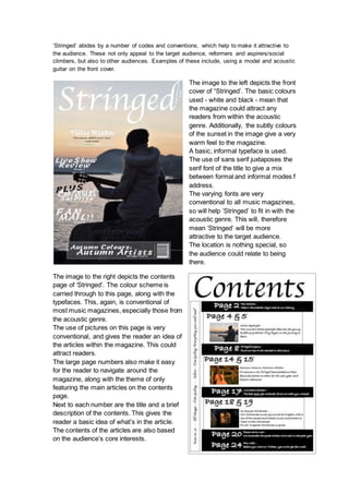
- 1. ‘Stringed’ abides by a number of codes and conventions, which help to make it attractive to the audience. These not only appeal to the target audience, reformers and aspirers/social climbers, but also to other audiences. Examples of these include, using a model and acoustic guitar on the front cover. The image to the left depicts the front cover of “Stringed’. The basic colours used - white and black - mean that the magazine could attract any readers from within the acoustic genre. Additionally, the subtly colours of the sunset in the image give a very warm feel to the magazine. A basic, informal typeface is used. The use of sans serif juxtaposes the serif font of the title to give a mix between formal and informal modes f address. The varying fonts are very conventional to all music magazines, so will help ‘Stringed’ to fit in with the acoustic genre. This will, therefore mean ‘Stringed’ will be more attractive to the target audience. The location is nothing special, so the audience could relate to being there. The image to the right depicts the contents page of ‘Stringed’. The colour scheme is carried through to this page, along with the typefaces. This, again, is conventional of most music magazines, especially those from the acoustic genre. The use of pictures on this page is very conventional, and gives the reader an idea of the articles within the magazine. This could attract readers. The large page numbers also make it easy for the reader to navigate around the magazine, along with the theme of only featuring the main articles on the contents page. Next to each number are the title and a brief description of the contents. This gives the reader a basic idea of what’s in the article. The contents of the articles are also based on the audience’s core interests.
- 2. The intended message is to reflect the relaxed but meaningful style of acoustic music using written and visual aspects of the magazine. This also links to the basic values of this audience, which seem to be mostly having a positive attitude towards everything. An example of this is the DPS article, in which the ‘artist’ is presented in a positive light. Giving a magazine meaning is an effective way of keeping an audience interested, in the case of ‘Stringed’, a positive atmosphere is built throughout the magazine through the subtle use of colours. ‘Stringed’ is relevant because it uses a simple colour scheme, an informal layout, and informal mode of address. This is conventional in this genre of music and is also the preferred style of the audience, mentioned earlier.