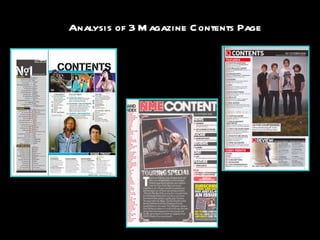
3. DATE By including the date on the contents page, it reinforces the fact that the reader knows what edition this is and around what time period the articles were. This is important so we know the magazine is not giving us old information and it is all new articles. BILLBOARD MASTHEAD SAME COLOUR CODE AS FRONT The billboard masthead needs to stay the same. This is because if the masthead changed, the reader would not be able to relate to the magazine. By keeping the Masthead the same, it ensures the reader that they are still reader Billboard magazine. Main image is….. The main image on the contents page is of two men. I assume that these two men are related to an artist or a band. It is difficult to say because there is no obvious link as to who the two men are. Charts By including a chart on the left third of the page, it immediately interests the audience. This is because straight away it gives the reader new exciting information and shows them who is topping the singles and album charts for this month. It also shows the page that the band is featured on. This is an important feature because it automatically allows the reader to know what page their favourite band is on. Billboard also makes this section of the magazine stand out by including a “no. 1” at the top of the page. This makes it obvious that there is a chart included so the reader can’t miss it out. Events/Online By including this little feature at the bottom of the page it adds a lot of effect to the contents. It allows the reader to know what events will be upcoming in the future and where they will be held. It also lets the reader know what page the information will be on so they can find out more about it. They have also added an “online” section. This lets the reader know that if they miss anything in the magazine they can go onto the online site and find out about any information they missed on there. Music Guides For Billboards right third of their contents page, they created it to highlight the most featured music sections of the magazine. This is important for billboard because they are mainly a a music magazine so they need to show where the article on music are. Up Front In the left third, they have included an “up front” section. This is also a good feature to include in the contents page because it allows the readers to know who billboard think are at the top of the boards and who is doing the best. This is also good advertisement. By Billboard expressing who they think are good musicians and artists, the readers will be intrigued as to what style of music that artist creates, and so they listen to them.
5. DATE By including the date on the contents page, it reinforces the fact that the reader knows what edition this is and around what time period the articles were. This is important so we know the magazine is not giving us old information and it is all new articles. NME MASTHEAD SAME COLOUR CODE AS FRONT For Q magazine, they use similar colours throughout. This is to distinguish the magazine and indentify that a similar theme runs throughout. Main image is….. Of “The Courteeners”. They use a full length shot to show the whole band and their posture. It is important that it shows you’re their body language in this image as it shows you their posture and gives you and insight about their attitude. They use this picture so that there is another band being shown as opposed to the same band being repeated constantly. Features The features on the left third of the page explains some of the other articles that will be included in the magazine. This is important because it ensures the reader knows that there are other articles in the magazine. It also gives the readers a direct page to certain articles that they would be interested in. Every Month By including this little feature in the bottom left corner, it lets the reader know what will be included in the magazine each month. Music Guides Q has included a music guide towards the bottom of the page. By doing this, they reinforce the fact that it is a music magazine. It also allows the reader to understand who Q thinks are the best musicians for this year. By doing this, they are suggesting which bands are better for the public to listen to.
7. DATE By including the date on the contents page, it reinforces the fact that the reader knows what edition this is and around what time period the articles were. This is important so we know the magazine is not giving us old information and it is all new articles. SUB HEADING BLOCKED OUT INTO BLACK SUB SECTIONS By creating a blocked out effect, it makes the contents page seem more interesting. Also by creating this effect it makes it easy to tell the difference between the titles and the information, this makes it stand out so you can differentiate the sections BRIEF HEADING + SUMMARY OF CONTENT WITH PAGE NUMBER IN RED They write a brief summary of the articles under each header. This is important because it gives the reader some knowledge as to what will be in this article. NME MASTHEAD SAME COLOUR CODE AS FRONT NME have ensured that the mast head is the same colour code as their font. This is important because as they are a popular magazine they keep the style the same to guarantee that the readers know which magazine they are looking at. If the masthead were to change all the time then the audience might get confused as to what the magazine title is. Main image is….. Showing a female motioning towards a tour bus. This image suits the majority of the page as there is a miniature article about touring. Therefore, by including this image, it relates to the article whereas if they had used a different image it would not have associated to the article. Band Index This feature in the contents page is important. This is because by including a band index it means that the reader can easily find their favourite band and on what page they are featured. By using different colours for the bands and the page, it makes it more distinguishable as to what page that band is on. It also creates a more professional appeal as they use NME’s regular colours. Image is edited so it looks like a photograph. This is appropriate because… By using this editing technique, it makes the image appear to be a photograph attached to the side of an amp. This is creative because by making it come across as an amp, it relates back to the theme of music. PREVIOUS/FUTURE EDITIONS OF NME ARE SHOWN WITH DETAILS OF WEBSITE/PHONE NUMBER ETC This is a good feature of the contents page as it shows the reader which magazine issue this. It also informs them that if they have missed an issue then they can purchase it on the website. At the same time they advertising subscriptions letting the reader know that they can pre-order the new editions before they come out and it will be delivered to them.