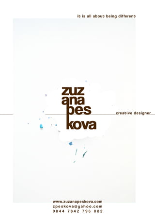
2. personal
business
cards
D E C E M B E R 2 0 1 4
As a part of introduction, the first
example of my portfolio is a de-
sign of my business cards.
I based the design on an exhibi-
tion idea where art or painting
is exhibited on the wall with the
small description and name of
the author on the bottom right
side of the painting.
Cards are in unusual size 1.4 x
3.6 inches as an art or painting is
open to any canvas size.
There is a strong typography im-
age on the both sides of the card
to point out my profession being
a Graphic Designer.
3. bird’s
LEGENDS
D E C E M B E R 2 0 1 4
I was asked to design a poster
for a flute and piano touring clas-
sical concert.
The overall direction was to cre-
ate an eye catching, sharp and
impressive poster.
The used images on this poster
are expressing the sonatas play-
ing at the concert. Flute is the
main instrument and by adding
image of flying birds crossing
the sun at the background, the
poster has the story telling feel.
I chose to use shade of orange
and blue colour as a symbol of a
sun and the sky, which are nec-
essary for birds to make their ad-
ventures stories.
4. Felix
Niel
D E C E M B E R 2 0 1 4
After the successful poster de-
sign for a touring classical con-
cert, I was asked to be a personal
Graphic Designer for a award
winning flutist Felix Niel.
My business card design idea is
based on flipping cards. To get
the whole information you need
to keep flipping the business
card back and forth. It gives the
interactive feel and makes it dif-
ferent from other business cards.
In the same time it stays simple,
straight forward and bringing out
the dramatic pompousness of a
classical music.
5. studio
recordings
J A N U A R Y 2 0 1 5
Logo like looking design for a CD
cover to be used for future studio
recordings of a flute and piano
collaboration.
My aim was to create a logo look-
ing visual, consisting of the two
classical instruments. Which I
gain by using the close up details
and shapes of flute and piano.
The line at the background is cre-
ating a shape of landscape and
in the same time giving the sense
of a sound waves.
6. ORGANIC
lines
F E B R U A R Y 2 0 1 5
Direction for this project was to
design a poster with an organic
feel which will eloquently ex-
press the title.
The whole poster is having the
relaxed but outstanding feel. Let-
ter “O” (from word ORGANIC) be-
came a part of the creative side of
the poster, wearing a bowtie as a
symbol of a special occasion or a
theatre play.
Name of a sonatas and their com-
posers are creating emotional
vibe around this letter and the
image of a flute blending with the
wooden background on the right
side is there to refer the genre of
the concert.
7. STUDIO
RECORDING
F E B R U A R Y 2 0 1 5
After successful outcome of the
Organic Lines poster, my client
asked me to keep the main de-
sign of that poster for a new stu-
dio recording CD cover design.
I added image of a flute and piano
as they are the main instruments
on this CD, plus I added name of
the two musicians and shape the
names and images into the de-
sign.
8. cLaReMONT
NURSERY
M A R C H 2 0 1 5
Claremont Neighbourhood Nurs-
ery is a day nursery based in Sal-
ford Manchester. The business
goal was to involve the clients
with the everyday routine in the
nursery and increase the social
engagement.
Our job was to create an experi-
ence that takes the target com-
munity to the next level of in-
teraction with the nursery and
being able to see the activities
their children are a part of. For
this project I designed the web-
site and newsletter and with col-
laboration with a web developer
we successfully finished the pro-
ject.
9. PH MEDIA
GROUP
M A R C H 2 0 1 5
PH Media Group is a provider of
audio branding, music on hold
and on-hold marketing. The over
all direction in this project was to
redesign and refresh the existing
B2B promotional packaging.
The final design idea is based
on images reflecting a sound
and images of land line phone.
The design includes expressive
typography and black, red and
white colours to draw the atten-
tion but keeping the message
clear and straight forward.
The design of the first card is
aiming for the strongest atten-
tion being achieved by a sharp
image of a land line phone and
memorable details in the typog-
raphy.
FRONT BACK
DESIGN of the FRONT side
A word “WE” ( meaning the company) is representing a crown on the top of a word HELP.
“THE WAY THEY SOUND” is placed in order to represent a sound wave.
Image of a land line phone is replacing a text instead and finishing the fully sentence.
Design of the BACK side
PH logo is a part of question mark as it is the right answer to how to improve business.
Little detail is made on a letter “D” (in word SOUND) where a singing bird is placed instead.
10. FRONT BACK
Image of a receiver is takes the
main attention in the design for
this card as it is a very important
element in on-hold marketing.
11. FRONT BACK
Design on this card is mainly
representing the importance of
a voice and a sound behind this
brand. Image of an open mouth
and of a sound waves are there
to demonstrate it.
12. THERAPY
FIRST
J A N U A R Y 2 0 1 5
Therapy First is a physiother-
apy clinic based in Media City
Manchester. They approached
me with a project for eye catch-
ing but relaxing almost clini-
cal design look for a flyer to
promote their pilates class.
Image of a female body figure
was added to achieve the fit-
ness look and replacing letter
“O” with an image of a heart (in
a word “BODY”) is symbolis-
ing the healthy approach to life
by applying pilates classes to a
weekly routine.
13. TOPMAN
J A N U A R Y 2 0 1 3
In 2013 I took a part in competi-
tion, to come up with a design
concept for a new TOPMAN shop
opening in Chicago.
The main idea for this concept
was to appeal to a local people
and raise their proudness within
by using recognisable buildings
monuments and symbols from
the city and blending it with TOP-
MAN male models.
14. Design made for a bag has a male
model as a striking image with
the Chicago city elements on the
top of model’s head making the
illusion of a clown and sending
the message to the people: “You
can be the TOP-MAN of CHICA-
GO!”
15. BLUE
CAMAS
S E P T E M B E R 2 0 1 4
A logo is a mark for people to
identify a certain organisation.
Richard Guertin, a holistic life
coach I have met on conference
in UK, contacted me while set-
ting up a company in America.
He needed designing logo and
business cards for business pro-
motion.
I based the logo design on Sa-
cred Geometry* and I chose a
pleasant happy colours for it.
The collaboration of this project
is still on going, as Mr Guertin
would like me to continue to de-
sign other promotional material
for his company.
*Sacred geometry involves sacred universal patterns used in the design of everything in our reality, most often seen in sacred architecture and sacred art.
The basic belief is that geometry and mathematical ratios, harmonics and proportion are also found in music, light, cosmology.
16. FLUX
J A N U A R Y 2 0 1 3
FLUX is a spirited, independent
fashion, music and art magazine
distributing across the UK and
beyond.
In the 2013 as a university stu-
dent I attended a competition in
creating a spring season front
cover design for a Flux maga-
zine.
The design with the elements of
nature and bright colours is cel-
ebrating the spring season and
pointing out the awakening after
cold winter.
The background of the cover is
made out of a differently shaded
lines to symbolise the fresh flout-
ing water.
17. WATCH
A P R I L 2 0 1 3
The posters were made for an
optical clinic in Bratislava to dec-
orate the patient’s waiting area.
Final design is celebrating one-
ness and uniqueness of human-
kind. All these eyes belong to dif-
ferent people, different genders
and different race with or without
disabilities or difficulties but with
the luck of not being able to see
the physical body, we tend to not
judge them. Therefore all these
eyes become equally beautiful to
look at.
18. THE Quays
MEDIA
solutions
F E B R U A R Y 2 0 1 5
The Quays Media Solutions is an upcoming web
developing company which approached me
with a branding project to promote their com-
pany.
LOGO
design is mainly focused on the capital letter
“Q” and based on Sacred Geometry*. The font
used in the logo is Helvetica Bold and colours
were picked by the company owners.
*Sacred geometry involves sacred universal patterns used in
the design of everything in our reality, most often seen in sa-
cred architecture and sacred art. The basic belief is that geome-
try and mathematical ratios, harmonics and proportion are also
found in music, light, cosmology.
BUSINESS CARDS
are in standard 3.5 x 2 inches size. I kept the de-
sign simple and strongly related with the logo.
WEBSITE
design is continuing with the main theme. There
are added details and visual effects in order to
appeal to a target audience. The main menu is
made of three icons representing the main of-
fice tools. The whole feeling of the website is
very relaxed, confident and trustworthy.