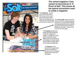
1. The masthead – stands out from the rest of the front cover and is one of the main focuses of the page, this is because it is in the top third of the page and the eye is drawn to it. The main image used on the front cover is aimed at a target audience of parents, as it shows two friendly and approachable looking students, giving the idea that the school is a friendly environment. They are the main focus of the page. The heading showing the article that will be featured inside the magazine is written in a large font, with a white border around the lettering so that it stands out on the page. It shows clearly what the article will be about and it written simplistically. The tag line on the bottom of the page holds the school motto and shows you the connection between the school and the slogan. The school magazine I have chosen to deconstruct is ‘A Pinch of Salt’. This shows all the typical conventions used to create a magazine.
![[object Object]](data:image/gif;base64,R0lGODlhAQABAIAAAAAAAP///yH5BAEAAAAALAAAAAABAAEAAAIBRAA7)