Keppel Ltd. 1Q 2024 Business Update Presentation Slides
Analyse School Magazine
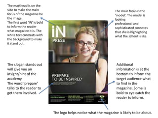
1. The masthead is on the
side to make the main
focus of the magazine be
the image.
The first word ‘IN’ is bold
to inform the reader
what magazine it is. The
white text contrasts with
the background to make
it stand out.
The main focus is the
‘model’. The model is
looking
professional and
sophisticated connotes
that she is highlighting
what the school is like.
Additional
information is at the
bottom to inform the
target audience what
to find in the
magazine. Some is
bold to eye catch the
reader to inform.
The slogan stands out
will give you an
insight/hint of the
academy.
The word ‘prepare’
talks to the reader to
get them involved.
The logo helps notice what the magazine is likely to be about.
2. The green shows that
the school is the
associate and
representation of the
school.
The masthead is
located in the content
page as well. To eye
catch the reader to
know what the
magazine is called.
The images give the reader a clue on what's inside.
The subheading
of the content
page shows
what the
magazine is.
3. The mast head is bold and big
to stand out to the reader. The
solid colour makes it eye
catching and contrasts with
the background.
The main focus is the
middle, the students to
give detail to the reader.
The logo at the
bottom to highlight
what it is.
4. The title is bold to stand out. The font is quite
big and eye-catching as the white contrasts
with the blue dark background.
The pictures
shows the
professional
way of the
school.
The text is small
but bright to make
the main focus of
the magazine be
the images.