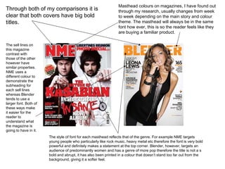
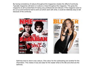
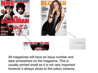
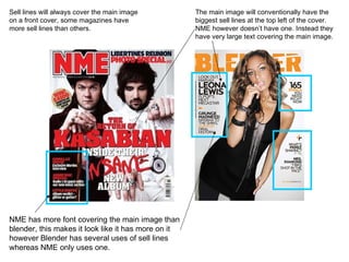
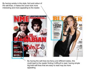
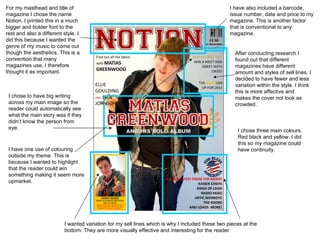
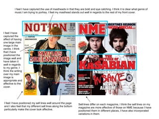
This document discusses conventions used in magazine covers. It notes that magazine covers typically use 3 colors or less, have a main focal image, bold titles, and varied fonts. It examines the covers of two magazines, NME and Blender, and how they employ these conventions. For example, both have bold titles but use different colors and font styles reflecting their targeted genres. The document also discusses how its own mock magazine cover applies conventions like continuity of colors, varied sell lines around the main image, and a bold masthead to portray its music genre.