
Recommended
More Related Content
What's hot
What's hot (20)
Similar to Contents 2
Similar to Contents 2 (20)
Recently uploaded
Recently uploaded (20)
Contents 2
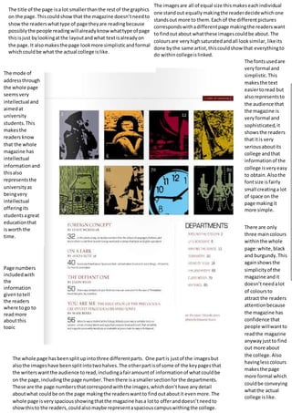
- 1. The title of the page is a lot smaller than the rest of the graphics on the page. This could show that the magazine doesn’t need to show the readers what type of page they are reading because possibly the people reading will already know what type of page this is just by looking at the layout and what text is already on the page. It also makes the page look more simplistic and formal which could be what the actual college is like. The images are all of equal size this makes each individual one stand out equally making the reader decide which one stands out more to them. Each of the different pictures corresponds with a different page making the readers want to find out about what these images could be about. The colours are very high saturated and all look similar, like its done by the same artist, this could show that everything to do within college is linked. The whole page has been split up into three different parts. One part is just of the images but also the images have been split into two halves. The other part is of some of the key pages that the writers want the audience to read, including a fair amount of information of what could be on the page, including the page number. Then there is a smaller section for the departments. These are the page numbers that correspond with the images, which don’t have any detail about what could be on the page making the readers want to find out about it even more. The whole page is very spacious showing that the magazine has a lot to offer and doesn’t need to show this to the readers, could also maybe represent a spacious campus withing the college. The fonts used are very formal and simplistic. This makes the text easier to read but also represents to the audience that the magazine is very formal and sophisticated, it shows the readers that it is very serious about its college and that information of the college is very easy to obtain. Also the font size is fairly small creating a lot of space on the page making it more simple. There are only three main colours within the whole page: white, black and burgundy. This again shows the simplicity of the magazine and it doesn’t need a lot of colours to attract the readers attention because the magazine has confidence that people will want to read the magazine anyway just to find out more about the college. Also having less colours makes the page more formal which could be conveying what the actual college is like. The mode of address through the whole page seems very intellectual and aimed at university students. This makes the readers know that the whole magazine has intellectual information and this also represents the university as being very intellectual offering its students a great education that is worth the time. Page numbers included with the information given to tell the readers where to go to read more about this topic