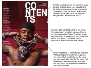
1. By looking at this ‘V’ I can straight away tell that this magazine was furnished by vibe. I've noticed that vibe like to use the colour red, the reason why they like the colour red is because they know that red is an eye catching colour because the human eye is naturally drawn to it. The title has been is in a strong text because it’s clear and round and very readable and the white complements the red very well by contrasting. I think the reason why the title has been written like that is because the designer didn’t want to cover the ‘V’ The main focal point of the shot is the image, this image is very important because it has a high stereotype of an African American rapper with the amount of jewellery he has on his body and his gold teeth; I’s surprised he isn’t muscular as most of the over vibe models.
2. The image has been guided around the text because this contents page has put the image around the text because I think the this is a biography or article about the female in the image. The image is most attractive thing on this page because it’s quite bland. When analysing this magazine I noticed that it’s been polluted with text. The colour of the text and the colour of the background don’t work well with each other because it doesn’t really have a colour scheme they don’t contrast properly. The colour scheme also doesn’t compliment the image. The layout if this contents page is the worst aspect of this magazine because it doesn’t really flow properly because there is too much text, the colours are bad and the image isn’t big enough, in my opinion this layout doesn’t really work.
3. I noticed that they have used a double overlay for the image and the text, the layer is to separate the text and the face in the background image. The use of red separates the text because red and white contrast well, the face in the background is it’s original colour and red. When I look at this I’m not sure if they wanted that effect but it doesn’t really hind the design. The image is normally the main attraction for the target audience, in this case even doe this the main thing on the page I don’t think it’s the main eye catcher because your automatically draw to the red banner then the white text. The intensity of the of the face shows the emotion of the face because it’s a really stern look, most likely anger or hostility. The layout of the there name is done superbly it fits together very neatly and it doesn’t disturb the colour scheme.