QUESTION – AUDIENCE
APPEAL
By Joe Roper
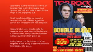
I think people would like my magazine
because it has a lot of bright aggressive
colours that correspond well with the genre.
I decided to put the main image in front of
the mast head to give the image a more
dynamic look to it and make it seem like the
image is kind of popping out.
I added a lot of cover lines to make the
magazine seem more eye-catching because
if someone see’s a story they are interested
in they would more likely pick it up.
Having banners on the bottom on of my
magazine makes it easy to see what will be in
the magazine at a glance.
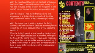
With the image that is leaning against the listing
column, I decided to do this because it makes people
look at it a lot more because it had a very appealing
look to it.
With the listing I gave it a nice blending background
so it is more appealing to look at with the writing on
the front. In the listing column I have given heading a
large white font that looks like a newspaper writing, I
put the sub headings in yellow and a different font to
there is some difference between the headings and
sub-headings.
With the images I had made them give me and
aggressive or a distant look so they look like they
don’t care which would attract the teenage readers.
With the masthead I had given it the look of looking
like it had been coloured hastily in with a crayon. I
had also included a little logo of my magazine in the
top left corner to give it more of an appealing look.
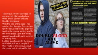
With the title of the page I had
tried to find the right fonts to use
for the text. I had used a big bold
text for the normal writing, and for
the word blood I put it in red to
reprent blood and I put it in more
of a sharp font.
I added a pull quote to the image
which helps draw in people if
they relate or are curious about
the quote so it is quite effective.
The colour scheme I decided to
use was red, black and yellow
these are all colours that are
liked by teenagers.

Question 5 audience appeal

  • 1.
  • 2.
    I think peoplewould like my magazine because it has a lot of bright aggressive colours that correspond well with the genre. I decided to put the main image in front of the mast head to give the image a more dynamic look to it and make it seem like the image is kind of popping out. I added a lot of cover lines to make the magazine seem more eye-catching because if someone see’s a story they are interested in they would more likely pick it up. Having banners on the bottom on of my magazine makes it easy to see what will be in the magazine at a glance.
  • 3.
    With the imagethat is leaning against the listing column, I decided to do this because it makes people look at it a lot more because it had a very appealing look to it. With the listing I gave it a nice blending background so it is more appealing to look at with the writing on the front. In the listing column I have given heading a large white font that looks like a newspaper writing, I put the sub headings in yellow and a different font to there is some difference between the headings and sub-headings. With the images I had made them give me and aggressive or a distant look so they look like they don’t care which would attract the teenage readers. With the masthead I had given it the look of looking like it had been coloured hastily in with a crayon. I had also included a little logo of my magazine in the top left corner to give it more of an appealing look.
  • 4.
    With the titleof the page I had tried to find the right fonts to use for the text. I had used a big bold text for the normal writing, and for the word blood I put it in red to reprent blood and I put it in more of a sharp font. I added a pull quote to the image which helps draw in people if they relate or are curious about the quote so it is quite effective. The colour scheme I decided to use was red, black and yellow these are all colours that are liked by teenagers.