Automating Business Process via MuleSoft Composer | Bangalore MuleSoft Meetup...
Evaluation
1.
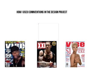
2. The font they have used for the mast head was
very sharp and incorporates the professional look
that the vibe magazine likes to uphold, I noticed
that the text is very clean and san-serif.
The layout of the magazine
is at a high standard I
noticed that the text has
been put in an invisible box I noticed that the target audience
so it doesn’t get in the way of is most likely female but this can
model’s pose at lot of also appeal to the male target
professional companies do audience because of the sexually
this technique symbolic that could appeal to
young males.
The colour scheme that the editor
has used throughout magazine I
noticed that vibe they like to keep
the colures relatively bright and
simple.
3. Good colour scheme
San-Serif
Both Uppercase
Boxed Layout
Both African American males
Good quality photo
Takes up most of the page
Main attraction of the magazine
Simple background colour
4. •Numbered pages
•All the text to one side of
the page.
•‘Contents written in large
text.
•Good use of white
space.
•The insignia in a clear
readable position.
•The layout is from right
to left.
•Simple layout.
•Easy to navigate.
5. The name of the artist in the top corner.
They both have massive letters to represent there
names.
Large letters at the beginning of the sentences
Large image of the main focal point of the shot.