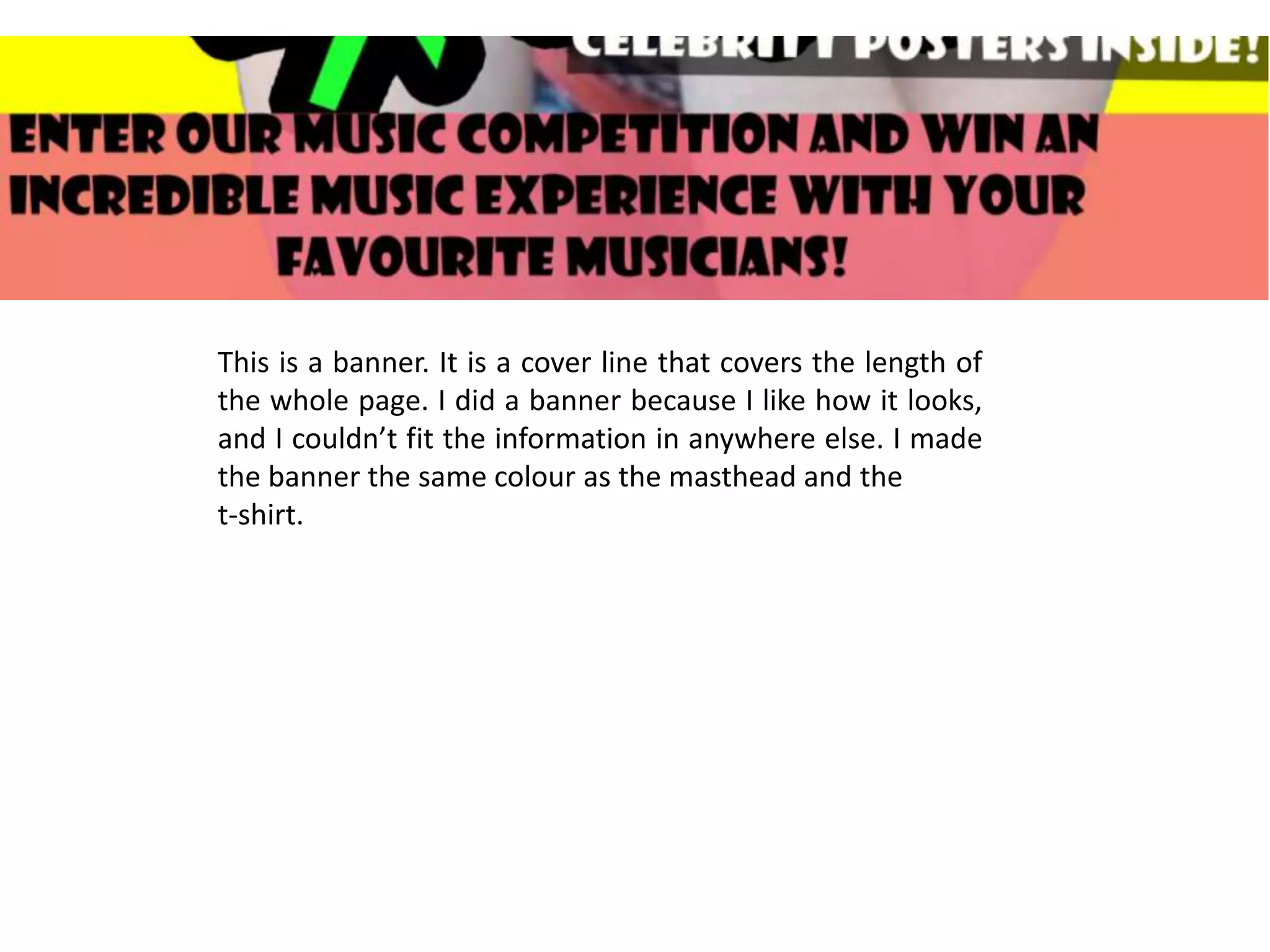
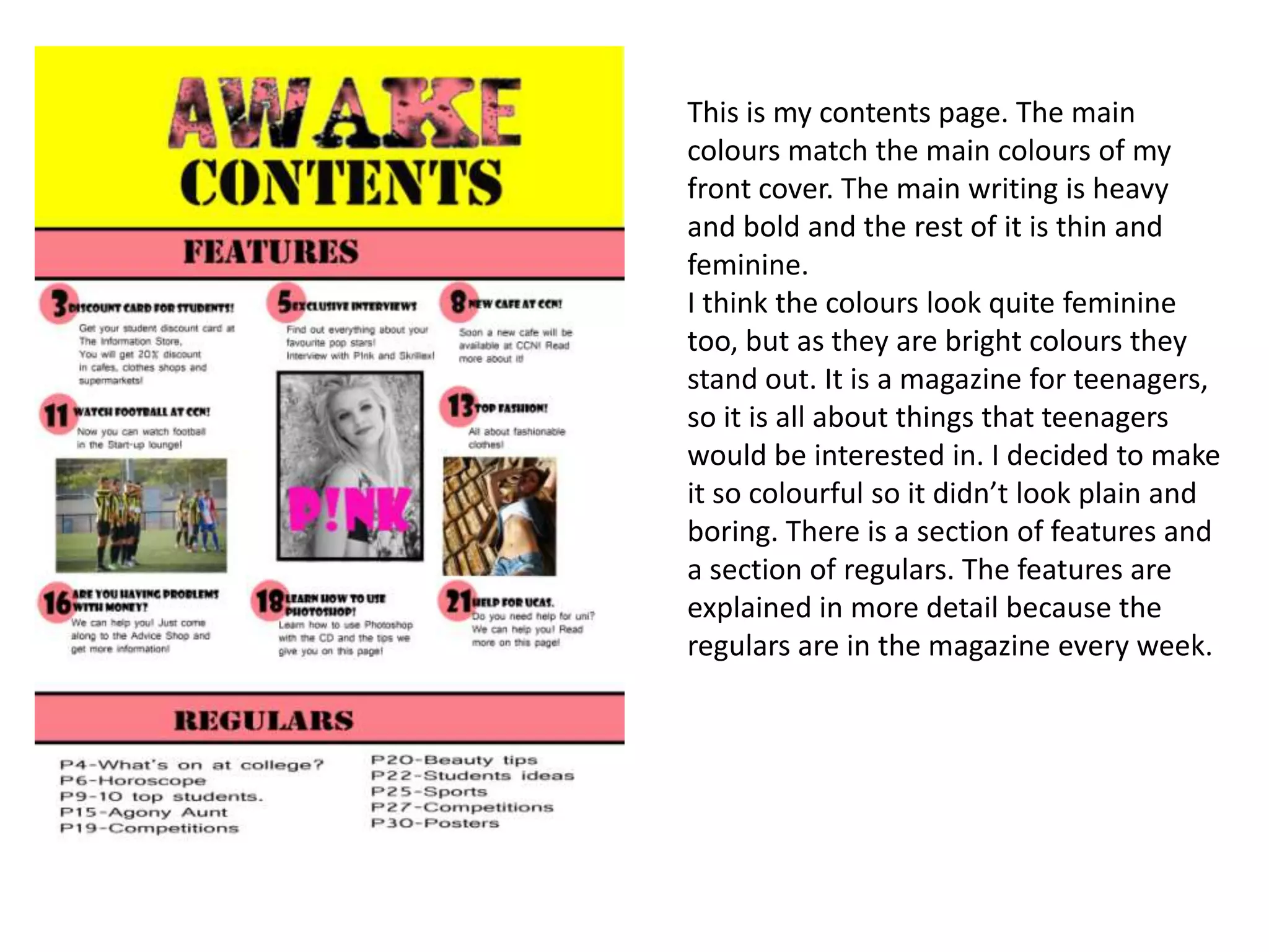
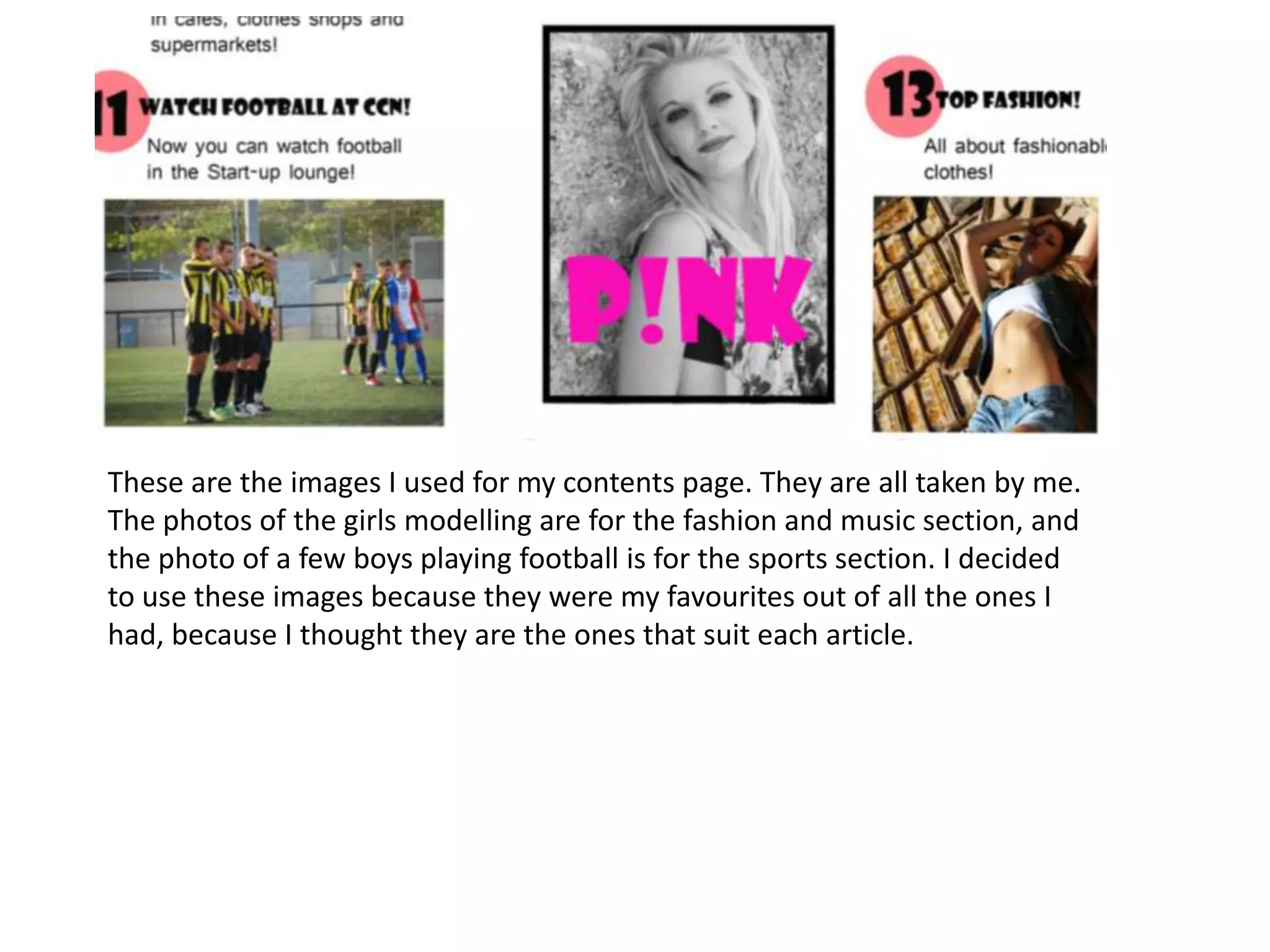
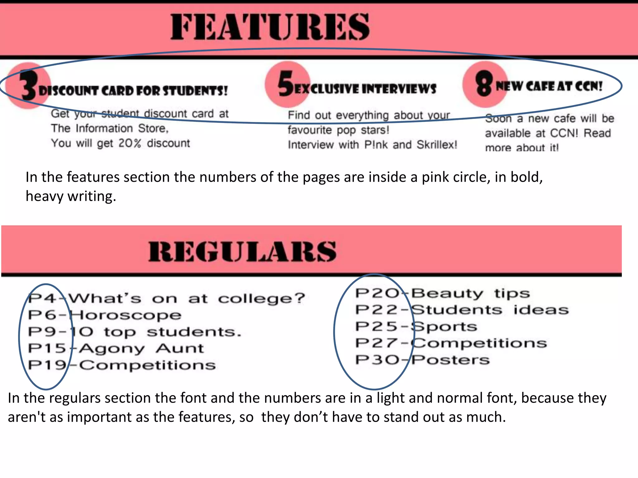
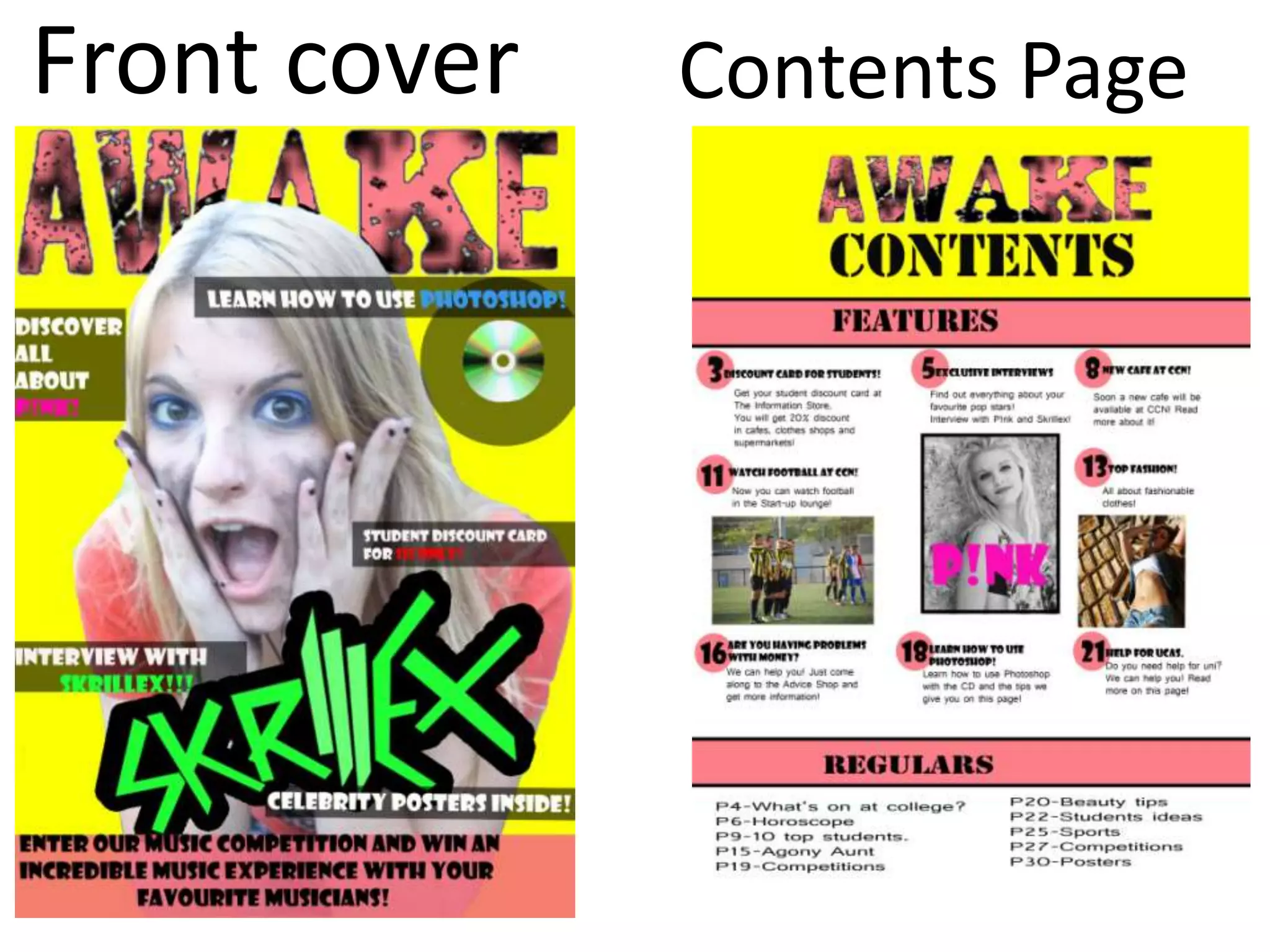
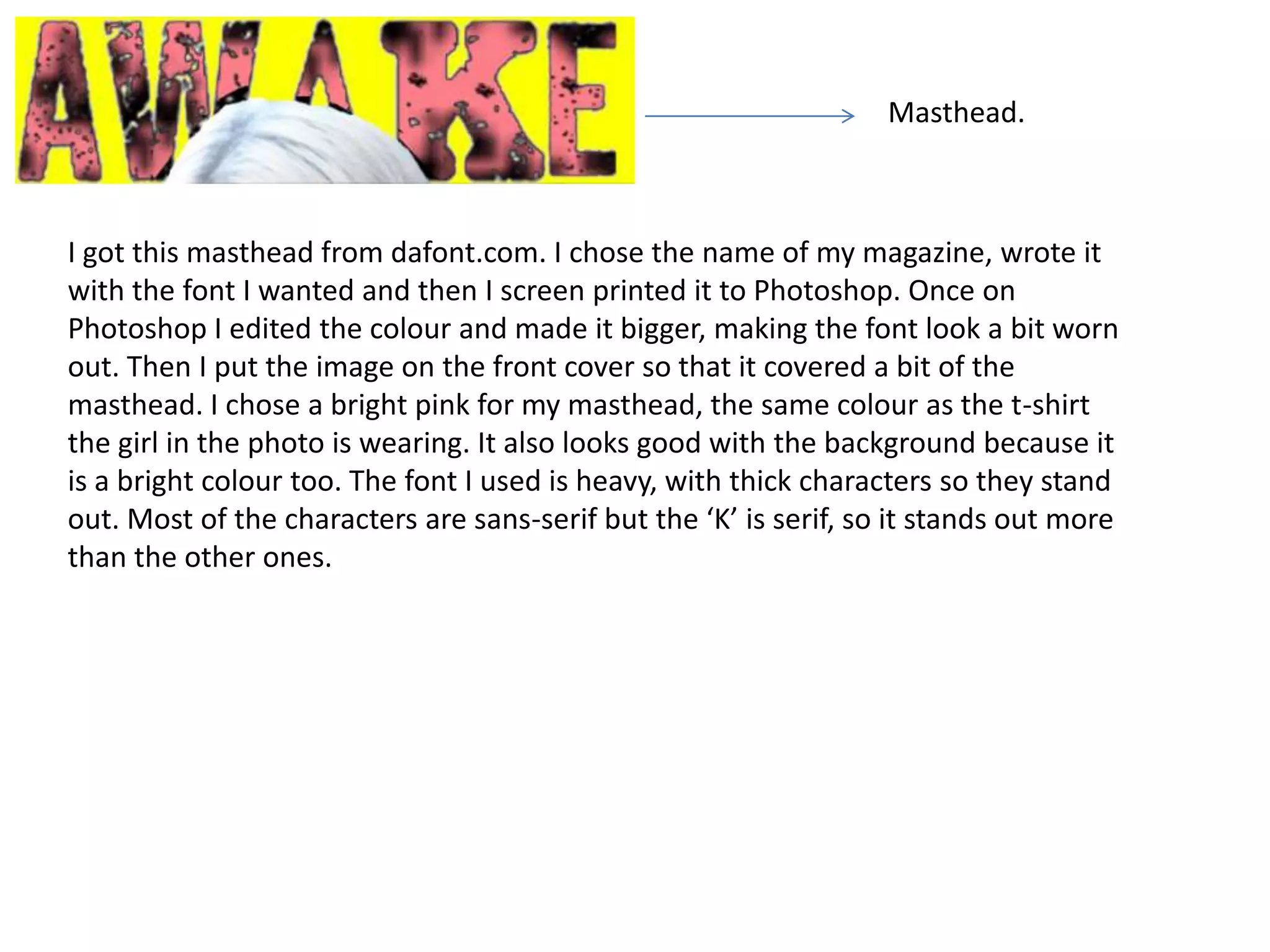
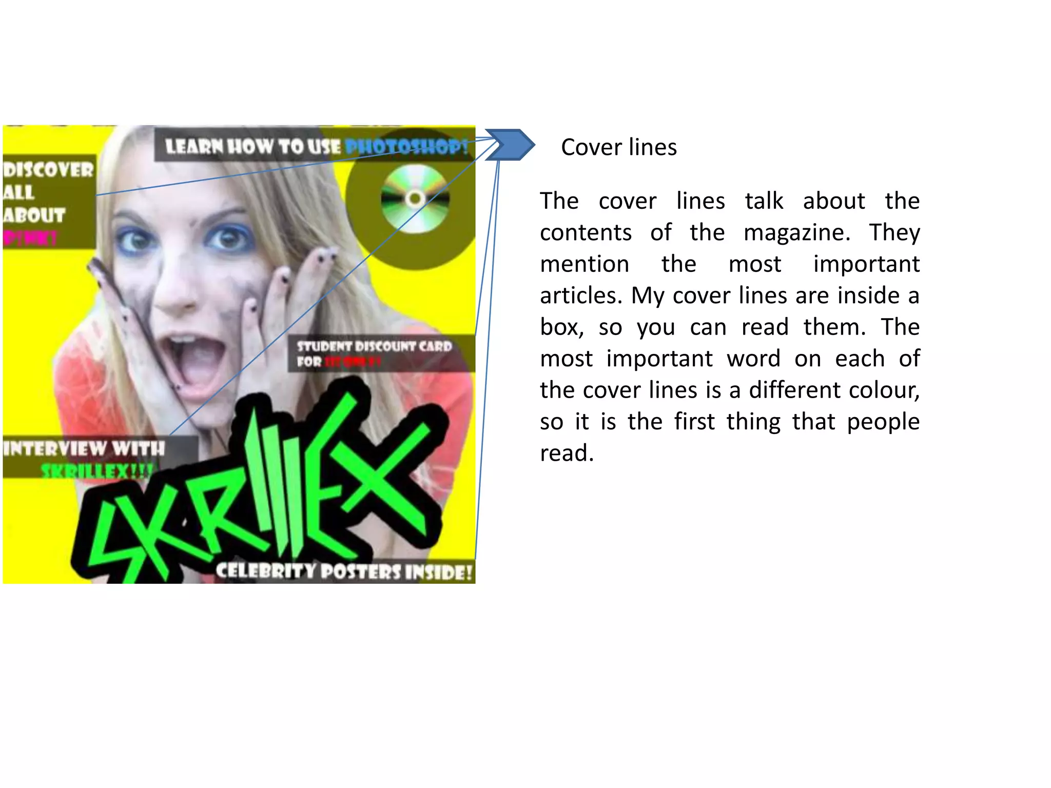
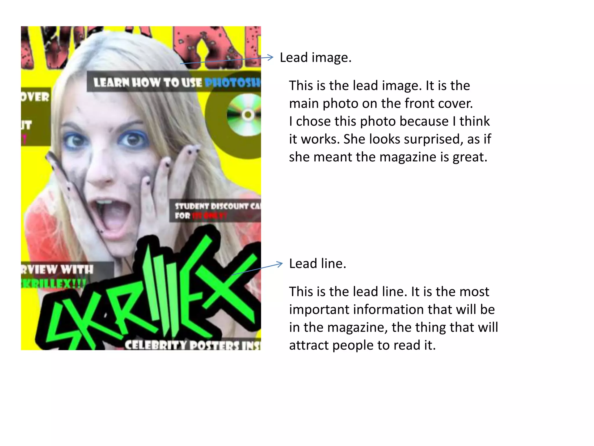
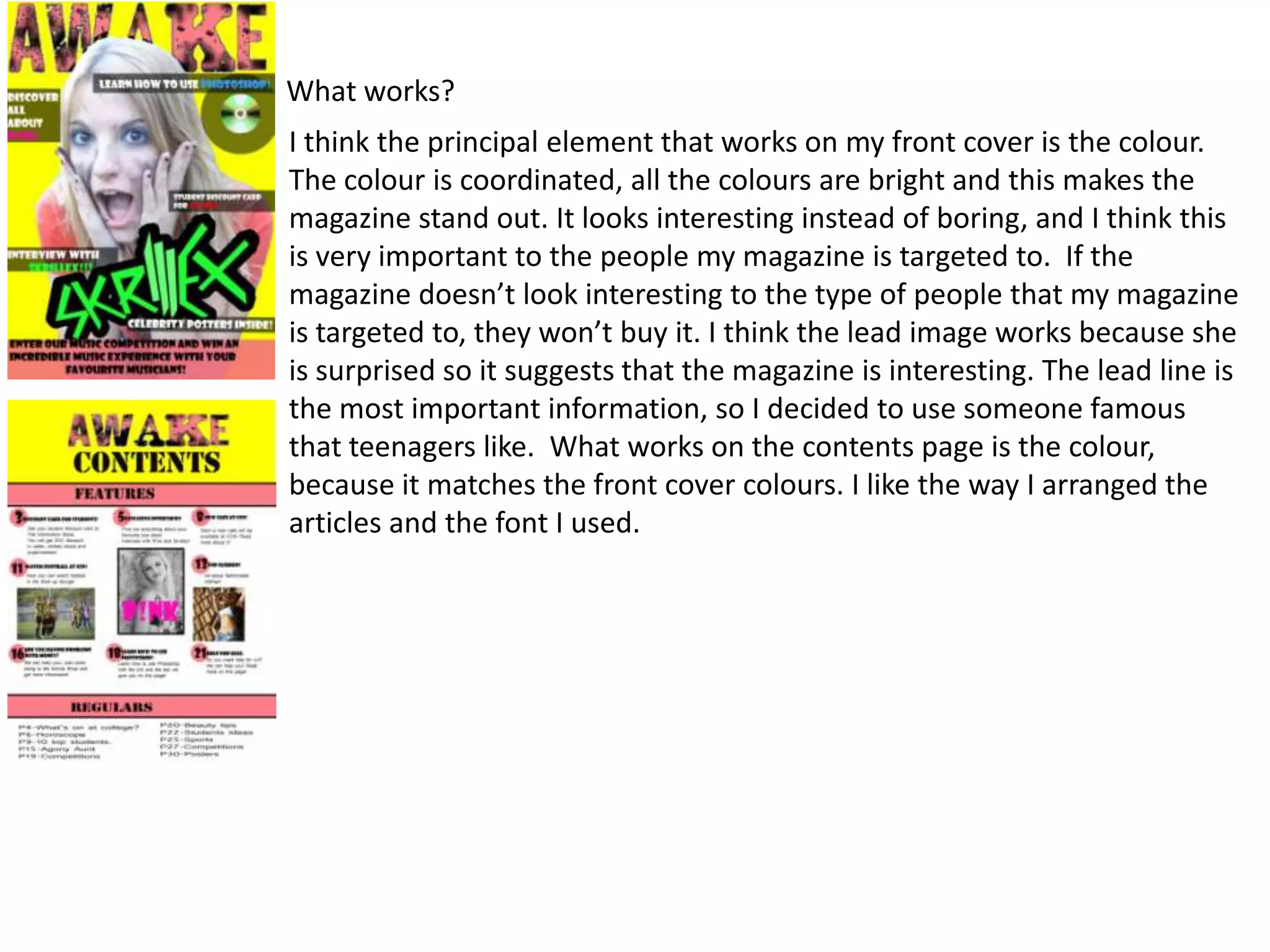
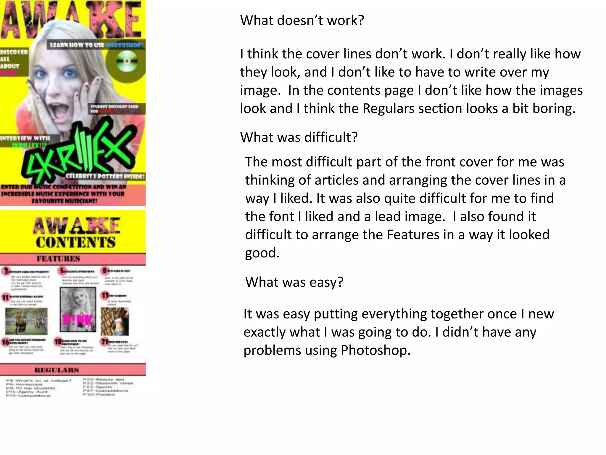
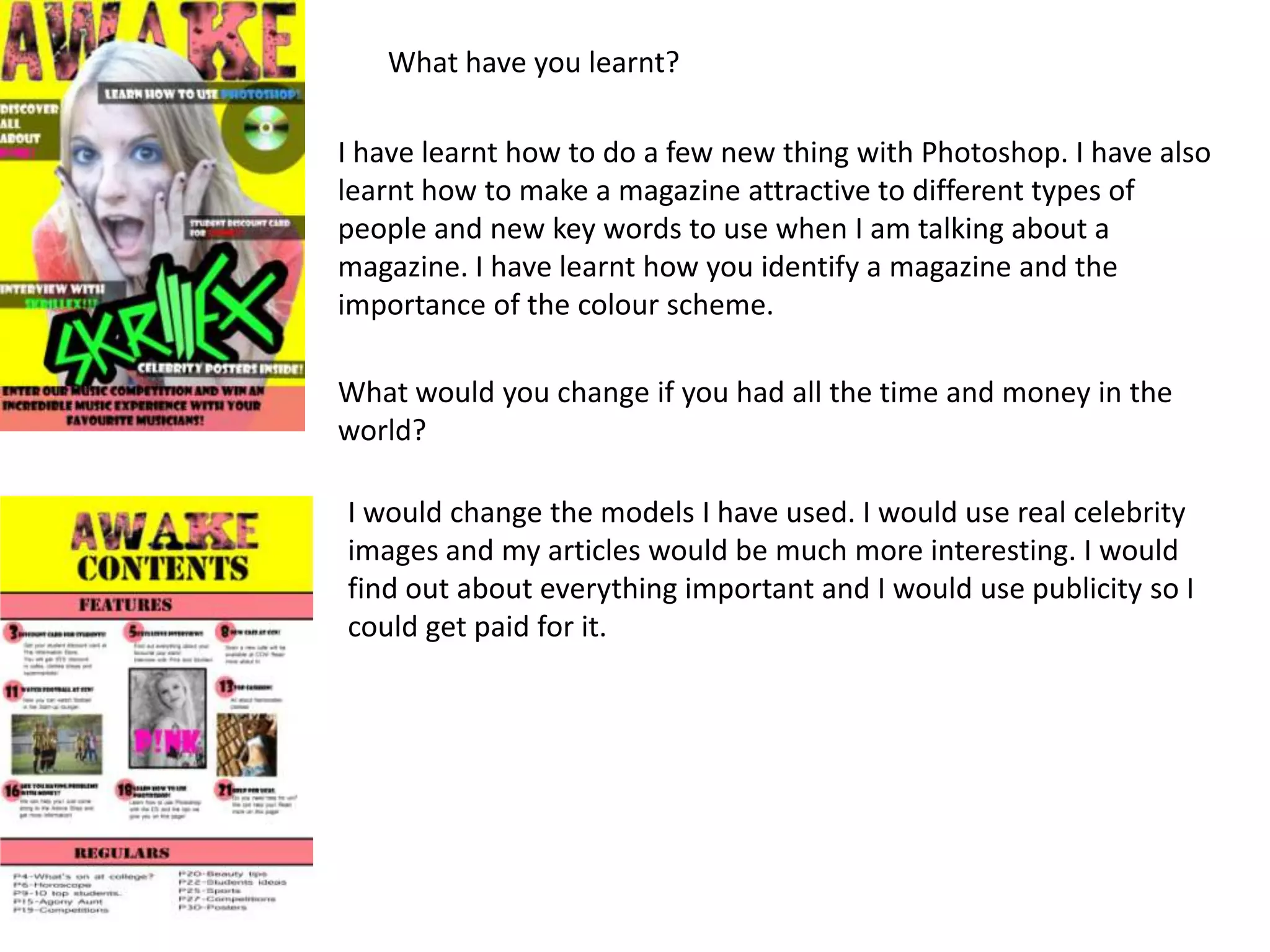
The document analyzes a magazine front cover and contents page created by the author. Some key points:
- The author used Photoshop to design the bright pink masthead and arrange the cover elements.
- The cover lines highlight important articles in colored boxes, and the lead image shows a surprised model.
- The contents page matches the front cover colors and styles articles sections with photos chosen by the author.
- The author notes what design elements worked well (bright colors, lead image) and not as well (cover lines, contents photos) and what was difficult (article ideas) versus easy (assembling in Photoshop).
3. Masthead.
I got this masthead from dafont.com. I chose the name of my magazine, wrote it
with the font I wanted and then I screen printed it to Photoshop. Once on
Photoshop I edited the colour and made it bigger, making the font look a bit worn
out. Then I put the image on the front cover so that it covered a bit of the
masthead. I chose a bright pink for my masthead, the same colour as the t-shirt
the girl in the photo is wearing. It also looks good with the background because it
is a bright colour too. The font I used is heavy, with thick characters so they stand
out. Most of the characters are sans-serif but the ‘K’ is serif, so it stands out more
than the other ones.
4. Cover lines
The cover lines talk about the
contents of the magazine. They
mention the most important
articles. My cover lines are inside a
box, so you can read them. The
most important word on each of
the cover lines is a different colour,
so it is the first thing that people
read.
5. Lead image.
This is the lead image. It is the
main photo on the front cover.
I chose this photo because I think
it works. She looks surprised, as if
she meant the magazine is great.
Lead line.
This is the lead line. It is the most
important information that will be
in the magazine, the thing that will
attract people to read it.
6. This is a banner. It is a cover line that covers the length of
the whole page. I did a banner because I like how it looks,
and I couldn’t fit the information in anywhere else. I made
the banner the same colour as the masthead and the
t-shirt.
7. This is my contents page. The main
colours match the main colours of my
front cover. The main writing is heavy
and bold and the rest of it is thin and
feminine.
I think the colours look quite feminine
too, but as they are bright colours they
stand out. It is a magazine for teenagers,
so it is all about things that teenagers
would be interested in. I decided to make
it so colourful so it didn’t look plain and
boring. There is a section of features and
a section of regulars. The features are
explained in more detail because the
regulars are in the magazine every week.
8. These are the images I used for my contents page. They are all taken by me.
The photos of the girls modelling are for the fashion and music section, and
the photo of a few boys playing football is for the sports section. I decided
to use these images because they were my favourites out of all the ones I
had, because I thought they are the ones that suit each article.
9. In the features section the numbers of the pages are inside a pink circle, in bold,
heavy writing.
In the regulars section the font and the numbers are in a light and normal font, because they
aren't as important as the features, so they don’t have to stand out as much.
10. What works?
I think the principal element that works on my front cover is the colour.
The colour is coordinated, all the colours are bright and this makes the
magazine stand out. It looks interesting instead of boring, and I think this
is very important to the people my magazine is targeted to. If the
magazine doesn’t look interesting to the type of people that my magazine
is targeted to, they won’t buy it. I think the lead image works because she
is surprised so it suggests that the magazine is interesting. The lead line is
the most important information, so I decided to use someone famous
that teenagers like. What works on the contents page is the colour,
because it matches the front cover colours. I like the way I arranged the
articles and the font I used.
11. What doesn’t work?
I think the cover lines don’t work. I don’t really like how
they look, and I don’t like to have to write over my
image. In the contents page I don’t like how the images
look and I think the Regulars section looks a bit boring.
What was difficult?
The most difficult part of the front cover for me was
thinking of articles and arranging the cover lines in a
way I liked. It was also quite difficult for me to find
the font I liked and a lead image. I also found it
difficult to arrange the Features in a way it looked
good.
What was easy?
It was easy putting everything together once I new
exactly what I was going to do. I didn’t have any
problems using Photoshop.
12. What have you learnt?
I have learnt how to do a few new thing with Photoshop. I have also
learnt how to make a magazine attractive to different types of
people and new key words to use when I am talking about a
magazine. I have learnt how you identify a magazine and the
importance of the colour scheme.
What would you change if you had all the time and money in the
world?
I would change the models I have used. I would use real celebrity
images and my articles would be much more interesting. I would
find out about everything important and I would use publicity so I
could get paid for it.
13. What magazines can you compare it to?
I think my magazine and this magazine are similar.
The masthead is under the image and the lead
image is a blond girl. I has the cover lines in the
same places as my magazine, but this magazine
isn’t as bright.
This magazine is bright, but it uses a lot of pink, red and
purple. I think this is similar to my magazine because
the colours are brighter, this magazine looks much more
interesting than the one above. The cover lines are a
little bit disorganised but it makes it look like it is going
to have much more content.