Enjoy Night⚡Call Girls Iffco Chowk Gurgaon >༒8448380779 Escort Service
Question two
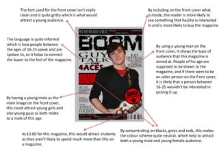
1. The font used for the front cover isn’t really By including on the front cover what
clean and is quite gritty which is what would is inside, the reader is more likely to
attract a young audience. see something that he/she is interested
in and is more likely to buy the magazine.
The language is quite informal
which is how people between By using a young man on the
the ages of 16-25 speak and are front cover, it shows the type of
spoken to, so it helps to connect audience that this magazine is
the buyer to the feel of the magazine. aimed at. People of his age are
supposed to be drawn to the
magazine, and if there were to be
an older person on the front cover,
it is likely that a person between
16-25 wouldn’t be interested in
picking it up.
By having a young male as the
main image on the front cover,
this could attract young girls and
also young guys as both relate
to a male of this age.
By concentrating on blacks, greys and reds, this makes
At £3.00 for this magazine, this would attract students the colour scheme quite neutral, which help to attract
as they aren’t likely to spend much more than this on both a young male and young female audience.
a magazine.
2. Like the front cover, nothing on the contents
page is aimed specifically at a male or female
All artists and bands mentioned audience. This helps to keep it neutral and open
each appeal to a younger audience to both genders.
themselves, so by linking these together
with a magazine that is aimed at a younger
audience, you are more likely to succeed
in selling it.
The contents page is laid out
in quite an ‘easy read’ style.
This makes it more enjoyable
for the reader as they don’t
have to look very hard to find
what they want, and it is also
All images on the front cover better for a young audience as
are of young people. This helps they are buying this for leisure,
to attract and link a younger rather than to sit and read and to
audience to the magazine itself. challenge themselves at all.
The language used is quite informal and
snappy which appeals to a young audience.
And all information is short which makes it
easier to get through.
3. My magazine is designed to attract an audience of 15 – 25 year olds. I did this by
including certain features that would specifically attract them as they can relate
to quite a bit on the front page. An example of this is the main image – by using a
young male, this attracts other young men to buy it and also young females to be
interested in it as well.
The language used is also quite informal (e.g GUY TALK) which is used for a
younger audience. The fonts used aren’t clean or neat. The font used for the title
is ‘Defused’ which makes the magazine look more gritty, therefore appealing to a
younger audience.
The colour scheme used (black, grey and red) helps to keep the magazine more
neutral. This has been thought about carefully so that it doesn’t attract male or
female but both.
The price of £3.00 has been specifically chosen. This is due to research of people
between the ages of 15 – 25 who mainly said that they would be willing to buy a
music magazine if it were around the £3.00 mark, and understanding that the
audience that the magazine is aimed at are mainly students, this price is
reasonable.
4. Most of these features run throughout the whole magazine so that it
keeps to attracting the attention of a younger audience so that they are
not disappointed and more likely to purchase the next addition of
‘BOOM’ magazine. For example – images used on the contents page
consist of younger bands and artists and the language remains snappy
and informal (e.g GORILLAZ – AREN’T MONKEYING AROUND).
The content of the magazine also interests a younger audience
(specifically students) as there are quite a few sections where they can
contact the magazine and ‘have their own say’ – something that would
appeal to younger people.
In regards to appealing to people of a certain sexuality, it doesn’t
specifically try to attract itself to either gay or straight audiences, but
hopefully both. Gay artists are included and not left out due to their
sexuality, something that I hope would appeal to people of any sexuality
themselves.