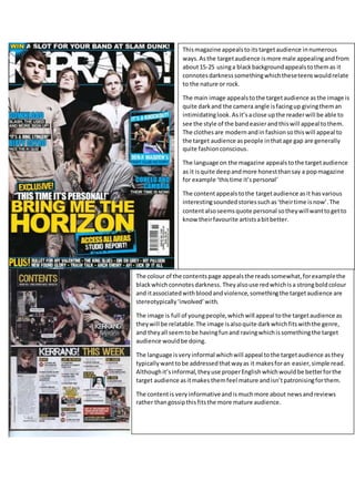
1. This magazine appeals to its target audience in numerous
ways. As the target audience is more male appealing and from
about 15-25 using a black background appeals to them as it
connotes darkness something which these teens would relate
to the nature or rock.
The main image appeals to the target audience as the image is
quite dark and the camera angle is facing up giving them an
intimidating look. As it’s a close up the reader will be able to
see the style of the band easier and this will appeal to them.
The clothes are modern and in fashion so this will appeal to
the target audience as people in that age gap are generally
quite fashion conscious.
The language on the magazine appeals to the target audience
as it is quite deep and more honest than say a pop magazine
for example ‘this time it’s personal’
The content appeals to the target audience as it has various
interesting sounded stories such as ‘their time is now’. The
content also seems quote personal so they will want to get to
know their favourite artists a bit better.
The colour of the contents page appeals the reads somewhat, for example the
black which connotes darkness. They also use red which is a strong bold colour
and it associated with blood and violence, something the target audience are
stereotypically ‘involved’ with.
The image is full of young people, which will appeal to the target audience as
they will be relatable. The image is also quite dark which fits with the genre,
and they all seem to be having fun and raving which is something the target
audience would be doing.
The language is very informal which will appeal to the target audience as they
typically want to be addressed that way as it makes for an easier, simple read.
Although it’s informal, they use proper English which would be better for the
target audience as it makes them feel mature and isn’t patronising for them.
The content is very informative and is much more about news and reviews
rather than gossip this fits the more mature audience.
2. The colour scheme of the double page spread is very black which shows darkness, something the
target audience will be attracted to as it’s a popular theme among the magazines genre. Some of the
writing is in red which represents blood and violence, something teens can relate to as they
stereotypically get into fights and cause trouble.
The image is a close up of a popular and so the target audience will be appeared as they like rock and
they are a big rock band, also they have a certain style and look about them which the age group
could be attracted to.
The language is once again very detailed and proper, this is so it doesn’t patronise the teenage
audience making it appeal to them. They also use some slang suited towards teenagers such as ‘I was
tripping balls’ this makes the target audience feel like they can relate and that the magazine is right
for them.