1. The language on the front cover is quite informal.
This is because the audience that it is appealing to
is quite young, so this is the language that they would
expect from a magazine that they would buy.
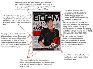
My choice of title is BOOM
because I wanted something
I chose this font as it is quite that related to sound and
plain, but still has quite a professional music, and BOOM is snappy and
look to it. It fits well within the front also easy to remember.
cover as it squares off and fits together I chose this font as it is quite gritty
well. And goes well with the style of the
Magazine. It’s font is this big as it
Needs to make an impact and it being
A 4 letter word, it needed size to stand
The page is filled with bands and Out against the title ‘GUY TALK’.
what’s included inside. The reason The main image was changed
that there is so much information 3 times. I chose this image as
on the page is so that the front there is a direct mode of address,
cover catches the attention of the he suits the style of the magazine,
buyer and shows that the price reflects and also his clothes match the
how much is in the magazine. colour scheme.
Two different styles of puffs were
used so they both stood out but
The use of red being the feature colour, in different ways.
helps certain things to stand out, and the way
that it is not over used, doesn’t make it too
in your face.
2. The cover is filled with information
about stories that are in the magazine to Like mine, this title is short and snappy
show what the buyer is getting for their money. and the font size is similar. You can see
how increasing the size, doesn’t take
away from the ‘Bob Marley’ title, but
attracts the eye.
There is a second title to show the
main story in the magazine.
The puff is a different colour
to the text so that this stands out
and the yellow ties in with the puff
in the top left hand corner.
The main image has a direct mode
of address. He also covers part of the
title like mine to show the full image, All fonts and colours match
and this shows that ‘MOJO’ is an within the text on the front cover
established magazine. but each story has it’s own block
like they do on my front cover.
3. As well as columns, I have split the page in two.
This is so that the regular content is apart from
the features so the readers can see what’s new
and what to expect. I also think that having the The title is included so that
two split, helps to make the page look more it ties in completely with the
appealing. front cover.
The images are overlapped
so that they’re not just in The fonts are around about the same size
a block on one side of the page. but for some stories it is slightly bigger.
You can see on the ‘MOJO’ contents This is for two reasons, one – it helped to
page that most of the images are fit on the page and looked better, and
placed in a line and I don’t think two – certain stories should stand out,
that this looks as good as when they but not all can be put in a puff.
are overlapped.
There are puff on the page so that certain
My contents page is split into columns. stories stand out. I put two in rather than one
One for images and the other for the as I thought if there were just one, it might look
stories and pages. This helps to break up a little out of place.
the page and is easier on the eye.
4. Split into two columns
which separate the images
and the content. The font isn’t too large so that
it doesn’t take away from the
information on the page.
MOJO also have their
magazine title on their
contents, this helps to
tie it in.
I didn’t like the way that the The colour scheme runs
images are lined up, except this throughout. Not too much
one. I thought it made it look colour is included so that
a little out of place. it doesn’t take over the
page.
Different sections help to break up
Different font sizes in order the information and it also helps the
to break up parts of the page look more organised.
information – helps things
to stand out better.
5. A title to stand out and catch attention,
and then a smaller caption under it to Colour kept quite simple and
give information about the article. plain so that not too much is going
on and it doesn’t overwhelm the page.
Colour on the image kept simple
and it all blends together to make
it easier on the eye.
One image to stand
out on the page.
Direct mode of address. Columns used to help break
Helps to make the article up the article and to make the
seem more personal. page easier to read than a block
of writing.
6. Blunt and honest language used
which attracts the reader.
One single image to stand out
Colour scheme kept simple.
and catch the readers attention.
Direct mode of address.
Heading that stands out
to catch attention.
Small bursts of colour
Columns used to break which tie in together
up the article. and link the page.