
Recommended
More Related Content
What's hot
What's hot (18)
Viewers also liked
Viewers also liked (19)
Similar to Film poster analysis
Similar to Film poster analysis (12)
More from ShahEman
More from ShahEman (20)
Recently uploaded
Recently uploaded (20)
Film poster analysis
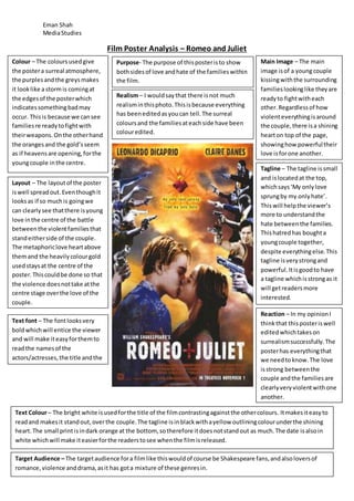
- 1. Eman Shah MediaStudies Film Poster Analysis – Romeo and Juliet Colour – The coloursusedgive the postera surreal atmosphere, the purplesandthe greysmakes it looklike astormis comingat the edgesof the posterwhich indicatessomethingbadmay occur. Thisis because we cansee familiesre readytofightwith theirweapons.Onthe otherhand the orangesand the gold’sseem as if heavensare opening,forthe youngcouple inthe centre. Main Image – The main image isof a youngcouple kissingwiththe surrounding familieslookinglike theyare readyto fightwitheach other.Regardlessof how violenteverythingisaround the couple,there isa shining hearton top of the page, showinghow powerfultheir love isforone another. Layout – The layoutof the poster iswell spreadout.Eventhoughit looksas if so muchis goingwe can clearlysee thatthere isyoung love inthe centre of the battle betweenthe violentfamiliesthat standeitherside of the couple. The metaphoriclove heartabove themand the heavilycolourgold usedstaysat the centre of the poster.Thiscouldbe done so that the violence doesnottake atthe centre stage overthe love of the couple. Tagline – The tagline issmall and islocatedat the top, whichsays‘My onlylove sprungby my onlyhate’. Thiswill helpthe viewer’s more to understandthe hate betweenthe families. Thishatredhas boughta youngcouple together, despite everythingelse.This tagline isverystrongand powerful.Itisgoodto have a tagline whichisstrongas it will getreadersmore interested. Text Colour– The bright white isusedforthe title of the filmcontrastingagainstthe othercolours. Itmakesiteasyto readand makesit standout,overthe couple.The tagline isinblackwithayellow outliningcolourunderthe shining heart.The small printisindark orange at the bottom, sotherefore itdoesnotstandout as much.The date isalsoin white whichwill make iteasierforthe readerstosee whenthe filmisreleased. Realism– I wouldsaythat there isnot much realisminthisphoto.Thisisbecause everything has beeneditedasyoucan tell.The surreal coloursand the familiesateachside have been colouredited. Purpose- The purpose of thisposteristo show bothsidesof love andhate of the familieswithin the film. Target Audience – The targetaudience fora filmlike thiswouldof course be Shakespeare fans,andalsoloversof romance,violence anddrama,asit has gota mixture of these genresin. Reaction – In my opinionI thinkthat thisposteriswell editedwhichtakeson surrealismsuccessfully.The posterhas everythingthat we needtoknow.The love isstrong betweenthe couple andthe familiesare clearlyveryviolentwithone another. Text font – The fontlooksvery boldwhichwill entice the viewer and will make iteasyforthemto readthe namesof the actors/actresses,the title andthe tagline.