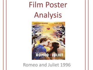
2. Purpose
The purpose of the poster is
mainly advertisement reasons;
however it’s used to show
those involved in the
production such as the
director and producers. It
highlights the two main
characters who are positioned
at the bottom centre of the
poster and also the many
people who are involved in the
poster. It also shows the
viewers that this film will be of
violence but will a romantic
feel
Key Image
The two images are of a
couple immersed with each
other and the brutal gun fight
of individuals on either side.
We clearly come to the
conclusion that the couple are
Romeo and his lover Juliet due
to the title; they have taken
their role seriously as two
bittersweet lovers with the
intense kiss. However the
overall image loses its positive
aspects with the coinciding
battle on either side, this
indicates that those fighting
are on the left side may be on
Romeos side of the family
whilst those on the right will
be on Juliet’s. This
incorporates William
Shakespeares love story but
with a modern twist
3. Background
Colour
The background has a
psychedelic look with the
purple and orange haze.
The clouds do not come
across calm or tranquil
making it seem like
something nerving will
occur. The burning heart is
actually the sacred heart
which seems to fit in with
whole concept of the
poster as it’s a bittersweet
image
The poster has a very vintage
look to it. The poster hasn’t
got too much colours involved
but mainly orange and bluish
tones. The main colours can
be seen within the background
whilst those in the battle are
in black and white or in a blue
hue, this goes well with the
colour scheme of the
background. Romeo and Juliet
are not in any overpowering or
bold colours but are just in
ordinary clothing which will
portray ordinary colours.
The title colour is just in plain
white which is very simple. I
really like the casts name text
colour as it appears that it is
burning with an orange glow
coming out of it, it is very
appealing and it goes with the
backgrounds orange cloud-like
image
4. Text Font
The actual text style is
quite plain in simple and
ordinary sans serif type,
however it does come
across quite edgy as it has
a very grunge like look to it
with shattering effects
within each letters this
could be due to the
edginess of the poster. The
text of the heading and
subtext is very large but
not too overpowering were
it will take our attention of
the images, I really like the
size as it is very clear
Tag Line
The tag line states “my
only love sprung from my
only hate”, this doesn’t
give too much away but
however tells the audience
it’s a love story. Those who
are familiar with the
famous Shakespeare love
story will be aware of the
meaning to the tag line
that it is indeed a love
triangle story and that the
feuding and disagreements
have brought the couple
together
5. Layout
Straight away we see a great
contrast within the poster, we can
see the feuding sections on each
side which comes across very
negatively, then we see the loving
couple who are immersed with
one another and are not fazed by
their surrounding. We can already
come to the conclusion that the
topic of the film will be around
love and violence and feuding
families. The fact that the battle
are on each of the couples side
suggests that each side are
battling for each of the couple
showing that they defend their
family members, this is very mafia
inspired. The battle seems to
calm down a little with the sacred
heart in the middle of the fight,
this could be the extinguish of the
battle showing that the negativity
will not come in between the
couples love for each other
Target Audience
A mature audience will be
best suited for this film due
to the genre. Young adults
could be targeted due to
the age of the two main
couple, they seem to be
rather young themselves
so could appeal to that age
group. Those who are
interested in love and
action films intertwined
and also the original
Romeo and Juliet story will
be the target audience
6. Overall Opinion
This poster is a great way to modernise an old love tragedy
story written in the 1500s. I love how they outlined this
with the use of weapons (from swords to guns) and the
individuals’ attire which is a common indicator of the
present. The poster tells us a lot about the film such as how
violence can somehow bring a couple closer to one
another; though it doesn’t give too much away so the
audience know what they are looking forward too