Call Girls In Gorakhpur Escorts ☎️8617370543 🔝 💃 Enjoy 24/7 Escort Service En...
Q2 poster
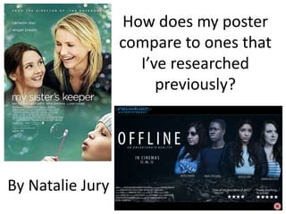
1. How does my poster
compare to ones that
I’ve researched
previously?
By Natalie Jury
2.
3.
4. Both images display clear shots of the main
images characters, allowing audiences to establish
their role within the movie and also
enticing audiences if they see an actor that
they had previously liked. The images are
both central within the poster with close
ups of the characters faces, showing there
expression, suggesting more about the
mood of the movie.
5. Both posters display simple backgrounds
emphasizing the images within the
background foreground. The coloring within my sister
keeper is a very natural bright green
which can be linked with their smiles
sending a more light hearted positive
message compared to offline which is
very dark highlighting the gritty elements
within my trailer. The use of the city
backdrop also helps to set the scene.
6. The titles can seen to be very similar within
both posters, with both displaying plain white
titles text, in a simple and clear font. The main
difference is the case in which they are written
in, with My Sisters Keeper being in lower case
and Offline in upper. This continues with the
idea that Offline is more dramatic, making text
look more urgent aswell as font being more
sharp in comparison to the more rounded text.