
Recommended
More Related Content
What's hot
What's hot (20)
Viewers also liked
Viewers also liked (19)
Similar to Task1 4e
Similar to Task1 4e (20)
More from ReeceEcR
More from ReeceEcR (20)
Recently uploaded
Recently uploaded (20)
Task1 4e
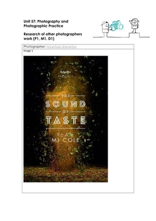
- 1. Unit 57: Photography and Photographic Practice Research of other photographers work (P1, M1, D1) Photographer: Jonathan Knowles Image 1
- 2. Image 2 Image 3
- 4. Image 4
- 5. Image 5
- 6. Image 6
- 8. Theme or focus of images The main focus of these images is the product being advertised, As you can see in image one there is an explosion of colour and herbs. In big white letters that are in the front right at the middle it says the sound of taste. The fact that the text is right in the middle shows that it is the main focus of image 1. Image 2 is an album cover for black Sabbath or a poster, black Sabbath is a heavy metal rock band so all the colours in the shot are dark and washed out, and right in the middle is a big and bold 13 which is on fire. Everything in the image represents the band in a way, which you could say that the image is symbolic. Image 3 is an advertisement poster for carling cider. Right in the middle of the image is the product with water all around it, the effect is to make you thirsty and the bottle look refreshing. Right at the top in all capital letters is the product slogan, its all in capitals so it stands out and makes you want to read it. Image 4 is a clever advert from Coke cola, The image consists of half a 6pack of cokes and half a 6pack of a man, this is a way of trying to make the viewer of the image wonder whether the slogan, “there’s nothing like a six pack to put a smile on your face.”, is talking about the man or the coke. Image 5 is an advert for Evian water, the picture is mostly blue and only has a few words which to me suggest that they were trying to make the advertisement simple but effective. Image 6 is a poster for Weetabix, the product is placed right in the middle of the image which suggest to me that it is the main focusing point. Composition All the images were taken with a close up shot of the product, this is so that the viewer of the photo will clearly be able to see what is being advertised, and also most of them were placed in the middle of the image to show that they are the most important thing in the image. Generally for most adverts a long shot of a product would be pointless because you want people to see the product with ease and be able to guess what it is straight away. Techniques used The photographer has defiantly y used rule of thirds in my opinion. Also the photos would have been edited on Photoshop to add in certain objects that were not in the original shot and to place the text in the right places. Strengths & Weaknesses The images are very good at getting the main focus of the product across quickly for example the carling being refreshing. Also the colours used are specifically picked to match the products identity, like the black Sabbath has dark colours and the Evian image has blue colours. I think one of the weaknesses of image one and two is that there isn’t a lot in the photo which shows what it is advertising, for example image one if you didn’t know the names or brand you wouldn’t know what it was advertising and is you didn’t know who black Sabbath were you might not know it was a band.