1. Front Cover Research
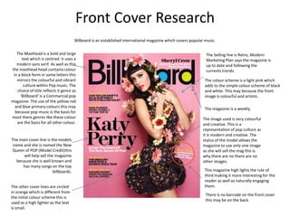
Billboard is an established international magazine which covers popular music.
The Masthead is a bold and large The Selling line is Retro, Modern
text which is centred. It uses a Marketing Plan says the magazine is
modern sans serif. As well as this up to date and following the
the masthead head contains colour currents trends.
in a block form in some letters this
mirrors the colourful and vibrant The colour scheme is a light pink which
culture within Pop music. The adds to the simple colour scheme of black
choice of title reflects it genre as and white. This may because the front
‘Billboard’ is a Commercial pop image is colourful and artistic.
magazine. The use of the yellow red
and blue primary colours this may The magazine is a weekly.
because pop music is the basis for
most there genres like these colour The image used is very colourful
are the basis for all other colour. and creative. This is a
representation of pop culture as
it is modern and creative. The
The main cover line is the models status of the model allows the
name and she is named the New magazine to use only one image
Queen of POP (Model Credit)this as she will sell the mag this is
will help sell the magazine why there are no there are no
because she is well known and other images.
has many songs on the top
billboards. This magazine high lights the rule of
third making it more interesting for the
reader as well as naturally engaging
The other cover lines are circled them.
in orange which is different from
There is no barcode on the front cover
the initial colour scheme this is
this may be on the back.
used as a high lighter as the text
is small.
2. Front Cover Research
Blender is a Pop magazine know as the ultimate guide to music and more.
The skyline also has
different colours used
(grey) this states what The Masthead used is centred ad uses
else will be in the the entire top of the front cover. The
magazine without colour is a deep purple which reflects
drawing attention from the models used. As well as this as
the main cover lines as Blender is an established magazine
it is smaller and in a they don’t need to have the images
milder colour. used at a clear distance from the
masthead.
The main cover line used is
the same swatch used for The images used have a variety of positioning
the masthead and stands and this may reflect the hierarchy with in the
out in contrast to plain girl group, As well as having full length shots he
whites and backs used . magazine is overtly advertising the group new
The cover lines main album and the choice of outfit replicates this as
points are in bold “NEW they are all wearing white symbolising a fresh
ALBUM” which help the new image.
reader pick out the most
important information. As this magazine is trying to fit in 5
figures the rule of third is ignored.
Other surrounding cover
lines follow this rule of the
important parts high
lighted in bold for example The colour scheme used is simple and reflects
“135 & Kings of Leon” . How more of the girl group than the genre of the
ever the are placed lower to magazine as pop is vibrant and creative genre
allow the main cover line to or music. The use of a dark purple is attractive
have the main position. and an effective eye catcher for the readers
without drawing attention form the main
image. The use of blacks and greys had a
The bar code in place in the subtle effect on the magazine however the
lower left hand corner text is still reader able .
Blender is a monthly issue magazine.
3. Front Cover Research
Top of the Pops is a British pop magazine which originates to the late television music chart.
The masthead captures the glitz
of the pop culture with the glitter Similar to other pop culture
and the colour of the text as well magazines Top of the Pops has a sky
as tying in with the colour line with images this informs the
scheme. The font used is modern reader f there interesting things to
and uses sans serif front. The look forward to such as a quiz.
centred position follow the
conventions within the magazine
The main image is a mid shot showing happy and
world. However the position of
vibrant figure which ties in with the main cover
“of the” saves space allowing the
line. The figure is dressed in all back which may be
text to be big and also has a retro
contradictory to the statement “I’ve beaten my
feel.
Haters” however the lively colour scheme over
rides this.
The main cover line has a use of
many colours and goes against The colour scheme used is energetic and
the convention of a simple one eye catching which will appeal to their target
coloured text. As well as the audience of young girls and boys . The use of
size of the text the angle draws pinks reds whites and purples clash however
attention to the readers. The they give the magazine a youthful look.
main cover line also has a small
piece of text in a block colour Going against many of the pop culture
shape giving the reader more magazines Top of the pops has more
information on the main story. then one main image. The smaller
images surrounding show and tell the
The rule of third is not used in this reader what else there is in the
magazine this may because the shot magazines supported with text. As well
Is a middle shot and the position of as this there is use of different shapes
the figure is of less importance to the The barcode ins placed at the bottom of the magazine and which is not common in pop magazines.
facial expression. also the price and weekly issue is also positioned here.
4. Front Cover Research
We (love) Pop is a new pop culture magazine highlighting not only pop music but pop fashion and lifestyle.
The mast head for We (love) Pop is The colour scheme is bright with yellows
one which interpretation is obvious pinks and whites. The colours do not clash
and unconventional. Instead of but they work well together. The bright
having the masthead centred and colours represent a bright music culture
large the editor have chosen to place within pop. There is no use of a background
the masthead in a speech bubble as colour which is good because the issue of
if it would be some thing a reader colour is mainly with in the text.
would say “we love pop” . As well as
this the use of a heart instead of the The main image is a large mid shot showing a
word love is a modern device which female happily smiling wearing a daring white
reflects pop culture as it is a creative dress which related to one of the supporting
world. cover line “X rated is pop too rude”. The
position of the figures arms are in a relaxed
There are other images in the front place which is open and welcoming.
cover of the magazine which is different
to other pop music magazines. They are The main cover line is positioned at an angle
smaller so they do not over power the and is in the main colour (pink) with in the
main image. As well as other artist the colour scheme. The font used is a modern and
magazine also focus on clothing which is has an edge to it as some of the text is solid
influenced by Pop music and their block. The main cover line continues
artists. underneath in contrasting white and in a
smaller font as this is just additional
information . This is also on an angle because it
We (love) pop has also put their help the complete cover line layout look
skyline on the bottom of the page organised.
instead of the top this challenges the The magazine respects the rule of
conventions within in the magazine Third as the main image is position on
world. The colours used are also eye the right hand side of the magazine
catching and the word “exclusive” this allows the image to catch the eye
informs the reader there is more The barcode is position in the bottom right corner of the reader when on the shelf and
interesting article inside. along with the week issues date. when looking at it.