1. Contents Page Research- NME
The issue date is important as it allows
the readers to know the article they The NME logo helps establish the
are reading a current story. magazines brand and image to
readers. And also links to the front
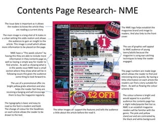
The main image is a long shot of 4 males in
cover.
a urban setting this adds realism and allows
the audience to gain an insight to the
article. This image is small which allows
more information to be placed on the page. The use of graphics will appeal
to NME audience of young
NME have a “This week column” by teens/adults because the
having this they are able to include more magazine is using eye catching
information in they contents page as techniques to keep the reader
well as having a simple way for reader to engaged.
find articles. As well as showing what is
in this weeks issue NME have a small
section where they show what will be in The page numbers are made large
following issues this gives the audience which allows the reader to find and
some thing to look forward to. interesting story quickly. By having a
little information on each article the
The use of a promotional offer ins readers can find a story suitable for
bright yellow grabs attention and also them. As well as flowing the colour
helps the reader feel they are scheme the
receiving a barging and will encourage
them to buy the magazine regularly. The colour scheme is bright and
would appeal to a youthful
audience the contents page has
The typography is basic and easy to a slight indie/popular feel but as
read as the font is modern and bold. NME is an establish magazine
The change of colour for the headlines The other images all support the features and tells the audience readers will be familiar with the
on each article allows the reader to be a little about the article before the read it. genre. The pink and yellow
drawn to the text. stand out and are contrasted by
the black and white background
2. Contents Page Research- SPIN
The use of the magazine logo grabs the
The use of a pull quote is uses
readers attention as it is the only bright
as a tool to get readers to read
colour page it also is can be used as a
their main cover story, and
tool to establish the magazine with its
add background info for the
readers making them aware this is Spin
main image.
magazine. The date issue is placed
underneath which is informative to
reader. The lay out of this contents page is
contents page is simple the text is
aligned to the left . The image is
place on the last third of the page
The colour scheme is vey basic but the
and looks similar to a font cover.
grey background allows the main image
to stand out.
The main image is dramatic in contrast
to the white text and red logo. Is grabs
the readers attention as it’s a full length
The text is place in numerical order and shot.
the main aspect is in bold which will
catch the readers attention. The sizing
of the main body of each article is quite Using the convention of having one
small making it less noticeable and image spins contents page has no
hard to read. supporting images this may be to
keep the page simple of to avoid
drawing attention from the main
The “On the Cover” section links the image.
contents page to the front cover and
states the relevance to the image.
3. Contents Page Research- THE FLY
The main image is a close up of a
female this may suggest the majority
The colour scheme is simple, the white
of their audience is female . The facial
background contrast the image and tile . The
expression suggest power and
black text stands out and is not over
domination. The models make up
powered
follows the colour scheme as it the
same colour as the title.
This contents page challenges the codes
and conventions of typical contents pages .
The editors have chosen to have the issues
A Caption is paced near the photo
date is the predominate title for the
to add credit to the photographer.
contents page . The choice of a bold colour
which has been made translucent adds
colour to a simple colour scheme.
The lay out of this contents page is
different in comparison to other By having the page number attached to the
contents page the image does not image it makes is easier for the reader to skip
take up the entire background of to the main story. The page numbers are
the page and the text is position at bold which makes it easier for the reader to
bottom. find stories and improves the typography.
The variation of the font size also makes the
page numbers stand out and draw attention.
The use of columns to arrange the
text increases readability and helps
engage the reader more.