
Recommended
More Related Content
What's hot
What's hot (20)
Viewers also liked
Similar to Music MagazineFront Cover Analysis
Similar to Music MagazineFront Cover Analysis (20)
More from bdr628
More from bdr628 (20)
Recently uploaded
Recently uploaded (20)
Music MagazineFront Cover Analysis
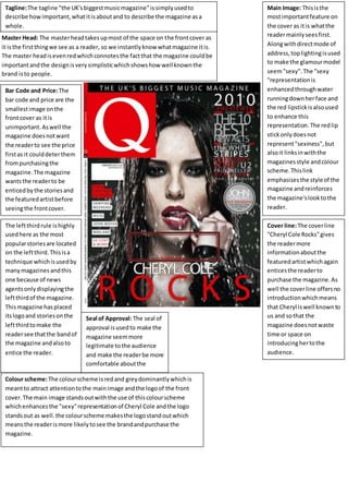
- 1. Master Head: The masterheadtakesupmost of the space on the frontcover as it isthe firstthingwe see as a reader, so we instantlyknow whatmagazine itis. The master headisevenredwhichconnotesthe factthat the magazine couldbe importantandthe designisverysimplisticwhichshowshow wellknownthe brand isto people. Main Image: Thisisthe mostimportantfeature on the cover as itis whatthe readermainlyseesfirst. Alongwithdirectmode of address,toplightingisused to make the glamourmodel seem"sexy".The "sexy "representationis enhancedthroughwater runningdownherface and the red lipstickisalsoused to enhance this representation.The redlip stickonlydoesnot represent"sexiness",but alsoit linksinwiththe magazinesstyle andcolour scheme.Thislink emphasisesthe styleof the magazine andreinforces the magazine'slooktothe reader. Tagline:The tagline "the UK'sbiggestmusicmagazine"issimplyusedto describe howimportant,whatitisaboutand to describe the magazine asa whole. Bar Code and Price:The bar code and price are the smallestimage onthe frontcover as itis unimportant.Aswell the magazine doesnotwant the readerto see the price firstas it coulddeterthem frompurchasingthe magazine.The magazine wantsthe readerto be enticedbythe storiesand the featuredartistbefore seeingthe frontcover. The leftthirdrule ishighly usedhere as the most popularstoriesare located on the leftthird.Thisisa technique whichisusedby manymagazinesandthis one because of news agentsonlydisplayingthe leftthirdof the magazine. Thismagazine hasplaced itslogoand storiesonthe leftthirdtomake the readersee thatthe bandof the magazine andalsoto entice the reader. Cover line:The coverline "Cheryl Cole Rocks"gives the readermore informationaboutthe featuredartistwhichagain enticesthe readerto purchase the magazine.As well the coverline offersno introductionwhichmeans that Cheryl iswell knownto us and sothat the magazine doesnotwaste time or space on introducinghertothe audience. Seal of Approval: The seal of approval isusedto make the magazine seemmore legitimate tothe audience and make the readerbe more comfortable aboutthe purchase of the magazine Colour scheme:The colourscheme isredand greydominantlywhichis meantto attract attentiontothe mainimage andthe logoof the front cover.The main image standsoutwiththe use of thiscolourscheme whichenhancesthe "sexy"representationof Cheryl Cole andthe logo standsout as well.the colourscheme makesthe logostandoutwhich meansthe readerismore likelytosee the brandandpurchase the magazine.
- 3. Master Head: The master headisfollowingthe thirdrule as it ison the leftthird.This showsthe potential reader that the magazine is “billboard”.The factthat the mainsingerof the featured band“Imagine Dragons”is editedoverpartof the master headshowsthe readerthe readerthe featuredband.This showsthe readerwhatband is featuredinthe magazine butit alsothe fact that the reader knowsits“billboard”sothe magazine ismore concerned aboutconveyingthe bandthat isbeingfeaturedintheir magqazine. Main Image: The mainimage isclearlythe featuredband and theyall followacolour scheme. The bandis wearing a varietyof coloursbut theyall surroundthe colourscheme of violet-blue. Thisshowsme that the band costumesand the backgroundof the images correlate tocreate a better frontcover thatseemsmore organised. Overall,Ireallylike thisdesignasitemphasisesonthe featured bandrather than relyingonotherpopularstoriestoentice the readerto readthroughthe magazine.AnyimagineDragonfan will immediatelyrecognisethemonthe coversothe thirdrule doesn'tapplyhere asthe entire frontcoverisbuilttoemphasise that Imagine Dragonsisthe featuredband. Side Features:Most magazinesfollow the leftthirdrule whichmeansthatthe mostpopular and biggeststorieswill appearonthe leftthirdtoensure thatitcapturesthe attentionof the target audience. “Billboard”hasnotfollowedthatrule astheyhave placedtheirside featuresonthe verytop of the page.I believe theyhave donethistoemphasiseonthe importance andpopularityof the bandwhichmeansthe readerismore directedtothe featuredbandratherthan otherstories.The background hasalsobeenfadedtoa darker shade of the backgroundcolourto allow the topstoriestobe see able to the reader.The size of the textfor the storiesimmediatelyshowsusthatthe magazine againisemphasising the enormityof the bandbeingfeatured.Ithinkthisisa goodstrategybecause the reader clearlyboughtthe magazine toreadabout imagines dragonsnotthe otherstories. DirectMode of Address:the direct mode of addressis usedthroughthe main image as the featured bandis lookingdirectly at the readerratherto the side.This technique ismainly usedto entice the potential buyerand readeras the band is lookingdirectlyat them.Thistechnique isusedby manyother magazines. Tagline:The emotive language usedonthe frontcover isvery effectiveatenticing the readerto read the magazine asthe title “Reimagined”whichis a playon wordsbut enticesthe reader.It enticesthe readeras clearlytheyare interestedinthisband and the tagline used intriguesthemsothey will readthe magazine to gainthe desired information. Emotive Language: The language usedbelowthe tagline isveryemotive asit statesthat the featuredband “imagine Dragons”isgreat as theyperformedatthe Grammys andare releasing theirnewalbum.The wording “That’s justone waya massive rock band comesoutswinging on itssophomore album.This isveryemotive asitdetails howthe band came out “swinging”withitsnew album.