
Recommended
More Related Content
What's hot
What's hot (20)
Viewers also liked
Viewers also liked (14)
Similar to COVER PAGE ANALYSIS
Similar to COVER PAGE ANALYSIS (20)
Recently uploaded
Recently uploaded (20)
COVER PAGE ANALYSIS
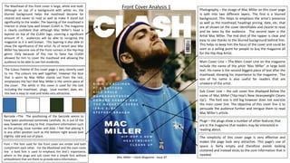
- 1. The Masthead of this front cover is large, white and bold. Although on top of a background with white on, the blurred background helps the masthead become far cleared and easier to read as well as make it stand out significantly to the reader. The layering of the masthead is interest in show how well known CLASH is. The magazine is clearly confident that although Mac Miller’s head is layered on top of the CLASH logo, covering a significant amount of it, audiences will be able to recognise the magazine as it is well known. This layering is also able to show the significance of the artist. As of recent year Mac Miller has become one of the front runners in the Hip-Hop genre. Only because of this rise to fame has CLASH allowed for him to cover the masthead and allowing the audience to be able to see him evidently. Photography – the image of Mac Miller on this cover page is split into two different layers. The first is a blurred background. This helps to emphasis the artist's presence as well as the masthead, headings pricing, date, etc. that are all shown on the cover identifiable and clearer to read and be seen by the audience. The second layer is the Artist Mac Miller. The mid shot of the rapper is clear and easy to see thanks to the blurred background behind him. This helps to keep him the focus of the cover and could be seen as a selling point for people to buy the magazine all for the Hip-Hop Artist. Barcode –The The positioning of the barcode seems to have been positioned extremely carefully. Its is out of the way however still easy to find. Important information such as the pricing, issue number and date. I feel that placing it in any other position such as the bottom right would look slightly odd and out of place. The Colour Palette of this cover page is very cleverly used to me. The colours mix well together, however the blue that is worn by Mac Miller stands out from the rest, emphasises the fact that Mac Miller is the centre piece of the cover. The white in this cover is used for the text including the masthead, plugs, issue number, date, etc. this text is easy to read and looks very attractive. Front Cover Analysis 1 Main Cover Line – The Main Cover Line on the magazine include the name of the artist ‘Mac Miller’ in large bold text. His name is the second biggest piece of text after the masthead, showing his importance to the magazine. The size of his name is also useful for readers that are unaware of the artist. Sub Cover Line – the sub cover line displayed below the name of Mac Miller (‘Hip-Hop’s New Heavyweight Cleans Up’). The font size is still big however does not oversize the main cover line. The objective of this cover line is to persuade the audience further and intrigue them to read Mac Miller’s article. Plugs – the plugs show a number of other features that are In the magazine that readers may be interested in reading about. Mac Miller – Clash Magazine : Issue 87 The simplicity of this cover page is very effective and makes the page look very attractive. This page’s use of space is fairly empty and therefore avoids looking cluttered and instead sticks to the core information that is needed. Font – The font used for the front cover are similar and both compliment each other. For the Masthead and the main cover line a bold font is used to emphasis the text’s importance, where as the plugs and sub cover line a simple font without embodiment that are there to provide extra information..
- 2. Photography – The image used involves Hip-Hop artist Kendrick Lamar. He is pictured in a close up shot where he is posing directly at the camera with a straight face, implying that he is drawing in an audience. Barcode – the barcode for this magazine is located in the bottom left of the page. It is surrounded by details such as the price, issue, date, etc. The location of the barcode is out of the way however positioned so that it can be clearly seen by the reader once they pick it up. The Colour Palette of this cover page uses bright colours as a way to stand out. The mix of purple and green in the background blends well behind Kendrick Lamar and the colours reflex light of green and purple on his face. Besides the text surrounding the barcode and a few artist names, the majority of the text on the cover is white. This colour works well as it is clear and readable. Front Cover Analysis 2 Cover Lines – the headline on the magazine include the name of the artist ‘Kendrick Lamar’ in large bold text. His name is the second biggest piece of text after the masthead, showing his importance to the magazine. The size of his name is also useful for readers that are unaware of the artist and make audiences understand that he is the primary feature on that issue of the magazine. Positioned below the Artist’s name and it simply gives an indication to the audience on what his article will be about. In this case this cover line says ‘In My Own Words’, indicating that the article will consist of a interview. This is supported by the quotes on the left is of the cover page that provide a small extract. This will intrigue readers and make them want to read more. The main audience of this magazine would be people of which have a interest in the Hip-Hop/Rap Genre. This can be understood due to the cover star Kendrick Lamar as well as the other names featured on the cover, all of which are Rappers. Plugs include a number of different artists that are featured in the issue of the magazine. This helps to make audiences aware of other artists in the issue to interest them further into reading/purchasing a copy. Kendrick Lamar – XXL Magazine – Winter 2014 The Masthead of this front cover is well known red and white XXL logo which is positioned in the top left of the cover. Also it is layered for it to be partially covered by Kendrick Lamar’s Head. Being such a well known magazine, XXL’s audience will be able to clearly know what the magazine is. Kendrick Lamar is a Hip-Hop Artist that in recent years has become one of the most appreciated talents in the music industry. Having this kind of status clearly explains the importance he has and therefore, he is layered over the title. Because his image being on the magazine would sell more copies. Font – The fonts used on this page are extremely effective in attracting an audience. Firstly, a Strong Bold font is used for the headline to ensure that it stands out and draws peoples attention. Lesser important text, that has little to no correlation to the cover is not written in the large font and is instead written in a thinner and smaller font.
- 3. The Masthead of this front cover is a large white title that has one of the highest layers of the design. The name (Fader) overlaps the artist as a way to show it’s brand and make it clear to audiences what magazine it is. This is done without obstructing the image of Tyler, The Creator. The letter F in the title creates an aesthetic effect in how the box surrounding the F is white rather than a normal White F letter. This adds a form of attractiveness to the cover and makes it unique to most magazine which simply stick to writing their name in at the top. The Colour Palette of this cover page includes: White, Teal Blue, Orange and Yellow. The colours used a bright and vibrant and do a great job at attracting the eye because of this. All the colours mix well together Font – The bold font used for the front cover remains the same throughout. The consistency of this is effective as it shows the professionalism involved. Photography – the image of Tyler, The Creator is a close up shot where his is posing from a sideward position looking directly in the centre. The image is cleverly taken as from whatever position the audience is looking from, it looks as if Tyler’s eyes are fixed on them as a way to draw them in. The simplicity of this cover page is the main component to what makes it so aesthetically pleasing.. The cover lacks a barcode and additional headings which focuses the readers attention to Tyler, The Creator. Lack of a barcode on the cover page also provides the magazine with the feeling of being a high end, well established product which look extremely professional. Front Cover Analysis 3 Tyler, The Creator, FADER Magazine, Issue 95, December/January 2015 The Artist’s name is centred in the bottom of the cover page. In large bold lettering. in large bold text. His name is the second biggest piece of text after the masthead, showing his importance to the magazine. The size of his name is also useful for readers to become aware that his is the primary feature on this issue of the magazine. The background of this cover page is an all orange theme. This supports the character of Tyler, The Creator and his love for bright and vibrant colours and his fashion sense.