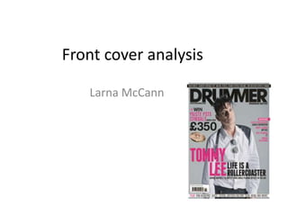
2. Masthead
The masthead of the magazine reads “DRUMMER” which helps to
anchor the genre of the magazine (rock) and immediately conveys to
consumers what the contents of the magazine is focused on. It is
written in a bold font which makes it stand out helping to attract a
wider audience as its very eye-catching. The colour of the font is
black which again has connotations of the rock genre and fits in with
the colour scheme. The artist’s head who is featured in the magazine
is slightly overlapping the title which suggests how popular the brand
is as it can be covered up yet is still recognisable.
3. Main image
The main image is of Tommy Lee, a well-known
rock artist with many fans which in turn, will
attract more buyers. A mid long shot is used to
capture him which is effective as it enables the
audience to see more of him making him easier to
recognize. His code of attire symbolizes the rock
genre as the colour scheme of his outfit includes a
wide use of black representing the style of music
he creates. In the image, he is directly addressing
the audience which entices in readers and
establishes a relationship with them making them
want to read the article.
4. Sub lines and cover lines
The sub lines and cover lines appear both on the far right and
far left sides of the magazine. These reveal information and
give hints on what the contents of the magazine will be based
upon. Within these, numerous artists names are mentioned
which helps to attract a wider audience as although these
people may not feature in the main image, their names still
appear on the front cover suggesting how they will feature in
the magazine, appealing to their fans.
5. Main coverline
This is smaller than the masthead yet bigger than the other cover lines. The
font colour is the same as the other cover lines but it is written in a more bold
style making it more eye-catching. The text of the main coverline reveals
what the main article is about/who the magazine features. This helps to
appeal to fans of that particular artist.
6. Buzzwords
The buzzwords “WIN” and “PLUS” both appear on
the front cover which help to draw in readers as
both words suggests that the readers are getting
more than they’re paying for and a good value for
money. The word ‘win’ inevitably entices in readers
as it reveals how buyers have a chance to win a lot
of money and are not losing out on anything by
purchasing the magazine.
7. Colour scheme
The colour scheme of the magazine consists of black,
pink, grey and white. Black is a very typical colour for
a rock product helping to anchor the genre of the
music that the magazine features. This suggests to
rock fans that this magazine is right for them and the
content is relevant to their tastes. The colour scheme
also includes pink and white which helps to give the
magazine a brighter, more vibrant look. This is more
attractive to the audience and is quite unusual for a
rock magazine however this may work in favour of
the product as it implies how it is unique and the
contents has more appeal.
8. Strap line
This is a banner running along the top of the magazine featuring more
information about the content. It is written in white on a black background
which reinforces the magazine’s colour scheme and fits in with the overall
image of the front cover. The fact that the strap line is at the very top of the
page, attracts buyers who are interested in what the strap line is advertising
as this may be the first thing they read from the front cover.
9. Subsidiary Imagery
There is only one subsidiary image on the front
cover which is of a section from a drum (a symbol).
This may be significant in attracting buyers as many
rock fans play the drums themselves, so this makes
the magazine seem personal to them and relevant
to their hobbies. It also implies how the magazine is
based upon the actual music, rather than irrelevant
information that consumers may not care about.
10. Price, Date & Barcode
These are featured in a the right hand corner of
the magazine taking up a small amount of
coverage leaving lots of space for more text and
images about the articles. However, the
information they reveal is rather important as it
shows to buyers how much they’re paying for the
magazine and whether it is the latest copy.
11. Positioning Statement
The positioning statement helps to anchor the genre of
the magazine reinforcing the theme of rock music.
“Drumming matters” places importance on music and
suggests to buyers that the magazine prioritizes the
creation of rock songs.