2. TRONLEGACY,ISSUE
32
Cyber theme of Tron reflected in cover
design
Favours artistic display of title, rather than eye-catching
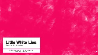
Little White Lies is an independent film magazine
which has been described as "magazines at the
vanguard of the independent publishing
movement”. It has been publishing since 2005
and is known for its bold presentation and unique
layout. It is sensitive to its feature film, creating a
front cover that usually features the main
character or element from the film. The design is
usually heavily artistic, incorporating features
from the film. I have chosen Little White Lies due
to its independent nature, artistic credibility and
interesting cover, opposed to the generic
magazines like Empire, in which the feature film
must adapt to their design.
3. MANOFSTEEL,ISSUE
47
Interaction of image and Little White Lies
logo
Logo sometimes changes for artistic effect, adds to effect
The designs are heavily influenced by the films
themselves. They are also designed by artists
and graphic designers, creating a unique
alternate to re-used graphics that feature so
often in generic film magazines. This design
allows me more freedom within my creative
outlet.
The conventions of Little White Lies are that the
image usually appears as a cartoon, never
featuring an unedited picture.
4. ANOTHER EARTH, ISSUE 38
Two covers, as a
feature
Interaction of logo
Issue 38 is an exceptional example of the craftsmanship that goes into a
Little White Lies cover. Despite it featuring nothing specific about the film,
the magazine still published it, not because it was commercially viable
but creatively stunning
Sci-Fi style
5. SHAME,ISSUE39
Broken effect alludes to his broken marriage and
life
Style is of an expressionalist painting, with
patches of different skin tone and lighting,
creating the effect of tears and separations
within the face. This adds to the ideas of the film.
6. THEBLACKSWAN,ISSUE
33
Bold and striking font attracts attention and is
beautiful
I particularly like this cover of Little White Lies
due to its bold font and stunning sketched
portrait of Natalie Portman. The intensity of the
shot beneath the prison-like font create an
uneasy atmosphere.
7. BLUEJASMINE,ISSUE49
Examples of covers. Each one is different, in
colour, layout, text and style. This really shows
the extent of the freedom of creativity exhibited in
the magazine.