
Recommended
More Related Content
What's hot
What's hot (20)
Viewers also liked
Viewers also liked (20)
Similar to Film Posters: Layout and Composition
Similar to Film Posters: Layout and Composition (20)
Recently uploaded
Recently uploaded (20)
Film Posters: Layout and Composition
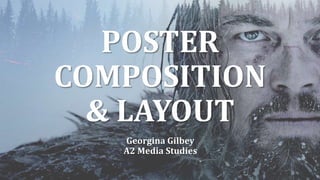
- 1. POSTER COMPOSITION & LAYOUT Georgina Gilbey A2 Media Studies
- 2. CLOSE-UP Close-ups as main images aren’t used very often because they leave little room for other features and don’t give a lot of information about the narrative. However, with this poster for The Purge, the close-up of a masked man is effective because it conveys a sense of the invasion of space, with the sinister smile and stare causing the viewer to feel uncomfortable. This is suitable for a horror film such as this because it clearly shows the genre and so not much information besides this is necessary, besides the release date and taglines to further entice the target audience.
- 3. TWO PERSON CLOSE-UP (ROMANTIC) In the romance genre, the two person close- up is very common for posters, as it immediately conveys intimacy and love. This poster for Blue is the Warmest Color is no exception, with profile views of two women, presumably about to kiss, which makes the nature of their relationship very clear to the audience (this is important because two person close-ups can be used in other genres, and so unless it is obvious, it can be misinterpreted by the viewer).
- 4. TWO PERSON CLOSE-UP (OTHER GENRE) After Earth’s poster also employs the two person close-up technique, except the tone is very different. The two protagonists are staring directly forwards, giving the poster the element of direct address which makes it eye-catching, and their expressions appear determined. This expression is usually associated with the action genre. The tagline, “Danger is real – Fear is a choice” reinforces this and suggests an intense theme (rather than romantic, like the previous poster).
- 5. ONE PERSON LONG SHOT In this poster, the one person long-shot is used both to make it clear who the protagonist is, and to show all costume and props (additionally, it uses star appeal through Zac Efron, who starred in the popular High School Musical franchise). The protagonist is wearing a leather jacket, a t- shirt and a tie, jeans and sneakers. The props he carries are a rucksack, books and sunglasses. Professional wear is strewn on the floor around him, which helps to explain the title ‘17 Again’; he is going back to school. The rhetorical question as a tagline reinforces this theme also (”Who says you’re only young once?”).
- 6. TWO PERSON MEDIUM LONG SHOT The two person medium long shot can be used for almost any genre, as long as there are two significant protagonists. The Theory of Everything uses it to communicate two themes; one of romance, shown through the intimate pose of the couple we see, and one of a biographical nature, as the audience would be aware that this film centres around Stephen Hawking’s life, and we can see multiple equations and calculations written across the sky above them.
- 7. TWO PERSON LONG SHOT This two person long shot is similar to The Theory of Everything’s in that it uses it to show two main protagonists. However, Divergent’s poster also uses it to show a background of a futuristic-looking, but possibly decaying, city. Similarly, it shows props such as guns to communicate an action theme, although the film is of a dystopian science-fiction genre.
- 8. THREE PERSON The three person poster style is essentially used to show three main protagonists or significant posters. This poster is advertising Men in Black 3. As this is an already established series, it can be assumed that the audience would already know what to expect in terms of plot and narrative, so they wouldn’t need a lot of information besides this. The poster also makes use of star appeal, mainly through Will Smith who is in the forefront, while having three characters also matches the film’s title of being the third in the series. The three characters appear identical in terms of costume, while the costume itself, a black and white suit, connotes professionalism and a typical, agent-like uniform.
- 9. ONE PERSON DESCRIBING BACKGROUND The one person describing background style is quite self-explanatory in that it primarily aims to show a background in order to convey its genre, theme, narrative, etc. This poster for The Dark Knight slightly breaks conventions because it shows the antagonist, The Joker, rather than protagonist. The background is of the fictional city of Gotham, and fire, ashes and debris are falling around the antagonist. He has one fist clenched and the other holds a gun, which suggests he is inflicting the destruction and ruin we see.
- 10. GROUP NON-DESCRIBING BACKGROUND The layout of a group with a non-describing background, in this case, is used to emphasise the characters, while other features such as the pink colour scheme suggest the genre and theme. The protagonist is at the front, surrounded by text, while the three antagonists or disruptors of the narrative are behind her. The fact that the protagonist is surrounded, almost boxed in, by text connotes she is feeling trapped, while the costume of the antagonists, the title Mean Girls and the tagline (“Watch your back”) convey the teenage drama genre.
- 11. GROUP DESCRIBING BACKGROUND Conversely, this poster for Need For Speed has a group with a describing background. The background shows obviously very expensive sports cars on a road, with the main characters (a mix of protagonists and antagonists, with an added love interest of the main protagonist) and a helicopter above them. With the film’s title and the cars etc, we can assume that the film’s plot is about racing, while the helicopter looming above connotes the film is of the crime genre because of its association with the police. Essentially, this style of poster is used to convey information about the characters and other elements such as the plot.
- 12. TRIANGLE LAYOUT The triangle layout is used to draw the eye to the centre of the image. In this case, the ‘focal point’ is the two main protagonists, and the eye is then led upwards to the disc Sam, the man on the left, is raising. The other elements such as the futuristic-looking planes are placed around the triangle, meaning they are the last feature the viewer notices, enclosing the main feature.
- 13. GRID LAYOUT The grid layout is quite an organised, but complex structure for a film poster and helps to make it more visually interesting, but they can also carry deeper meanings. In this case, the small squares are used to imply a separation; we immediately see that besides the one portrait of the main protagonist, there are snapshots of happy moments (see the top right image of a couple) and tragedy (third row, third column). The grid layout used here is both enigmatic and telling in terms of genre; it is clearly a drama. Instead of having the whole poster composed of square images, the bottom section is empty and instead has the title and actor/director credits, along with the release date. This helps to stop the viewer from being overwhelmed with visual material and makes the poster appear neat and professional.
- 14. RULE OF THIRDS The rule of thirds is a grid which is split into 9 equally-sized rectangles. It has four intersectional points which can be used to place certain elements. In this poster, from the red lines, we can see that the top row of boxes is allocated to the main protagonists from the shoulders up, the middle row to their torsos and finally, the bottom row to the title, actor/director credits and other general information about the film. The protagonists aren’t placed in the columns respectively, as the woman is in both the second and third columns, but this is also according to the rule of thirds because it helps to keep the image balanced.
- 15. CIRCLE/OVAL LAYOUT The circle layout is used to lead the viewer’s eye around an image – in this poster for Hot Fuzz, the circular shape is used as a type of symmetry; both of the protagonists are dressed identically and even the toothpicks in their mouths are symmetrical. They are separated only by the gun between them. The circular shape is made by their heads and shirt collars, as you can see from the red outlines. Additionally, the circle is on a rectangular poster, which makes it stand out more.
- 16. THE ‘Z’ LAYOUT In the ‘Z’ layout, text is placed at the top and bottom of the poster with the main image in the centre. The text at the top leads the eye downwards, so the viewer can appreciate all elements of the poster. In this poster for The Dark Knight, it may be slightly different because the Batman logo illuminated by fire is such a bright orange, which contrasts with the blue tone of the rest of the image and makes it the most noticeable, but the ‘Z’ layout can still be seen clearly when outlined in red.
- 17. HORIZON LINE LAYOUT The horizon line layout is another grid layout, except it is in quadrants. This poster doesn’t strictly use all quadrants to place its elements respectively, but the horizon line (middle line) roughly marks where the two images seem to separate (the top image of the main protagonist and the bottom image of the island). In this poster, the layout is used to show both the protagonist and the main location of the film that the plot is centred around, and also helps to draw the eye to the main protagonist first, because the text is all at the bottom and not crowding his face.