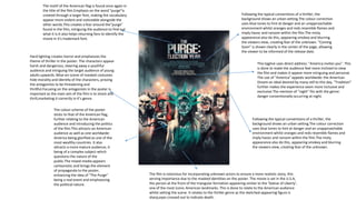
1. The film is notorious for incorporating unknown actors to ensure a more realistic story, this
serving importance due to the masked identities on the poster. The movie is set in the U.S.A,
the person at the front of the triangular formation appearing similar to the 'Statue of Liberty',
one of the most iconic American landmarks. This is done to relate to the American audience
whilst setting the scene. It relates to the thriller genre as the sketched-appearing figure is
sharp,eyes crossed out to indicate death.
Following the typical conventions of a thriller, the
background shows an urban setting.The colour correction
uses blue tones to hint at danger and an unapproachable
environment whilst oranges and reds resemble flames and
imply havoc and ransom within the film.The misty
appearance also do this, appearing smokey and blurring
the viewers view, creating fear of the unknown.
The colour scheme of the poster
sticks to that of the American flag,
further relating to the American
audience and introducing the politics
of the film.This attracts an American
audience as well as one worldwide:
America being glorified as one of the
most wealthy countries. It also
attracts a more mature audience, it
being of a complex subject which
questions the nature of the
public.The mixed-media appears
cartoonistic and brings the element
of propaganda to the poster,
enhancing the idea of "The Purge"
being a real event and emphasizing
the political nature.
Hard lighting creates horror and emphasizes the
theme of thriller in the poster. The characters appear
harsh and dangerous, steering away a youthful
audience and intriguing the target audience of young
adults upwards. Mise-en-scene of masked costumes
hide morality and identity of the characters, proving
the antagonists to be threatening and
thrillful.Focusing on the antagonists in the poster is
important as the main aim of the film is to shock and
thrill,marketing it correctly in it’s genre.
The motif of the American flag is found once again in
the title of the film.Emphasis on the word "purge"is
created through a larger font, making the vocabulary
appear more violent and noticeable alongside the
other words.This creates a fear around the"purge"
found in the film, intriguing the audience to find out
what it is.It also helps returning fans to identify the
movie in it's trademark font.
Following the typical conventions of a thriller, the
background shows an urban setting.The colour correction
uses blue tones to hint at danger and an unapproachable
environment whilst oranges and reds resemble flames and
imply havoc and ransom within the film.The misty
appearance also do this, appearing smokey and blurring
the viewers view, creating fear of the unknown. "Coming
Soon" is shown clearly in the center of the page, allowing
the viewer to be informed of the release date.
This tagline uses direct address: "America invites you". This
is done to make the audience feel more inclined to view
the film and makes it appear more intriguing and personal.
The use of "America" appeals worldwide: the American
Dream an ideal desired by many still to this day. "Tradition"
further makes the experience seem more inclusive and
exclusive.The mention of "night" fits with the genre:
danger conventionally occurring at night.
2. The background of the image is white, keeping the
main focus on the star of the film. This hints that the
location of the film is insignificant, the main story
being specific to the person rather than her
surroundings (proving it to be a psychological thriller)
Dark eye makeup mimics the eyes of a swan, fitting
with the title of the film and storyline. Her skin is
painted and airbrushed white, once again mimicking
a swan whilst allowing the dark eyes lips and
contours of her face to stand out more and appear
more impressive and demon-like.
Red eyes match lips to create the sense of danger
and inform the genre of the film. The red tones are
continued throughout the poster and is used on
font to resemble blood and gore: found in the
thriller genre.
The only parts of the photo used that is focused
are her eyes, ensuring that they are the most
dynamic and thrilling as possible. The crown
matches the silver and black tones of the eyes
with sharp ridges which appear slightly like
knifes, hinting at danger in the thriller genre.
The font is narrow and sharp, indicating horror alongside the
deep black contrasting with the white background. In capitals, it
is clearly understood and centred to capture the viewers
attention.
The cast and crew are listed in the billing block less
obviously in this poster. I believe that this is to
keep the focus on that star: Natalie Portman. The
font is in a blood red, continuing the theme of
horror.
Being an unspecific release date, it is not needed to be seen
clearly, the font rounded and deep red with a slight
transparency to blend into the image beneath.
The main stars are listed in a wide
spread font, creating more of an
impact and attracting more
attention to their names. Each star
is very well known- hence being
listed on the poster (to attract fans
and others who are familiar with
their previous work).
The awards are mirrored on each side of the
centred image, balancing one another and in a
dark font matching the dark shades of the eye
makeup. This makes the font noticeable and the
awards more impressive, allowing viewers whom
are interested in the industry to be attracted for
the film itself and not the star power.
3. The tagline proves the film to be thriller: the
violent vocabulary of “killer” proving danger. The
mention of “looks” introduce the personality of
the character, being extremely vain and
egotistical (a sign of psychopathy). The italic font
glamorises the tag line.
The actor is pouting, again proving to be a vain
character, sharp cheekbones giving a model-like
appearance. Christian Bale is very well-known in
Hollywood, attracting a large audience due to his
attractive features and star power. Hard lighting is used
to create shadowing across half of his face, implying
that he suspicious and a dark character. Black
shadowing is conventionally acknowledged with evil in
the theme or thriller.
Reflection is commonly used in thrillers to prove
a double identity, the usage of this once again
enforcing the idea of insanity around the man
and informing the viewer of the complicated
story found.
The title of the film is conventionally presented
on the bottom centre of the page. The silver
shining appearance fits with the theme of
horror, the lettering with a high resemblance to
knives.
Costuming of the character gives a clear
indication of what character he is: professional
and business-like. This can indicate that the
character is serious and once again his neat
outfit implies vanity.
The colouring of the poster follows that
conventional of horror: reds, purples and dark
hues. The cool tones prove an unapproachable
atmosphere. Reds in the background indicate
death, blood and danger.
Following the colour scheme, the billing block’s
font is narrow but stands out against the
complete black background. This balances the
poster’s aesthetics whilst also indicating luxury
of the character through the purple hue (which
also hints at darkness)
Lighting highlights sharp shoulders and the
man’s muscles, further suggesting danger and
violence in the image. His fist is clenched to do
so additionally.