💚😋 Angamaly Escort Service Call Girls, 9352852248 ₹5000 To 25K With AC💚😋
magazine analysis
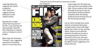
1. Large logo featuring
magazine title. Brand
recognition.
Title “Total Film”
suggests extreme
dedication to film
related content
Large image from film featuring
main stars front and slightly to the
right. Entices audience with image
of people they may or may not
know (Adrian Brody and Naomi
Campbell) while also letting
audiences know primary focus of
the film being promoted.
Text gives more information on what else is inside
the magazine.
Big bold text in bright
yellow featuring name of
the film is eye-catching and
draws people’s attention.
Also, King Kong is a popular
name so it draws in a lot of
people.
More large text showcases
“Preview” issue, suggesting
exclusivity and implying
that it’s a must-have issue.
Use of a dark and light tone colour
scheme consisting of dark greys
and light whites mixed with bright
yellow text creates an eye-catching
colour scheme sure to grab the
attention of audiences as well as
conveying the genre of the film
featured on the cover, with dark
tones suggesting a serious film but
the lighter colours suggesting a fun
fantasy vibe too.
2. Large red magazine title. Grabs
attention, suggests passion
(red). Passion for film.
Title “Empire” suggests vast
content, perhaps even the most
film content of any magazine
Close up image of main
protagonist from featured film
(Harry Potter) immediately gains
attention since it’s front and
centre. Popular character so
everybody knows who it is and is
drawn in.
Use of terms such as
special suggests the issue
is a one off, and the
inclusion of previews also
suggests exclusive content,
persuasion to buy the
magazine. Humourous tagline
links in with image
Images from other films
featured inside the magazine.
If the main feature doesn’t
interest the reader, this might.
Text at the bottom also features other films in the magazine
3. Image from the film front and
centre. Takes up most of the
space, features a popular
character from a popular
franchise and uses bright eye-
catching colours such as red
and blue.
“exclusive”! This is a must have issue,
it has something nothing else has and
therefore you must read it, readers.
Large text shows main feature of the
issue, as well as telling us what
information they have (set details)
Overlay over main logo
suggests a special edition,
explaining theme of the
magazine. in this case, 25th
anniversary links into the
large 25 for 25 feature which
talks about 25 films for the
25th year (2014).
Large text also suggests the
importance of this event.
The image overlapping the logo suggests the film is more
important than what magazine it is. Brand #1 > Brand #2
By now a trademark of the
film magazine – text
features less important films
which you’ll also find
featured inside (seriously,
Exodus?).
Bright colours and bold text over a
blackish background create a more
vibrant image instead of what could
be a boring slab of ink if they used a
less saturated image and thinner text.