1. Most magazine followthe ruleof 3 where the magazinecover will only contain maximumof 3 different colours and text font.
In this magazine the commonly used colours areyellowand white. The main reason to use less than 3 colours is to make sure
the cover doesn't confuse the audience by havingtoo many things going on. Also, the use of yellowfor the master head is
directly associated with the main image as the character’s eyes are the same colour.The colour yellowis normally symbolic
of warmth and optimismbut as the yellowcolour is assorted with black in the edges makingcover emit opposite means as
the dark shade hinders with the comfortable atmosphere. Similarly,with the colour white the darker shards areadded to
make the text have a feel of impurity, addingto the sinister atmosphereportrayed in the cover. The font style used is sans
serif,which radiates a masculinevibeto attract audienceas it represents how ‘scary’or ‘tough’ the filmitself will be.In
addition,the master head is distorted suggestinghow the antagonistin the cover is mentally unstableand insane.Rest of the
text convention: cover line,anchor,main cover lineare all in sansserif formatwithout any extra effects to it as all thes e
conventions will divertthe audience’s attention towards these text and not the main image also,itwill makethe audience
confused as to which element captures their attention so there will be less possibility of them readingthe heading or the
magazine being ableto grab the audience’s attention. All these elements connote to how a mainstreammagazines are put
together and these techniques will enablethe filmto target their targeted audience.
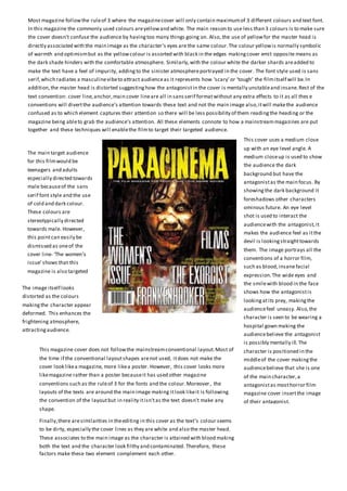
The main target audience
for this filmwould be
teenagers and adults
especially directed towards
male becauseof the sans
serif font style and the use
of cold and dark colour.
These colours are
stereotypically directed
towards male. However,
this pointcan easily be
dismissed as oneof the
cover line- ‘The women’s
issue’shows that this
magazine is also targeted
towards females.
This cover uses a medium close
up with an eye level angle. A
medium closeup is used to show
the audience the dark
background but have the
antagonistas the main focus. By
showingthe dark background it
foreshadows other characters
ominous future. An eye level
shot is used to interact the
audiencewith the antagonist,it
makes the audience feel as itthe
devil is lookingstraighttowards
them. The image portrays all the
conventions of a horror film,
such as blood,insanefacial
expression.The wide eyes and
the smilewith blood in the face
shows how the antagonistis
lookingatits prey, makingthe
audiencefeel uneasy. Also,the
character is seen to be wearing a
hospital gown making the
audiencebelieve the antagonist
is possibly mentally ill.The
character is positioned in the
middleof the cover makingthe
audiencebelieve that she is one
of the main character,a
antagonistas mosthorror film
magazine cover insertthe image
of their antagonist.
The image itself looks
distorted as the colours
makingthe character appear
deformed. This enhances the
frightening atmosphere,
attractingaudience.
This magazine cover does not followthe mainstreamconventional layout.Most of
the time if the conventional layoutshapes arenot used, itdoes not make the
cover look likea magazine, more likea poster. However, this cover looks more
likemagazine rather than a poster becauseit has used other magazine
conventions such as the ruleof 3 for the fonts and the colour.Moreover, the
layouts of the texts are around the main image making itlook likeit is following
the convention of the layoutbut in reality itisn'tas the text doesn't make any
shape.
Finally,there aresimilarities in theediting in this cover as the text’s colour seems
to be dirty, especially the cover lines as they are white and also the master head.
These associates to the main image as the character is attained with blood making
both the text and the character look filthy and contaminated. Therefore, these
factors make these two element complement each other.
2. The editing stylein this cover is similar
because the magazinecover only has texts
related to this specific film.Thus,makingevery
aspectof this cover related to each other.
The camera shotused is medium closeup to
focus on the character’s sinister facial
expression.This imageis an eye level shot to
make the audiencefeel as if the character is
staringatthe and in a way communication
with the audience. Most mainstreamhorror
filmmagazine cover uses this convention
because itis ableto gain the audience's
attention.
This magazine cover does not followthe convention of the layoutfor the
texts. This could be because they want to make the front cover simpleand
different from the other mainstreamhorror filmmagazine cover.
Moreover, this magazine cover is not promoting any films and marketing
less gossips.Mostmagazinecover that doesn't followthe convectional
layout,it doesn't make it look likean authentic magazinecover as thy
mostly look likea poster or a front cover for a game, but sincethis
magazine cover does not have too much going on itmakes this cover look
likean authentic magazine cover. Therefore, by not havingtoo addingtoo
much text itmakes the cover look as if itis followingtheconventional
layoutof ‘C’.
Image: This cover only has one image, which is
positioned in the middleof the cover making itthe
centre of attraction.Most horror films inserts their
antagonistin their cover to attracttheir target
audience. This magazinehas also used the same
principle.The antagonist’s eyes,nose and mouth is
dragged down to make it look eerie and haunting. On
top of that, the use of the mask makes the antagonist
mysterious forming curiosity in their target audienceas
they would want to know who is behind the mask,
attractingthe audienceto watch the film.The image
used is simpleyet at the same time is menacing.
Font: The master head, cover lineand sky lines areall the
same font styleof sans serif which gives off a masculine
vibe to the audience. This could represent how their main
targeted audiences arespecifically males.Thecover lines
are all aboutthe filmitself,the cover doesn't promote
any other films make this filmthe main focus.All the
fonts are the same style,this makes all the element of the
cover blend together and not confuse the audienceas to
what is goingon in the cover.
Colour: This magazine cover also applies theruleof 3 as their main colours arered, black and white that connotes to the
theme of horror film.The use for the red background symbolises danger and anger but these emotions are smoothened by
the dark colour around the edges, which also makes the background look more sinister atthe same time. The use of dark
colour creepingin from around the cover makes the image the main focus.By usingwhite colour for the text it makes the text
stand out as other colours contrasteach other making them emerge in their own way and also complimentingeach other.
The white mask contrasts well with the black hoodiemakingthis element the predominant part of this cover magazine.
However, the magazine also contains a bluetext for the word ‘returns’ to radiatea cold atmosphere, makingthat specific
word stand out to make the audience realisethatthis is oneof the trilogy of ‘Scream’. This will attractthe targeted audience,
epically thosewho are unawareof this trilogy as the word ‘retunes’ suggest that this filmis continuingas itis worth watching
as the director is ableto produce another part. These colours areused because none of these colours dominanteac h other,
which makes the audience focus on each of these colours rather than justone of the colour.This could be a problem as the
audiencecould disregard the other texts.