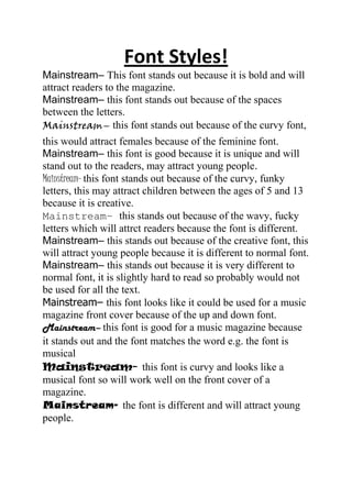
1. Font Styles!
Mainstream– This font stands out because it is bold and will
attract readers to the magazine.
Mainstream– this font stands out because of the spaces
between the letters.
Mainstream– this font stands out because of the curvy font,
this would attract females because of the feminine font.
Mainstream– this font is good because it is unique and will
stand out to the readers, may attract young people.
Mainstream– this font stands out because of the curvy, funky
letters, this may attract children between the ages of 5 and 13
because it is creative.
Mainstream– this stands out because of the wavy, fucky
letters which will attrct readers because the font is different.
Mainstream– this stands out because of the creative font, this
will attract young people because it is different to normal font.
Mainstream– this stands out because it is very different to
normal font, it is slightly hard to read so probably would not
be used for all the text.
Mainstream– this font looks like it could be used for a music
magazine front cover because of the up and down font.
Mainstream– this font is good for a music magazine because
it stands out and the font matches the word e.g. the font is
musical
Mainstream- this font is curvy and looks like a
musical font so will work well on the front cover of a
magazine.
Mainstream- the font is different and will attract young
people.