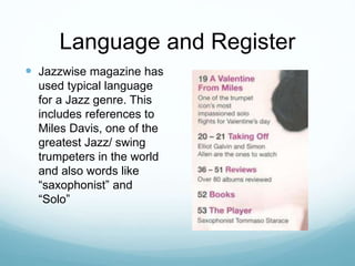
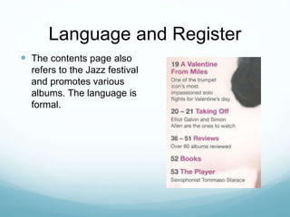
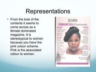
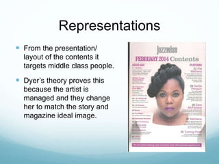
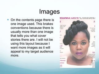
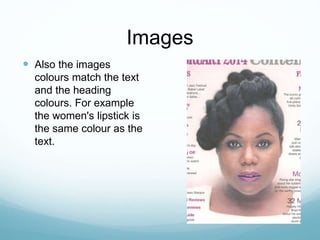
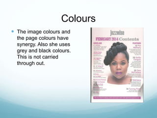
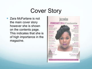
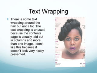
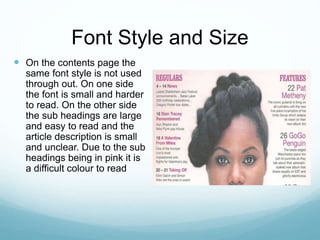
Research Contents Page: Jazzwise
magazine February 2014
By Kenza Hardy
Language and Register
 Jazzwise magazine has
used typical language
for a Jazz genre. This
includes references to
Miles Davis, one of the
greatest Jazz/ swing
trumpeters in the world
and also words like
“saxophonist” and
“Solo”
Language and Register
 The contents page also
refers to the Jazz festival
and promotes various
albums. The language is
formal.
Representations
 From the look of the
contents it seems to
come across as a
female dominated
magazine. It is
stereotypical to women
because you have the
pink colour scheme.
Pink is the associated
colour to women.
Representations
 From the presentation/
layout of the contents it
targets middle class people.
 Dyer’s theory proves this
because the artist is
managed and they change
her to match the story and
magazine ideal image.
Images
 On the contents page there is
one image used. This brakes
conventions because there is
usually more than one image
that tells you what cover
stories there are. I will not be
using this layout because I
want more images as it will
appeal to my target audience
more.
Images
 Also the images
colours match the text
and the heading
colours. For example
the women's lipstick is
the same colour as the
text.
Colours
 The image colours and
the page colours have
synergy. Also she uses
grey and black colours.
This is not carried
through out.
Cover Story
 Zara McFarlane is not
the main cover story
however she is shown
on the contents page.
This indicates that she is
of high importance in the
magazine.
Link to front cover
 There are only a few
links to the front cover.
The masthead is the
same on both front cover
and contents. All the
feature stories are
mentioned on the front
cover as well as the
contents. Apart from that
the contents uses a
different colour scheme.
Text Wrapping
 There is some text
wrapping around the
hair but not a lot. The
text wrapping is unusual
because the contents
page is usually laid out
in columns and more
than one image. I don’t
like this because it
doesn’t look very nicely
presented.
Font Style and Size
 On the contents page the
same font style is not used
through out. On one side
the font is small and harder
to read. On the other side
the sub headings are large
and easy to read and the
article description is small
and unclear. Due to the sub
headings being in pink it is
a difficult colour to read
Pull Quotes
 In this issue there are
no pull quoted in the
contents page. This is a
convention of any
magazine because the
pull quote is usually
found on the front
cover.

Research Contents 2 modified

  • 1.
    Research Contents Page:Jazzwise magazine February 2014 By Kenza Hardy
  • 2.
    Language and Register Jazzwise magazine has used typical language for a Jazz genre. This includes references to Miles Davis, one of the greatest Jazz/ swing trumpeters in the world and also words like “saxophonist” and “Solo”
  • 3.
    Language and Register The contents page also refers to the Jazz festival and promotes various albums. The language is formal.
  • 4.
    Representations  From thelook of the contents it seems to come across as a female dominated magazine. It is stereotypical to women because you have the pink colour scheme. Pink is the associated colour to women.
  • 5.
    Representations  From thepresentation/ layout of the contents it targets middle class people.  Dyer’s theory proves this because the artist is managed and they change her to match the story and magazine ideal image.
  • 6.
    Images  On thecontents page there is one image used. This brakes conventions because there is usually more than one image that tells you what cover stories there are. I will not be using this layout because I want more images as it will appeal to my target audience more.
  • 7.
    Images  Also theimages colours match the text and the heading colours. For example the women's lipstick is the same colour as the text.
  • 8.
    Colours  The imagecolours and the page colours have synergy. Also she uses grey and black colours. This is not carried through out.
  • 9.
    Cover Story  ZaraMcFarlane is not the main cover story however she is shown on the contents page. This indicates that she is of high importance in the magazine.
  • 10.
    Link to frontcover  There are only a few links to the front cover. The masthead is the same on both front cover and contents. All the feature stories are mentioned on the front cover as well as the contents. Apart from that the contents uses a different colour scheme.
  • 11.
    Text Wrapping  Thereis some text wrapping around the hair but not a lot. The text wrapping is unusual because the contents page is usually laid out in columns and more than one image. I don’t like this because it doesn’t look very nicely presented.
  • 12.
    Font Style andSize  On the contents page the same font style is not used through out. On one side the font is small and harder to read. On the other side the sub headings are large and easy to read and the article description is small and unclear. Due to the sub headings being in pink it is a difficult colour to read
  • 13.
    Pull Quotes  Inthis issue there are no pull quoted in the contents page. This is a convention of any magazine because the pull quote is usually found on the front cover.