Informative double page spread about The Teenagers band
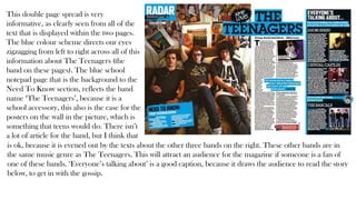
1. This double page spread is very
informative, as clearly seen from all of the
text that is displayed within the two pages.
The blue colour scheme directs our eyes
zigzagging from left to right across all of this
information about The Teenagers (the
band on these pages). The blue school
notepad page that is the background to the
Need To Know section, reflects the band
name ‘The Teenagers’, because it is a
school accessory, this also is the case for the
posters on the wall in the picture, which is
something that teens would do. There isn’t
a lot of article for the band, but I think that
is ok, because it is evened out by the texts about the other three bands on the right. These other bands are in
the same music genre as The Teenagers. This will attract an audience for the magazine if someone is a fan of
one of these bands. ‘Everyone’s talking about’ is a good caption, because it draws the audience to read the story
below, to get in with the gossip.
2. The black writing, hair and background for
the big quote clearly represent the fact that this
is a rock magazine page. Like I have pointed
out before in the front cover and contents
page analysis, the rock music genre is
associated with the theme rebellion, and the
way that the title is displayed as newspaper
cuttings is tied in with rebellion, because
ransom notes are known for usually being
made out of newspaper cuttings. The red
colour in this double page spread
compliments the layout. Although there is not
a lot of red text, I feel that it does not matter
because there is a lot of red on her shirt, so it
therefore makes up for the lack of red dotted
around the rest of the page. Having a quote by the artist for the title of the article, is good because it connects
the audience to the artist, because the audience feels like they know something personal about her. The
medium shot of the artist is good, because the reader gets to visualise the artist whilst reading about them, which
connects them to her even more.
3. This double page spread is very easy
for the audience to come to grips
with, because everything seems to
stand out. The USA in the
background stands out obviously due
to its bold font. It also gives meaning
to the cloth that she is sitting on. If
that USA wasn’t in the background
then I wouldn’t have known that the
stripy cloth is in fact the USA Flag.
The ‘got the love’ is also bold in
standing out to the audience, because
of its black letters against grey
background. This is actually the same
for the article text.
The long shot of the artist sitting on
the box, reveals her attractive revealed
legs which attracts the audience to
read about her in the article. The fancy sassy writing font reflects the artists photograph.
There is a black colour scheme in this that runs from her black outfit, to the ‘got the
love’ title, then back over the page to her shoes, and then to the black article text.