
Recommended
More Related Content
What's hot
What's hot (20)
Viewers also liked
Viewers also liked (14)
Similar to NME Contents
Similar to NME Contents (20)
Recently uploaded
Recently uploaded (20)
NME Contents
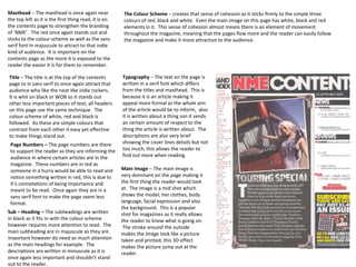
- 1. Masthead – The masthead is once again near the top left as it is the first thing read, it is on the contents page to strengthen the branding of ‘NME’. The red once again stands out and sticks to the colour scheme as well as the sans serif font In majuscule to attract to that indie kind of audience. It is important on the contents page as the more it is exposed to the reader the easier it is for them to remember. Title – The title is at the top of the contents page to in sans serif to once again attract that audience who like the neat like indie rockers. It is whit on black or WOB so it stands out other less important pieces of text; all headers on this page use the same technique. The colour scheme of white, red and black is followed. As these are simple colours that contrast from each other it easy yet effective to make things stand out. Page Numbers – The page numbers are there to support the reader as they are informing the audience in where certain articles are in the magazine. These numbers are in red as someone in a hurry would be able to read and notice something written in red, this is due to it’s connotations of being importance and meant to be read. Once again they are in a sans serif font to make the page seem less formal. Sub – Heading – The subheadings are written in black as it fits in with the colour scheme however requires more attention to read. The main subheading are in majuscule as they are important however do need as much attention as the main headings for example. The descriptions are written in minuscule as it is once again less important and shouldn’t stand out to the reader. Typography – The text on the page is written in a serif font which differs from the titles and masthead. This is because it is an article making it appeal more formal as the whole aim of the article would be to inform, also it is written about a thing son it sends an certain amount of respect to the thing the article is written about. The descriptions are also very brief showing the cover lines details but not too much, this allows the reader to find out more when reading. Main Image – The main image is very dominant on the page making it the first thing the reader would look at. The image is a mid shot which shows the model, her clothes, body language, facial expression and also the background. This is a popular shot for magazines as it really allows the reader to know what is going on. The stroke around the outside makes the image look like a picture taken and printed; this 3D effect makes the picture jump out at the reader. The Colour Scheme – creates that sense of cohesion as it sticks firmly to the simple three colours of red, black and white. Even the main image on this page has white, black and red elements in it. This sense of cohesion almost means there is an element of movement throughout the magazine, meaning that the pages flow more and the reader can easily follow the magazine and make it more attractive to the audience.