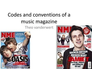
2. IMAGE
Secondary
images, to draw
the reader in if
they don’t like
the main image.
Medium shot or
close up
depending how
many people are
in the main
picture E.g. if its a
band it would be a
medium shot, solo
artist it would be a
close up.
Direct address the
main image will be
looking at the
reader.
No text on the
main artist’s
face, Or the
main image.
A Big picture of
the main artist
featured in the
magazine.
3. COLOUR
Only have about 3 – 4
different colours on the
cover.
Simple
colours.
No colours on the page
clash with each other.
Bright bold font
to catch the
customers eye.
4. TEXT
If one cover line
starts in bold all
the others have
to be bold.
Usually small
amounts of text
near to the
smaller images.
BUZZ WORDS
Puff – Advertising
on the page
Pug – Fake page
peel, usually in
the top right
corner.
Bold writing to
make it stand out
and attract the
customers
Main cover line,
with main
image, bigger
point size.
Cover lines all in
the same style of
font.
5. TITLEIn the
background.
Masthead
The image is
only slightly
covered, never
covered on the
face.
Big bold
unique font
to make the
main artist
stand out
from the
others.
Positioning
statement
6. SMALL DETAILS
Date of the
release, on
the barcode.
Price on the
barcode.
Usually come
with a free gift.
Promote
other bands