
Recommended
More Related Content
What's hot
What's hot (17)
Similar to Magazine anaylisis
Similar to Magazine anaylisis (20)
Recently uploaded
Recently uploaded (20)
Magazine anaylisis
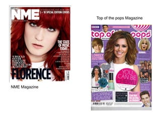
- 1. NME Magazine Top of the pops Magazine
- 2. Colours Every magazine that is produced has a colour palette which helps identify the magazine NME magazine has a colour palette of red, white and black, these are stereotypical Rock colours as this colour scheme will entice rock listeners in as they would think it suits them and it would be a good way to spend there money. Masthead The colour of the masthead is white because it breaks up the red colour and makes the name of the magazine stand out. The Masthead on NME magazine is always in the top left of the magazine, this is the first thing a reader will see of the magazine when it is on the shelf therefore it needs to be big and bold , it should take up about 1/3 of the page. Main Image The main image is of Florence which takes up the whole page of the magazine, they have used a close up image where it is cut off by her shoulders and not all her head is in the photo. They have used a close up image so they can get her hair and face taking up the space without the background in it this is good as they will use the colour of her hair in their colour scheme of the magazine. Main Cover line The main cover line on this magazine is about Florence this shows the reader that there is an article about her in the magazine. One of the main reasons they have used this as a cover line is that it is quite an important and main article. Target audience The target audience of this magazine is 16-22 year olds which are female and males as on every magazine cover they have females. The people that buy this magazine would be pop lovers and would want to buy as it has a well known artist on the cover. Slogan The slogan is placed under the masthead, the slogan of NME is simply saying what NME means which is ‘New musical express.’ Price and issue This informs the reader of how much the magazine will cost and what issue they are buying. The issue number is there for the people that buy the magazine regularly as they wouldn’t want to miss an issue. Layout The layout of this magazine hasn’t got a lot of writing everywhere. This shows that it is presenting itself to fit in with its genre as the genre doesn’t have much writing on any covers which makes it very minimalistic genre. This photos also makes the magazine look effortless. Cover line The cover lines are positioned on the left and right hand side which is where the majority of the red from Florence's hair is. They have placed them here as her hair is red so they choose white writing to contrast with the red and make them stand out to the reader.
- 3. Target audience The target audience of this magazine is 8-13 year old girls. This is a magazine for girls because of the colours on the magazine such as pinks and purples which are girly colours and they also have photos of well known artist such as the wanted , Justin Bieber and Cheryl Cole and this is the type of music this age range would listen to. Colours Every magazine that is produced has a colour palette which helps identify the magazine top of the pop magazine has a colour palette of pink, white and purples, these are stereotypical girly colours as this colour scheme will entice young girls in as they would think it suits them and it would be a good way to spend there pocket money to find out the gossip of the celebrities in the magazine. Masthead The masthead on this magazine isn't as big as they normally are on magazines as the masthead is normally 1/3 of the page as this one isn't, the writing of the masthead is very bubbly which could show represent little girls hand writing as they like to bubble write. The colour of the masthead is pink , this will attract young girls as they like bright bold colours Institutional presence The institutional presence of this magazine is BBC which is a popular TV broadcaster which everyone knows and lets the reader contact the magazine also allows them to follow on different social media sites that the reader could get updates about the magazine on. Direct mode of address The direct mode of address of ‘you can be Cheryl’ will make the reader think that the magazine is talking to them as it makes them feel special and that they are going to be the only one that is going to be like Cheryl. This will make the readers buy this magazine as they have Cheryl Cole as a role model on the front cover. Main image The main image is of Cheryl Cole which takes up the majority of page of the magazine, they have used a mid shot image where it is cut off by her waist and goes to her head . They have used a mid shot image so they can see who the magazine is going to be focused on. Cheryl only takes up the middle of the page but doesn’t take up the whole front cover of the magazine this is good so they can have other photos on the side to entice the readers in. Anchorage text The anchorage text gives you an insight into the articles in the magazine and what is going to be said in the magazine, these help the reader get an idea of what the articles will be about with just a glance at the cover. Graphic features Graphic features are pictures on the front cover of a magazine. Graphic features helps capture the reader attention when looking for a magazine, if there are photos of a well known artist that they like they might wonder what the magazine is advertising about them which would make them intrigued about them which means they would buy the magazine to find out some gossip. Price, date & barcode The barcode, price and date is used on every magazine as it allows the buyer to buy the magazine and tell the shop how much this magazine costs, and for the shop selling the magazine to physically scan the magazine so the readers can pay for the magazine, the date is on the magazine so the readers can see how old the magazine is.
- 4. NME Contents page Top of the pops contents page
- 5. Header The header includes the NME logo , this will make the readers aware of who produce the magazine. Having the header with the logo in gives a constant reminder what magazine they are reading, this is good so it makes the reader remember the magazine name and if they enjoy the magazine means that there is more chance for them to remember the name as it comes up a lot throughout the magazine. The header is very bold and big at the top of the magazine which means that they want you to notice the header which is why they put it there. Having ‘NME this week’ instead of having ‘contents’ gives it a feel of edge and helps communicate to the younger audience. It adds a bit of variety to every other magazine and not just the same so this helps to make the magazine stand out. Colour palette The colour palette is consistent throughout the magazine which helps the reader know that it is all part of the same magazine, the colour palette for NME is red, black, white and yellow these are the house colours they continue these colours throughout as it keeps the consistency through the magazine. They use the colour palette to highlight certain words and articles as they could be the main article or the words could have a significant to the magazine. They also use it for parts of the magazine to stand out such as the ‘NME this week’ at the top the colours help bring your attention to the top instead of anything else first, then your eye follow the page down. Layout The layout of the contents page is very conventional to NME magazine as they like to keep the majority of the writing on the side as it demonstrates on the front cover they keep most of the writing on the sides and a little bit In the middle, this contents pages sticks to this style as they have used the box method to set this contents page out which helps makes the page suit the style of the front colour of NME. Subheadings The subheading help to capture the readers attention as the subheading have bold letters and the writing is bigger than the other writing underneath. The subheadings on the right hand side of the magazine are different compared to the rest of the magazine, this affective as it adds a bit of variety to the contents page. Central image The central image Is of a building, this image isn't prepared for as there isn't people that they need to organise. Therefore this could mean that there is gossip about back stage in the magazine.
- 6. Header The header doesn’t have the word contents which makes it young and appeals to the target audience as it isn't the normal contents page therefore this helps the magazine to stand out from every other magazine in this genre. The writing used on the magazine is very bubbly and could be used to represent young girls hand writing as this is a similar look to how they write and just makes it clearer for the magazines target audience. Layout This contents page has used the grid method to make the page look equal, having the magazine front cover on the contents page helps you remember the magazine your reading and just shows that the contents and front cover match and go together. The use of little pictures on the contents page helps to add colour to the page and this helps attracts the readers attentions as young girls would prefer to look at photos instead of reading everything. Colour palette The colour palette is consistent throughout the magazine which helps the reader know that it is all part of the same magazine, the colour palette for top of the pops purple, pink and white these are the house colours they continue these colours throughout as it keeps the consistency through the magazine. They use the colour palette to highlight certain words and articles as they could be the main article or the words could have a significant to the magazine. They have used white for the ‘inside the mag..’ to stand out clearly on the pink. Subheadings The subheading help to capture the readers attention as the subheading have bold letters and the writing is bigger than the other writing underneath. The subheading are mainly all to the bottom as there is a picture of the front cover at the top to show where the certain articles on the front are in the magazine this helps the reader as they could flick straight to the article they want to read instead of reading the whole magazine .
- 7. NME double page spread Top of the pops double page spread
- 8. NME double page spread stick with the colour scheme of the whole magazine with the red, white and black colour scheme they have kept this on this double page spread by dressing Florence in black and then her hair and blanket that is red which helps follow the house style. Compared to the other double page spread in NME magazine, the title of this double page spread is more elegantly written this is to show the elegance of Florence so they match the writing with the celebrity. So if they had a celebrity that was more out there and vibrant they would have a more strong title font. The double page spread is based on the singer Florence Welch which is why the main image is of Florence which takes up half of the double page which is put on the left hand side of the magazine this shows consistency throughout the magazines produced as every NME magazine that is produced has the photo on the left of a double page spread. The photo is in colour which means it helps stands out and adds colour to the page. She has a direct gaze towards the camera with her arm twisting her round to look at the camera. The article is set out in columns which makes it easier for the readers to scan through. Having the double page spread in columns keeps it consistent and gives it the sense of organisation. The text of the article is black but has ‘Florence Welch’ in blue to show who the article is about. The use of black writing helps as it sticks with the colour scheme and contrast to the colour in the photo.
- 9. Top of the pops double page spread stick with the colour scheme of the whole magazine with the pink, purple and white colour scheme they have kept this on this double page spread by have the questions asked in pink and a quote in pink to stand out and to show the bits that the reader will be interested in. The quote at the tops instead of a title add variety to other magazine as most other magazines have a title for their article but this one has a quote which makes it different and will help for the magazine to stick in peoples heads as it is different. The double page spread is based on the singer Cheryl Cole which is why the main image is of Cheryl which takes up the majority of the right hand side of the double page. The top of the pops magazine has the majority of the central images in the middle or to the right hand side of the page but some times they change this to add a bit of variety to the magazine. This photo is in colour which makes it more interesting for young girls as they would be more interested in the photos not all the text. The article is set out in columns which makes it easier for the readers to scan through. Having the double page spread in columns keeps it consistent and gives it the sense of organisation. Having different photos to put with the interview keeps the readers attention for longer as they have a short attention span to reading therefore if they put photos in it will break up the text more so then that means they can have a break to look at the photos then they can continue reading.